In the high-stakes world of B2B software, the traditional "competitor comparison" page has become a relic of a bygone era. For years, the standard playbook was simple: create a one-to-one matchup page, stack a feature table in your favor, list the competitor’s weaknesses, and add a heavy-handed Call to Action (CTA).
However, today’s B2B buyers are more informed, skeptical, and time-poor than ever. They can spot a biased, sales-heavy comparison page from a mile away. When a page feels engineered to "win an argument" rather than provide clarity, it doesn’t just fail to convert—it actively damages the company’s credibility.
According to landing page expert Tas Bober, the most effective SaaS comparison pages are shifting from persuasion to education. By focusing on buyer fit, workflow, and honest trade-offs, companies can transform these pages from simple lead-gen assets into powerful tools that guide prospects toward a confident, informed decision.
The Evolution of the SaaS Comparison Page
Historically, marketers treated comparison pages as simple SEO traps designed to siphon traffic from high-intent keywords. While these pages served a role in discovery, they often failed at the "consideration" stage of the buyer journey.
Research from the Harvard Business Review highlights a critical issue in modern sales: between 40% and 60% of B2B deals are lost not to a competitor, but to customer indecision. When buyers are overwhelmed by options, they often choose the "safe" path of inaction—sticking with manual spreadsheets, clunky legacy systems, or no software at all.

A modern, high-trust comparison page serves as a navigational aid. Instead of shouting, "We are better than [Competitor X]," the page should answer: "How does our approach solve your specific problem, and is it the right fit for your team’s current priorities?"
Anatomy of a Trust-First Comparison Page
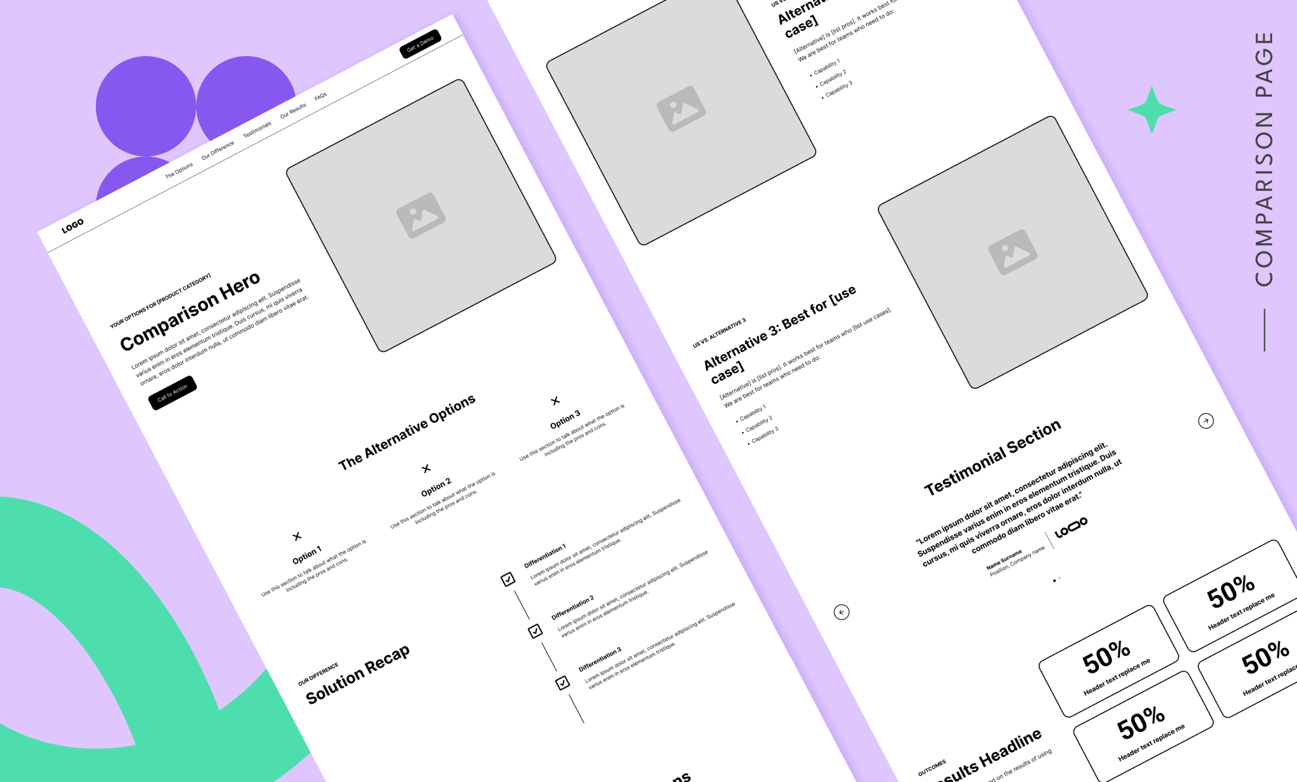
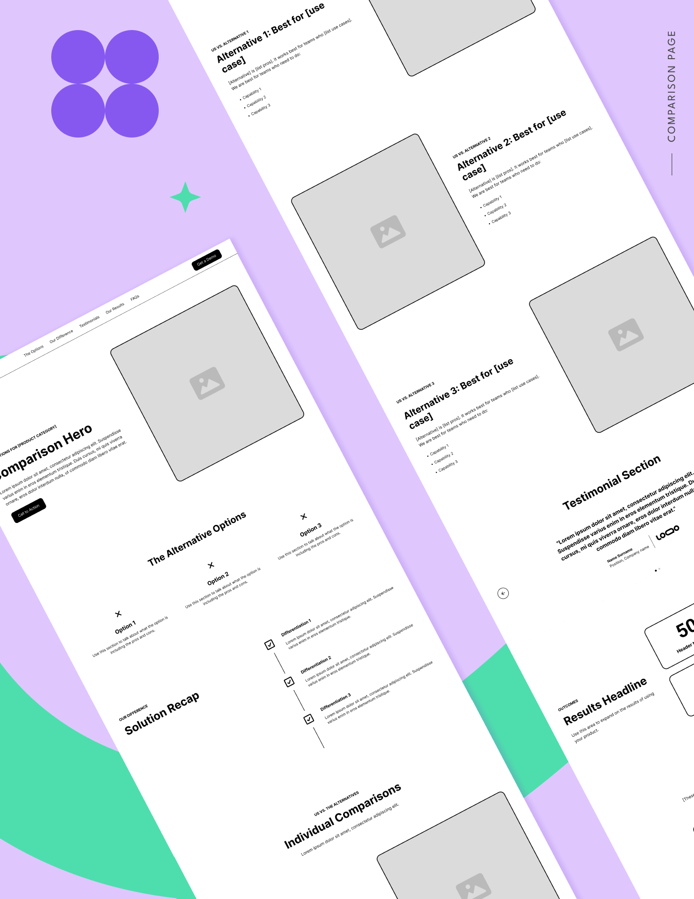
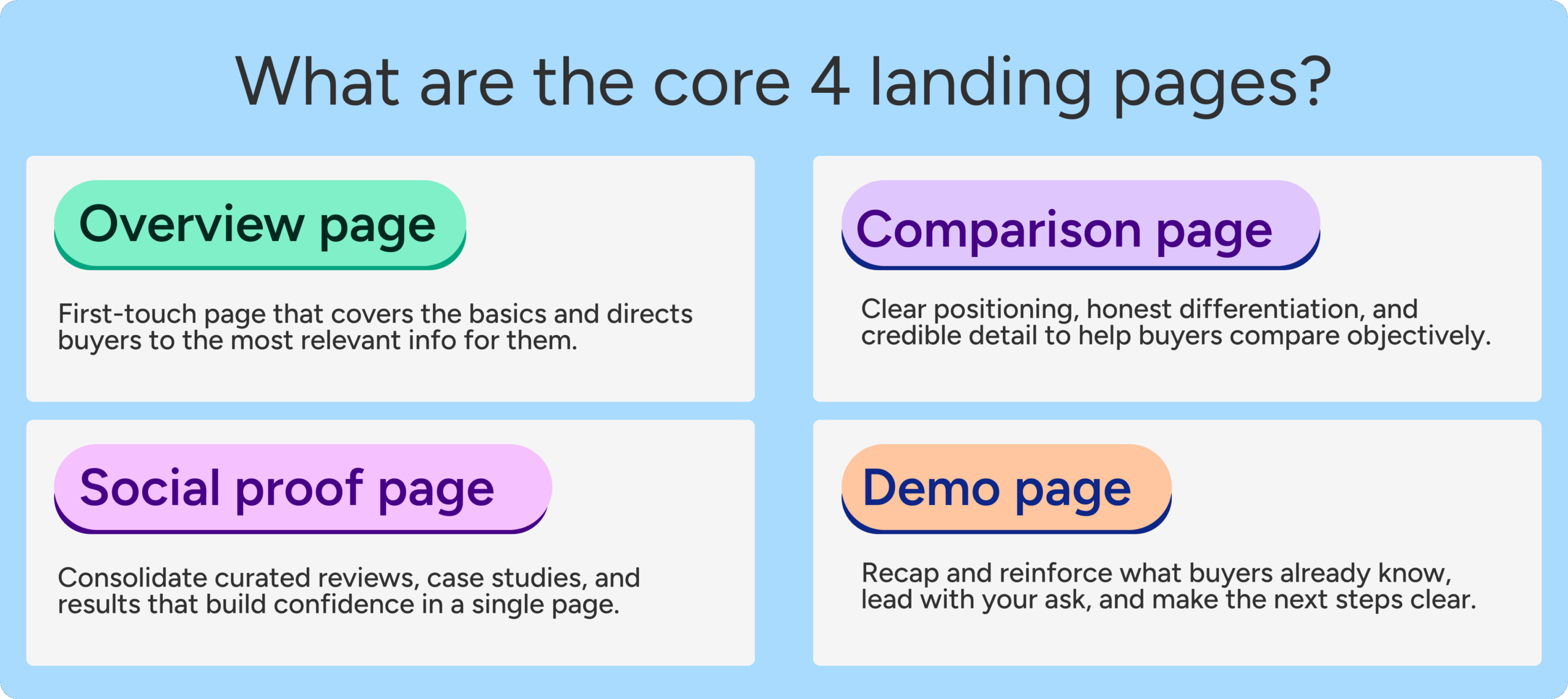
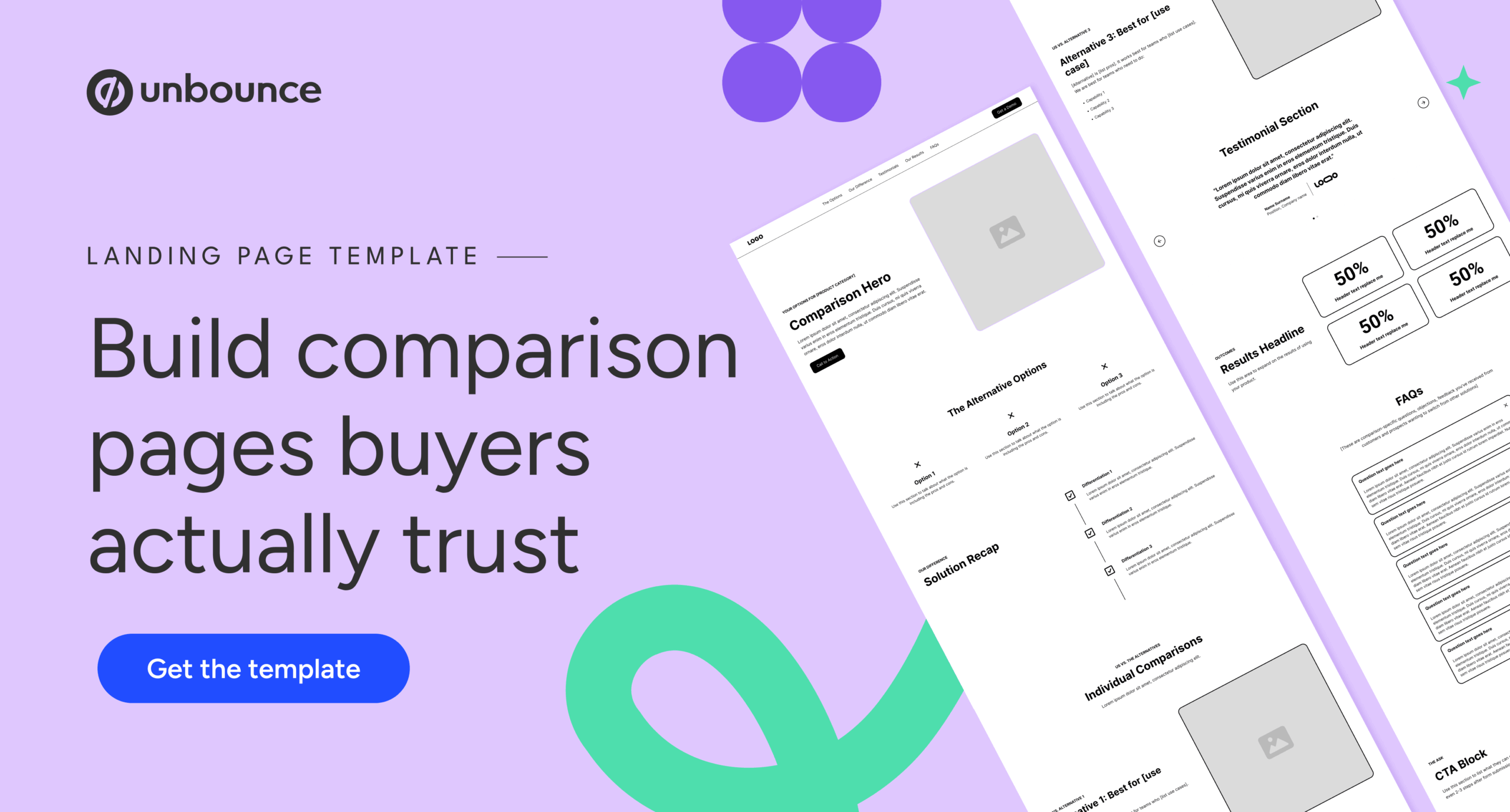
To build a page that resonates, marketers must move beyond the "we win, they lose" mentality. Tas Bober’s framework for a high-converting comparison page focuses on several key structural blocks that prioritize utility over pressure.
1. The Comparison Hero
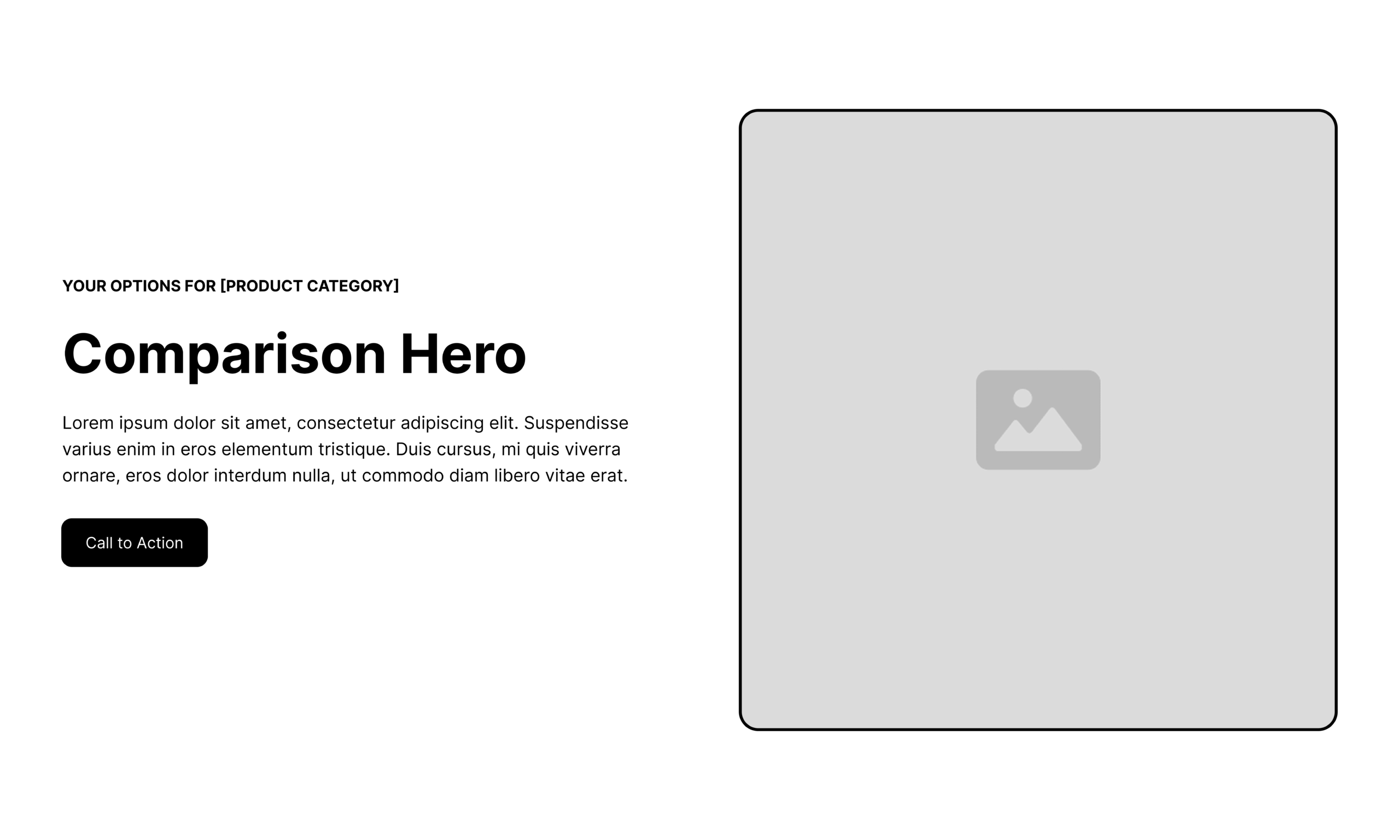
The hero section must immediately confirm the visitor’s intent. By using the "eyebrow" of the section to signal the category (e.g., "Your Options for Project Management Software"), you align with the user’s search query. The headline should then frame the decision around the user’s needs, not just product features.
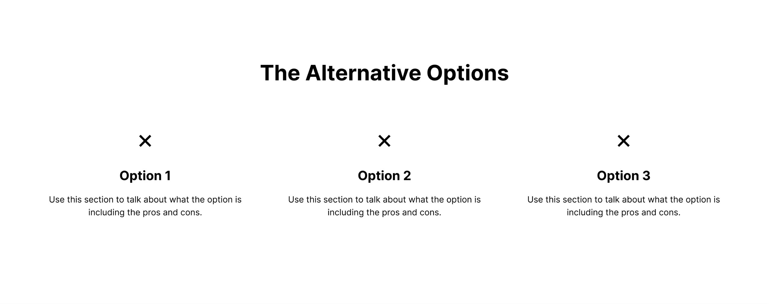
2. High-Level Alternatives
Before diving into a specific one-to-one battle, provide a broader context. Acknowledge that the buyer is evaluating multiple ways to solve a problem—this might include other software, custom-built solutions, or manual workarounds. By framing these as valid choices and discussing the pros and cons of each, you establish yourself as a helpful guide rather than a desperate vendor.
3. Solution Differentiation
Once the alternatives are established, the differentiation section acts as the "why us" summary. This is the place to highlight the specific pillars of your product that solve the unique pain points of your target audience.
4. The "Anti-Table" Philosophy
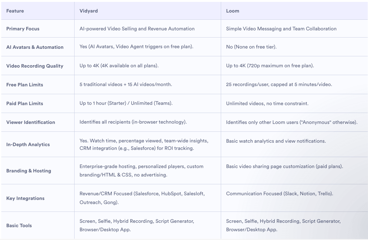
Interestingly, Bober suggests being cautious with the traditional feature comparison table. When used poorly, these tables feel like a list of "gotchas." If you choose to use one, it should be highly specific, focusing on themes like integration ecosystems, workflow depth, or ease of adoption, rather than a checklist of checkmarks and X’s.
Supporting Data and Strategic Positioning
Choosing which keywords to target requires a deep dive into sales data. By analyzing sales call recordings and lost-deal reports, marketing teams can identify the specific competitors that arise most frequently.
- One-to-one pages: Best for buyers who have already shortlisted two or three providers.
- Competitor alternatives pages: Targeted at high-intent users who are actively seeking a replacement for a specific, often legacy, tool.
- Overview pages: Best for those still in the discovery phase, helping them understand the full landscape of their category.
Real-World Examples of Integrity
A few companies are setting the gold standard for these pages by embracing transparency.
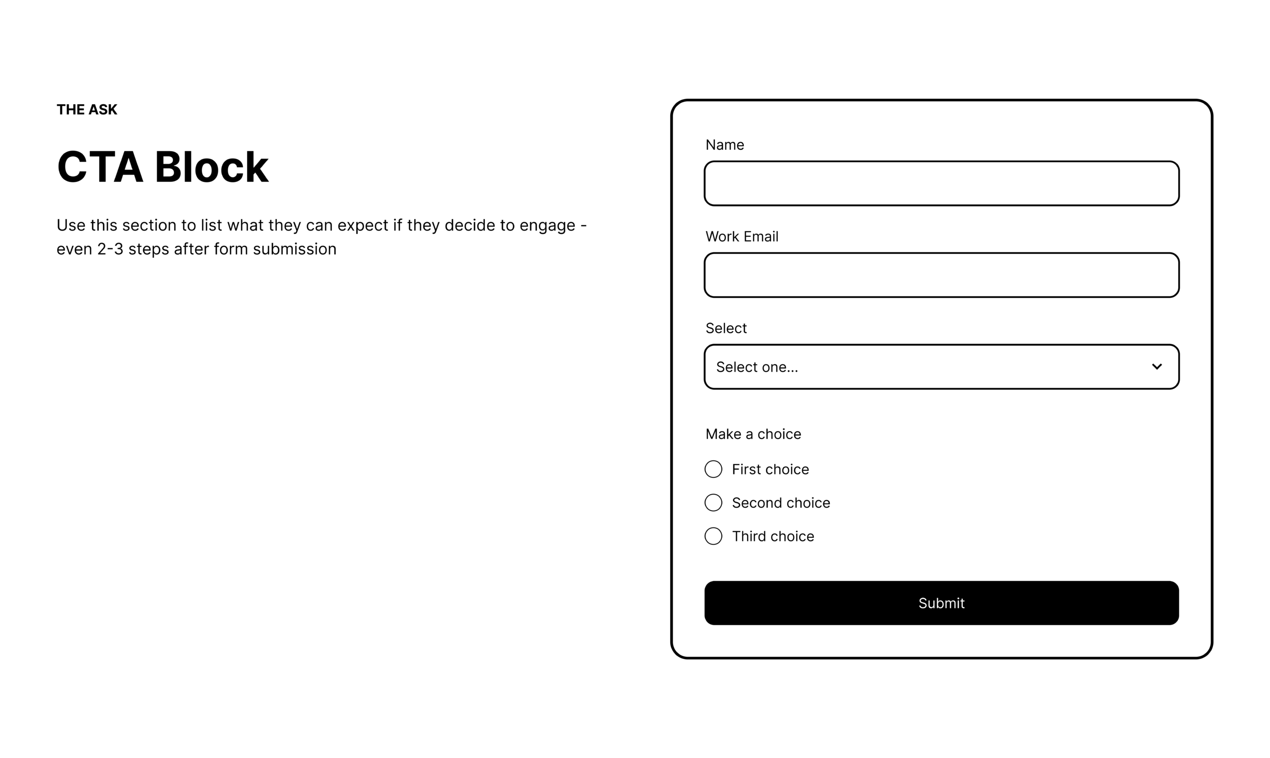
- Vidyard vs. Loom: Vidyard uses a hero section that directly addresses the buyer’s dilemma: "Which video tool is right for you?" By focusing on the use case rather than just the feature list, they position themselves as a consultant.
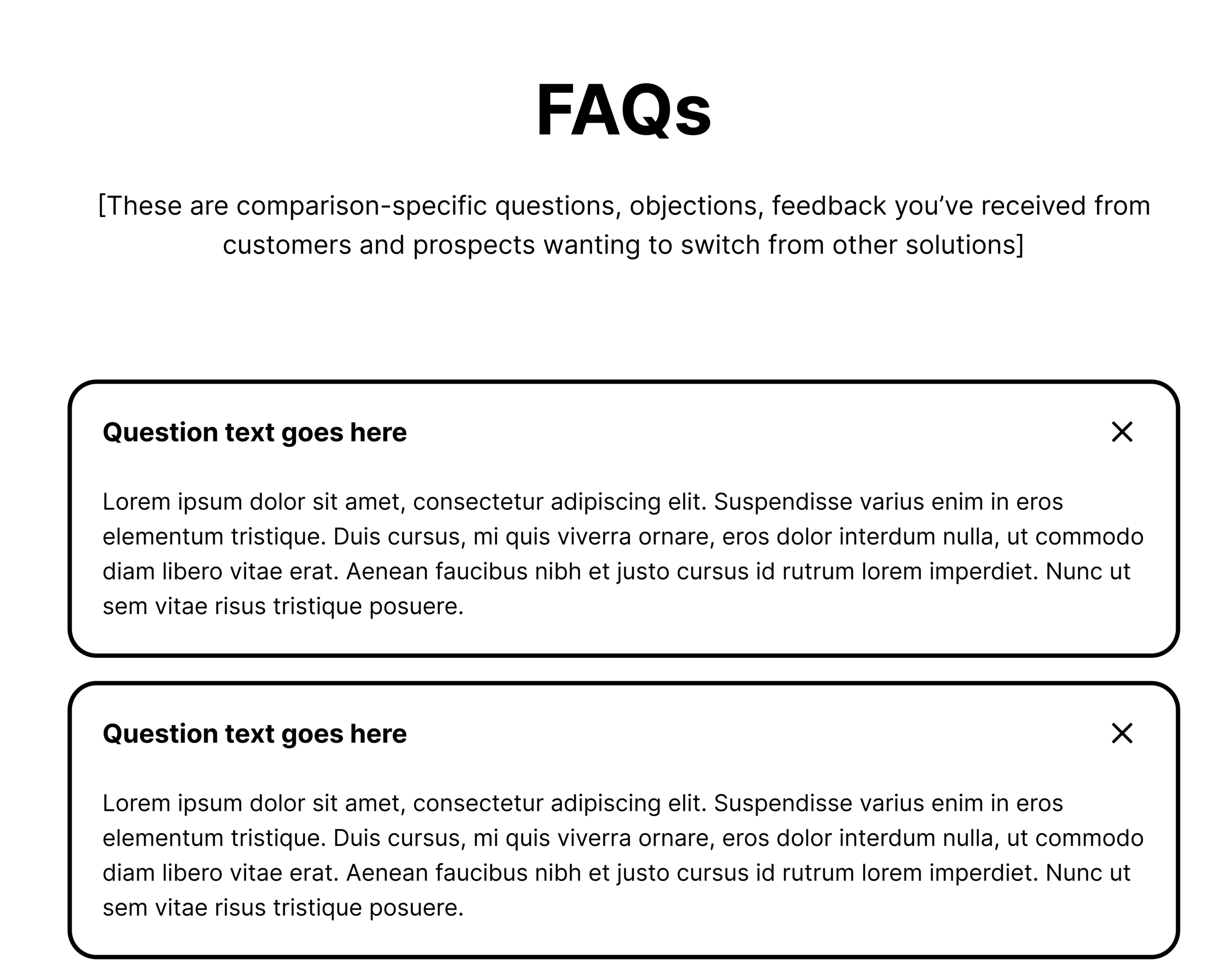
- Asana vs. ClickUp: Asana excels by using an FAQ section that addresses the psychological blockers of migration. They don’t ignore the difficulty of switching software; they provide answers that reduce the perceived friction of the transition.
- Mailchimp vs. Klaviyo: Mailchimp takes a bold step by admitting where they have gaps. By honestly acknowledging that certain competitors might be better for specific niche needs, they build a level of trust that makes their claims about their own strengths much more credible.
- Zendesk vs. Freshdesk: Zendesk leverages independent research to validate their claims. By citing third-party customer interviews, they shift the narrative from "our marketing team says this" to "the market says this."
Implications for Modern Marketing
The shift toward honest comparison pages is not just a moral choice; it is a tactical necessity in an era dominated by AI and sophisticated search algorithms. Search engines are increasingly capable of identifying "helpful content." Pages that are thin, overly promotional, or lacking in genuine insight are being deprioritized.
Furthermore, the rise of LLMs (Large Language Models) means that if your brand is not providing clear, honest, and useful information, the AI will synthesize an answer from your competitors’ content instead.
Moving Forward: The Implementation Checklist
To build a comparison page that actually moves the needle, marketing teams should adopt the following approach:
- Stop the Takedowns: Avoid trashing competitors. It signals insecurity and lacks professional maturity.
- Focus on Fit: Explicitly state who your product is not for. This acts as a powerful filter, attracting high-quality leads while reducing churn from poor-fit customers.
- Prioritize Results: Use testimonials from customers who actually switched from the competitor you are highlighting. The social proof must be relevant to the specific comparison.
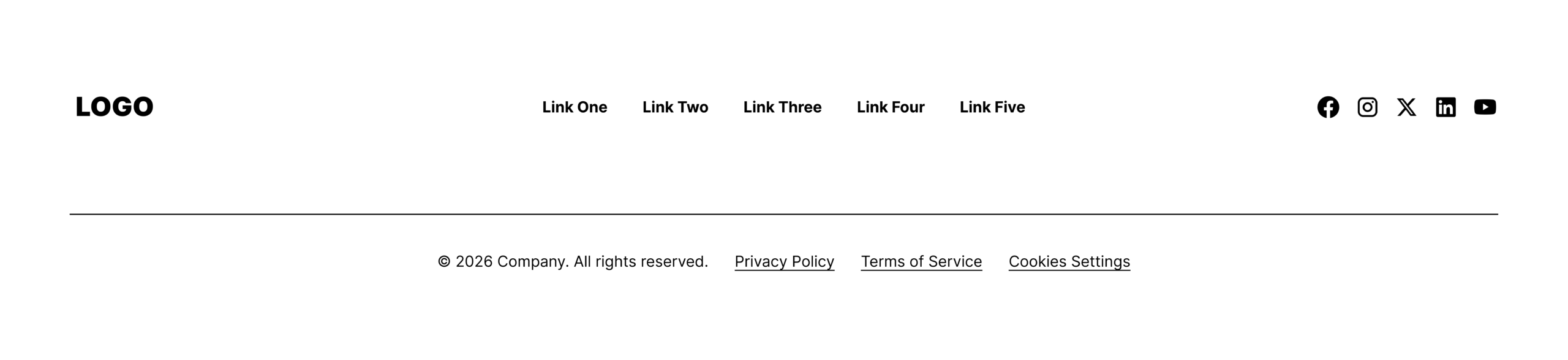
- Clear Next Steps: Use the footer to provide a path forward, not a dead end. Whether it’s a demo, a migration guide, or a pricing page, keep the momentum going.
In the end, the goal of a SaaS comparison page is to help the buyer make a decision they won’t regret. By providing the transparency they crave, you stop being just another vendor in a crowded market and start being a trusted partner in their success.