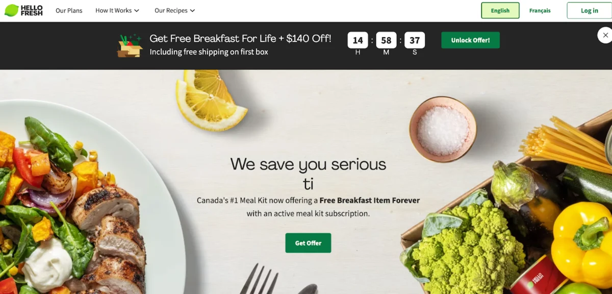
In the fast-paced world of digital marketing, the landing page serves as the digital front door to your business. It is the critical juncture where interest transforms into action, or where potential customers drift away into the abyss of the internet. A polished, professional landing page is the difference between a high-performing campaign and a costly waste of ad spend.
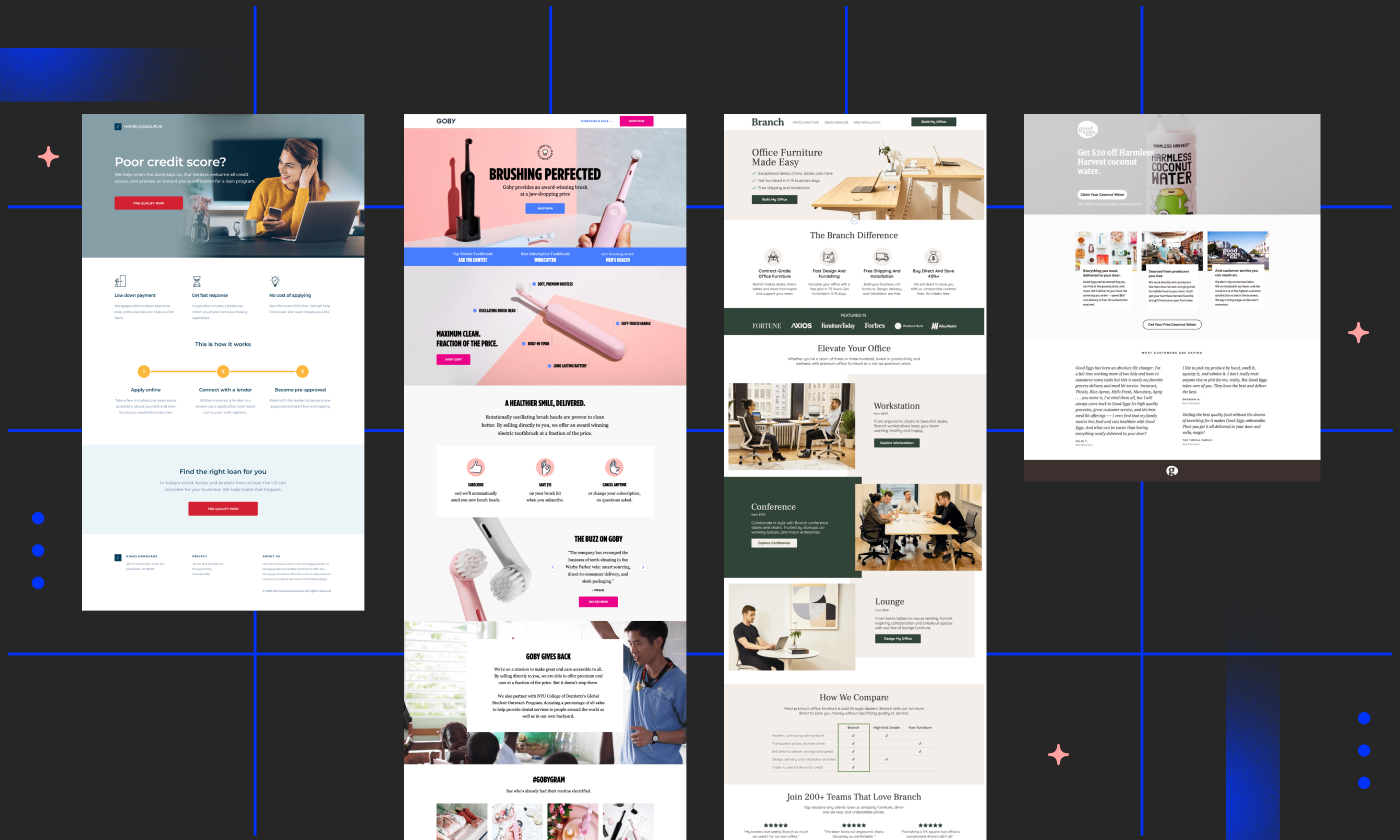
But what exactly defines "polished" and "professional" in the context of a conversion-optimized page? Is there a secret formula that separates the industry leaders from the rest of the pack? By analyzing 40 of the most effective landing page examples across diverse sectors—from SaaS and e-commerce to education and healthcare—we can uncover the strategic "x-factors" that turn visitors into loyal customers.

The Anatomy of a High-Converting Landing Page
Before diving into specific examples, it is essential to establish the foundational pillars of a high-converting page. A landing page is not merely a website extension; it is a standalone asset created for a specific marketing or advertising campaign. Its sole purpose is to convert.
The Core Pillars:
- Focused Messaging: A clear, concise value proposition that answers the "what’s in it for me?" question within seconds.
- Visual Hierarchy: Utilizing design to guide the visitor’s eye toward the Call to Action (CTA).
- Minimal Friction: Reducing the number of form fields and distractions to make the conversion path as smooth as possible.
- Social Proof: Leveraging testimonials, case studies, or trust badges to build immediate credibility.
40 Exemplary Landing Pages: A Strategic Analysis
To provide a comprehensive overview, we have curated a selection of landing pages that demonstrate mastery in specific conversion goals.
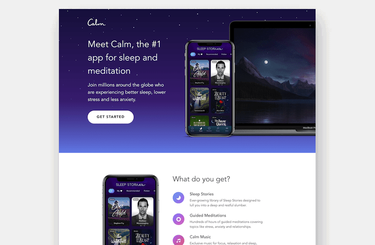
1. Calm (Health & Wellness)
Calm utilizes a serene, minimalist design that perfectly mirrors its product. By focusing on the emotional benefit of tranquility, the page encourages immediate engagement without overwhelming the visitor with dense technical jargon.

2. Netflix (Entertainment)
Netflix remains the gold standard for simplicity. Their value proposition—unlimited entertainment for a low monthly fee—is communicated instantly. By stripping away navigation bars and extraneous links, they ensure the only logical step for the user is to sign up.

3. SEMrush (Marketing SaaS)
Rather than attempting to sell their entire suite of tools, SEMrush focuses their landing page on a single, powerful pain point: competitive analysis. By narrowing the scope, they increase the relevance of the offer and, consequently, their conversion rate.

4. Grass Roots (Food & Nutrition)
In partnership with MuteSix, the Grass Roots Farmers’ Cooperative created a journey-based landing page. It educates the visitor on the benefits of grass-fed meat before presenting a compelling incentive: "$30 off your first order." This effectively moves the user from awareness to consideration and, finally, to conversion.

5. Amazon (E-commerce)
Interestingly, Amazon often breaks the traditional rules of landing page design. Their pages are frequently dense and filled with multiple exit points. However, they succeed because their brand equity and the strength of their offer are so powerful that they override standard conversion best practices.

Supporting Data: Why Design Matters
Recent studies indicate that landing pages incorporating video content can see conversion rate increases of up to 86%. Furthermore, the "above the fold" area—the content visible before scrolling—remains the most critical real estate. Statistics consistently show that visitors make a judgment about a page’s credibility in less than 50 milliseconds. Therefore, clarity in your headline and CTA is not optional; it is a prerequisite for success.

Official Perspectives: The Industry Consensus
Marketing experts, including those from agencies like ConversionLab and Webistry, emphasize that there is no "one-size-fits-all" template.

"Most brands have a huge opportunity to lower their CPA (Cost Per Acquisition) and increase conversions by focusing more on awareness and consideration phases," notes Cameron Gawley, CEO of BuzzShift. This sentiment is echoed across the industry: the most successful pages are those that treat the visitor as a human being on a journey, rather than just a data point to be captured.

Implications for Your Strategy
If you are looking to emulate these successes, consider the following tactical shift: Stop optimizing for "best practices" and start optimizing for your audience.

The 10-Step Implementation Framework
- Define your goal: Are you looking for leads, sales, or trial signups?
- Audit your traffic source: Ensure your landing page headline matches the ad copy that brought the user there.
- Simplify your navigation: Remove all links that don’t lead to your conversion goal.
- Write benefit-driven copy: Focus on outcomes, not just features.
- Use a hero shot: Show the product in action.
- Add social proof: Display testimonials or client logos.
- Optimize your CTA: Make it stand out with high-contrast colors and action-oriented text.
- Minimize forms: Only ask for the information you absolutely need.
- Ensure mobile responsiveness: A significant portion of your traffic will be on a smartphone.
- A/B Test: Never assume your first draft is your best.
FAQ: Navigating Landing Page Complexities
Q: What is the primary difference between a homepage and a landing page?
A: A homepage is a broad hub for your brand, whereas a landing page is a surgical tool designed for a specific campaign and a single conversion goal.
Q: How do I know if my landing page is "good enough"?
A: A good landing page is never "finished." Use A/B testing to compare variations of headlines, images, and CTAs. If your conversion rate is stagnating, it is time to test a new hypothesis.
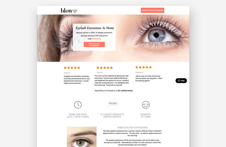
Q: Is it better to have a long or short landing page?
A: The length should match the commitment level of the offer. A simple newsletter signup should be short; a high-ticket B2B service may require a longer page to build trust and provide necessary information.
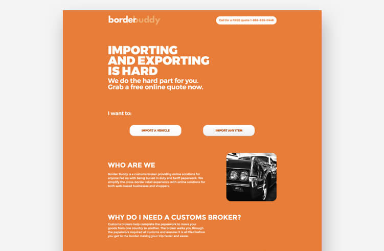
Conclusion: Becoming the Michael Jordan of Landing Pages
It is easy to look at the massive, polished pages of global brands and feel discouraged. However, it is vital to remember that these brands started with a blank page, a brand identity, and a core hypothesis.
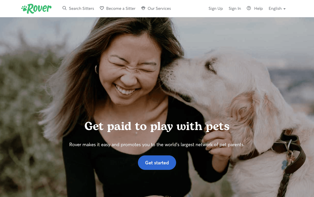
Do not let the "awesomeness" of industry leaders paralyze your progress. Use these examples as a library of inspiration—swipe the elements that resonate with your target audience, adapt them to your unique value proposition, and test, test, test. Your next high-converting landing page is only one iteration away. By focusing on the user’s journey and maintaining a rigorous commitment to data-driven improvements, you can build a digital presence that doesn’t just attract visitors—it wins them.