

In the high-stakes world of B2B software, the traditional "competitor comparison page" is undergoing a radical identity crisis. For years, the standard operating procedure for SaaS marketers was simple: build a side-by-side feature table that conveniently checks every box for your product while leaving the competition’s columns conspicuously empty.
But today’s B2B buyers are different. They are more informed, increasingly skeptical, and—thanks to tighter budgets—subject to intense scrutiny from internal stakeholders. They have seen the biased "us vs. them" playbook, and they have stopped trusting it.
According to landing page expert Tas Bober, the era of the "hit piece" comparison page is over. To capture the modern buyer, companies must pivot from persuasion to education. This article explores how to build comparison content that prioritizes integrity, utility, and, ultimately, the buyer’s confidence.
The Evolution of the Buyer Journey
Historically, comparison pages were treated as a bottom-of-funnel conversion tool. The goal was to force a decision by highlighting competitor weaknesses. However, this approach ignores the reality of the modern buyer journey. Research from the Harvard Business Review suggests that between 40% and 60% of B2B deals are lost not to a competitor, but to "customer indecision."
Buyers are often choosing between your software, a direct competitor, or the status quo: spreadsheets, manual workarounds, or nothing at all. If your comparison page only attacks the competitor, you fail to address the 60% of potential customers who are simply paralyzed by the choice itself.

A high-performing comparison page now serves as a guide. It helps the right prospects qualify themselves, understand their own specific trade-offs, and move one step closer to a decision—whether that leads to your checkout page or not.
Anatomy of a Modern Comparison Page
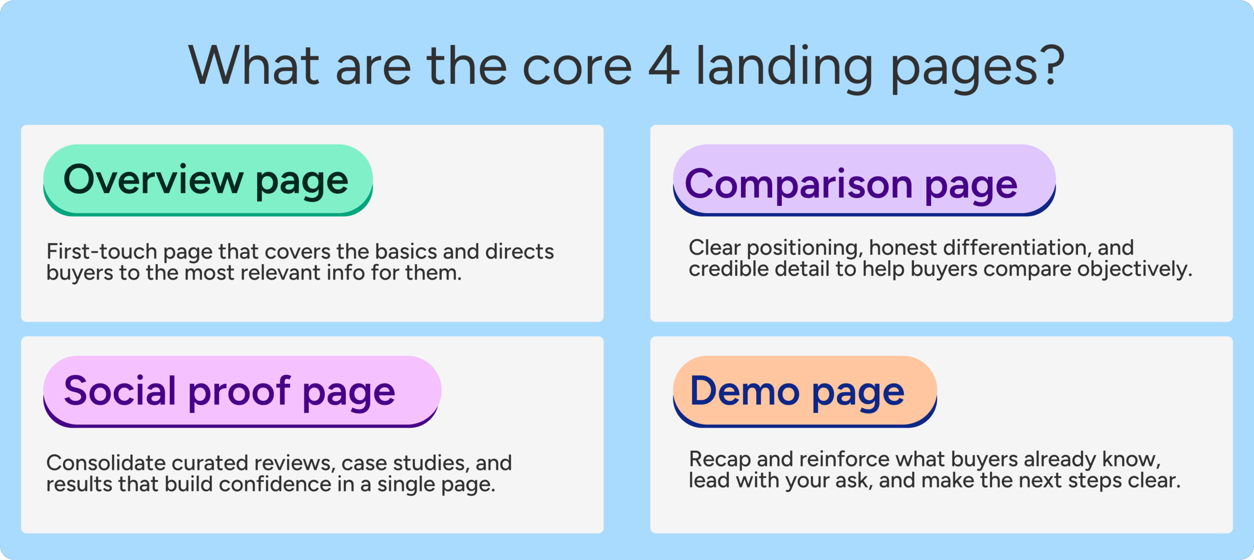
Tas Bober, a leading voice in B2B landing page strategy, advocates for a "Core Four" approach to high-intent pages, where the comparison page is a foundational element. A truly helpful comparison page should be built as a modular experience, focusing on objective value.
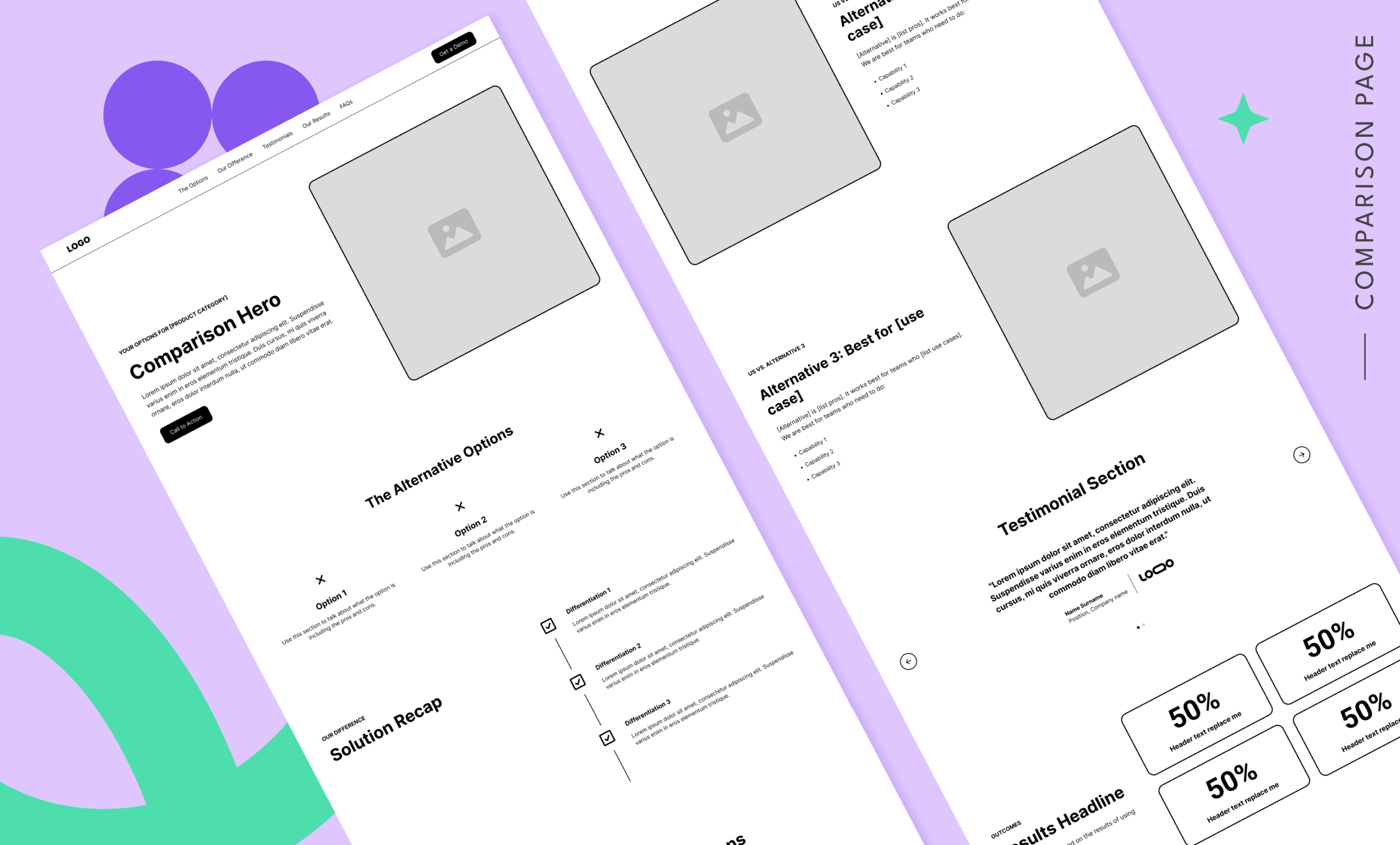
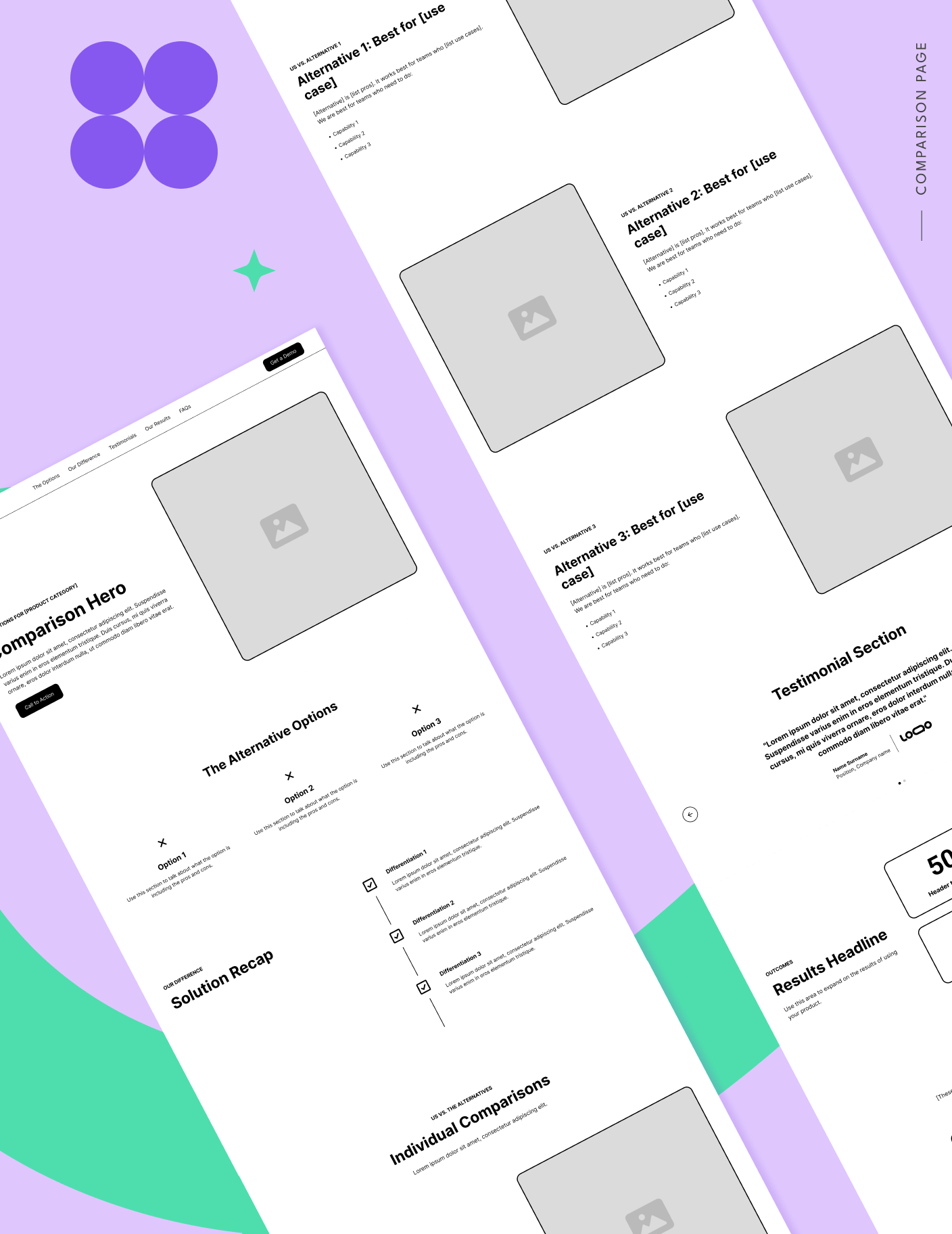
1. The Strategic Hero Section
The hero section should immediately confirm the search intent. Instead of a generic "Product A vs. Product B" headline, use an eyebrow or sub-headline that frames the decision. A strong example would be: "Your guide to choosing the right project management software for your team’s workflow." This signals to the buyer that they have landed on a resource designed to help them make a decision, not just a sales brochure.
2. High-Level Alternatives (The "What are my options?" Block)
Before diving into a specific match-up, successful pages provide a landscape view. By categorizing alternatives into buckets—such as "enterprise suites," "SMB-focused tools," or "internal manual processes"—you show the buyer you understand their specific challenges. Discussing the pros and cons of these categories establishes you as an expert guide rather than a desperate salesperson.
3. Individualized Comparison Blocks
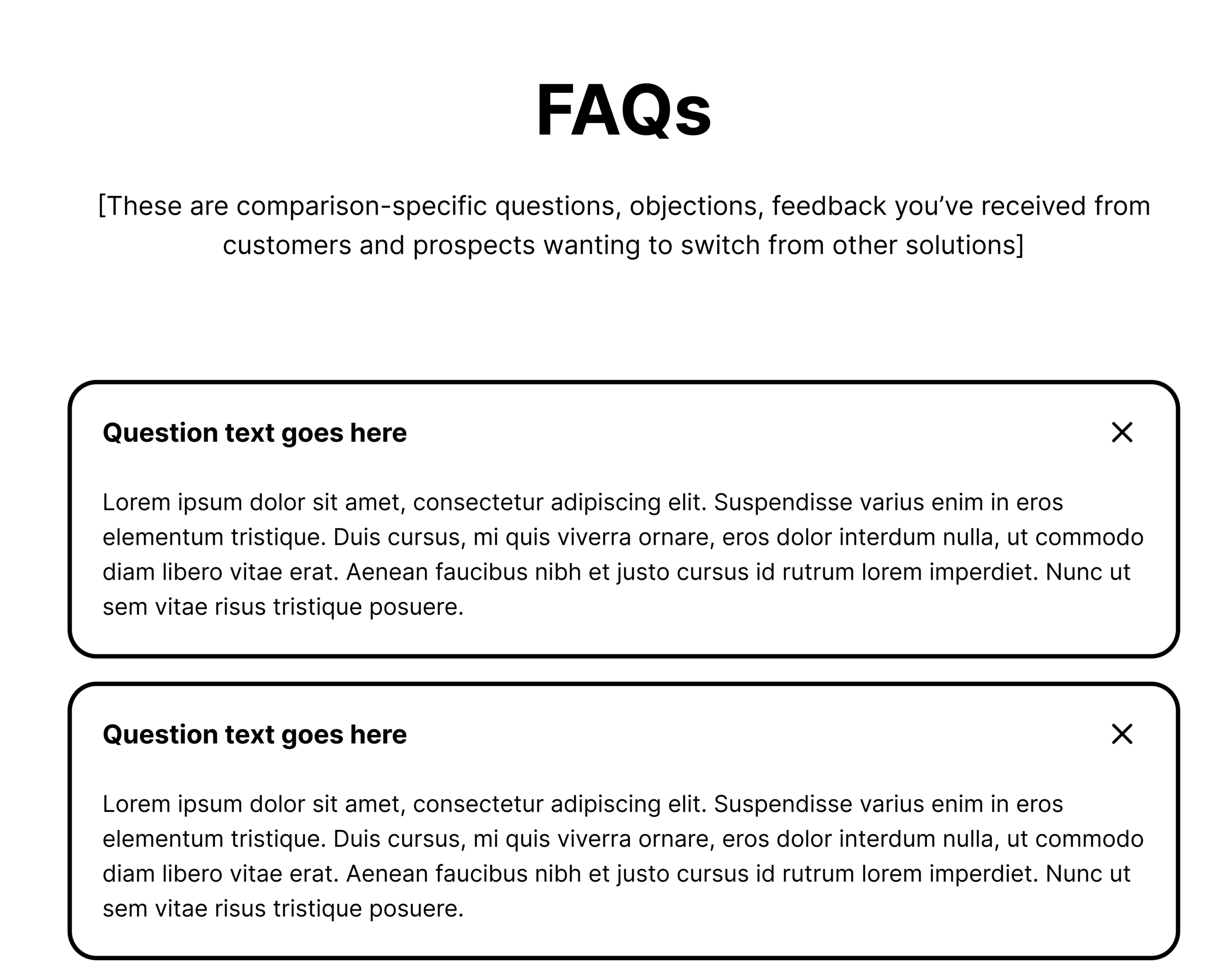
When it is time to compare your solution to a specific competitor, avoid the "takedown" mentality. Instead, use these blocks to answer specific questions: "Doesn’t Competitor X do this? Yes, but here is where our approach to [Specific Feature] is better suited for [Specific Use Case]." This level of nuance builds immense credibility.
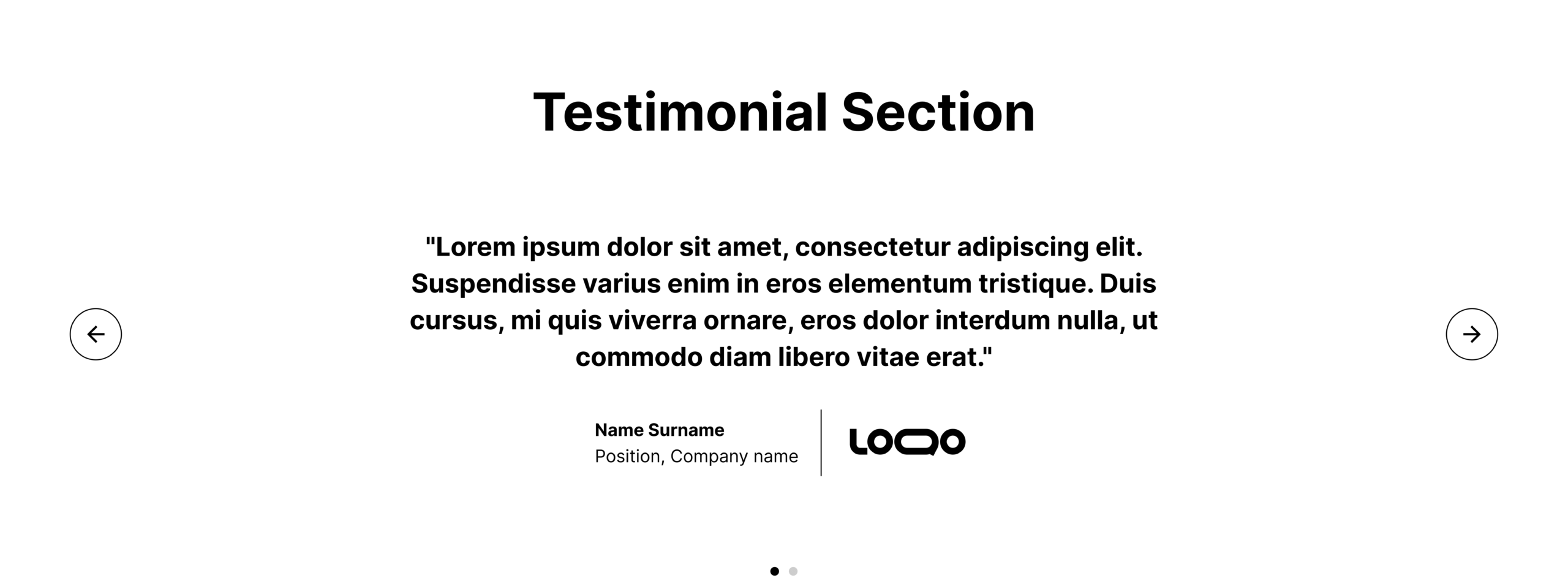
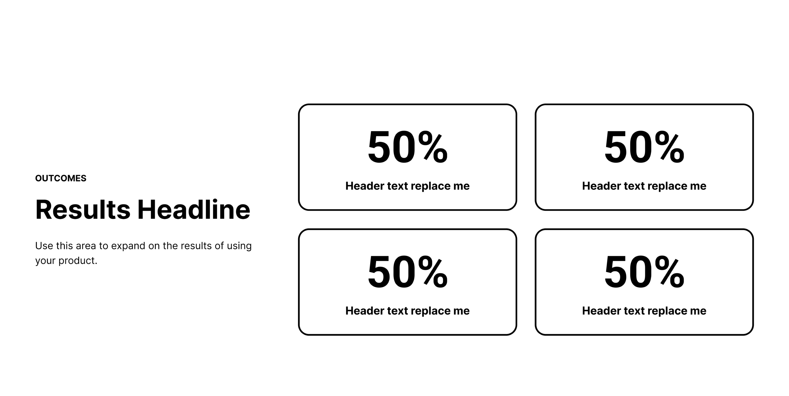
4. Evidence-Based Results
Testimonials on comparison pages must be targeted. A generic quote about how "great" your software is won’t sway a buyer looking for a specific migration. Instead, highlight testimonials from customers who explicitly mention switching from the competitor featured on the page. Quantifiable results—such as "reduced reporting time by 40% after switching"—are significantly more persuasive than vague praise.
Why Feature Tables Are Often a Trap
One of the most controversial pieces of advice from Bober is the intentional omission of the classic "checkmark table." While it may seem like a standard industry practice, it is often detrimental for three reasons:
- It lacks context: A checkmark doesn’t explain the depth or usability of a feature.
- It is easily dismissed: Buyers know these tables are biased, so they often skim past them without internalizing the information.
- It limits complexity: By reducing software to binary "yes/no" columns, you ignore the nuanced trade-offs that are actually driving the buyer’s decision.
If you must include a table, ensure it is qualitative, not quantitative. Focus on "best for" scenarios, integration priorities, or workflow philosophy rather than a simple checklist.
Strategic Implications: SEO and Search Intent
The shift toward more detailed, helpful comparison content aligns with the latest updates in search engine algorithms. Google and AI-driven search models are increasingly sophisticated at identifying "helpful content." If your page is merely a keyword-stuffed list of competitor bashing, it is less likely to rank or be cited by LLMs.

Furthermore, Google’s ad quality models reward pages that don’t lead to dead ends. A page that provides genuine, actionable research keeps the buyer engaged, lowers bounce rates, and signals to the search engine that you are providing a valuable resource.
The Role of Transparency: A Competitive Differentiator
The most effective comparison pages in the industry—such as those from Vidyard or Mailchimp—often lean into radical transparency. They acknowledge their own product’s limitations.
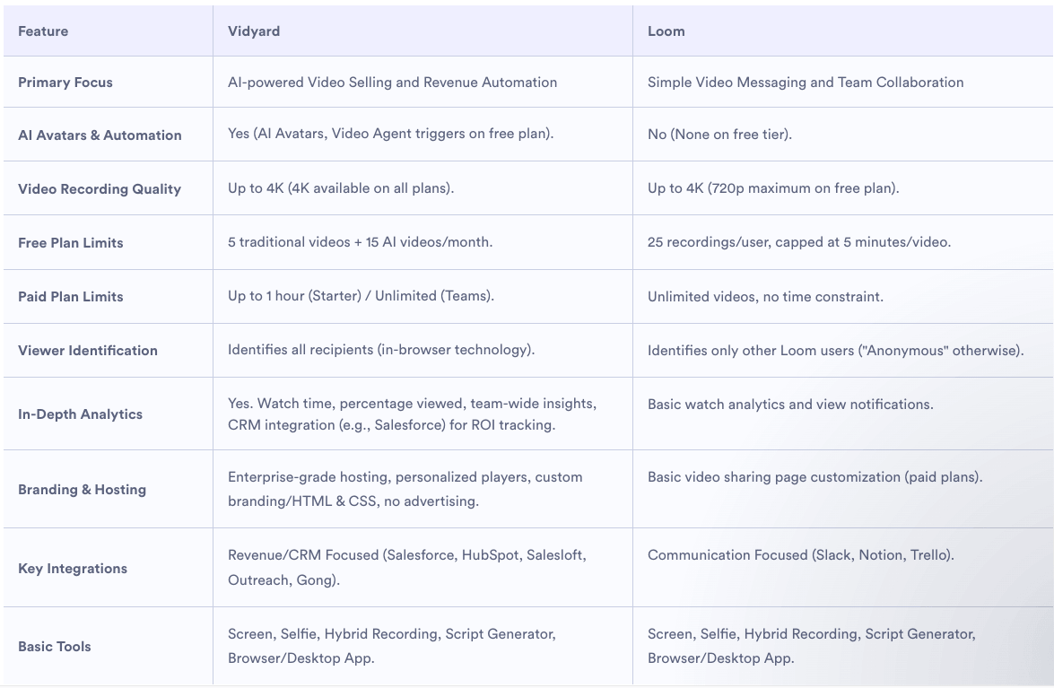
For instance, if your tool is built for high-scale enterprise teams, it is perfectly acceptable to admit it might be "overkill" for a small, two-person startup. By explicitly stating who your product isn’t for, you save both yourself and the buyer time. This level of honesty is rare in B2B, which makes it an incredibly powerful trust-building tool. When you are honest about your weaknesses, your claims about your strengths become instantly more believable.
Conclusion: Building for the Long Term
Building a library of comparison pages is a long-term investment in brand authority. By focusing on the buyer’s need for clarity, you transform these pages from tactical conversion assets into strategic hubs that guide the entire consideration phase.
To begin your transformation, audit your existing comparison pages. Are they designed to win an argument, or are they designed to help a buyer make an informed choice? By adopting the "guide" mindset—incorporating objective pros and cons, specific migration-focused testimonials, and clear "best-for" use cases—you can move your marketing from the outdated playbook of the past and into the reality of the modern B2B buyer.