In the modern digital landscape, the "newsletter pop-up" has become a ubiquitous, albeit often loathed, fixture of the eCommerce experience. It is the digital equivalent of a persistent street hawker, stepping into your path the moment you arrive at a storefront, demanding your attention—and your personal data—before you have even had the chance to touch a product.
For many businesses, these modals are driven by a singular, rigid objective: the generation of leads. Driven by internal Key Performance Indicators (KPIs) and the pressure to hit quarterly targets, marketing teams often prioritize the sheer volume of sign-ups over the quality of the customer relationship. However, as recent industry data and case studies suggest, this aggressive pursuit of metrics is frequently backfiring, leading to a "hollow growth" phenomenon where lead lists swell while revenue remains stagnant.
The Anatomy of a Failed Strategy
To understand the disconnect between lead volume and business success, one must look at the psychological friction created by intrusive design. A visitor lands on an eCommerce site with a specific intent: to browse, evaluate, or purchase. When a pop-up appears immediately—often referred to as an "interstitial"—it forces the user to switch their cognitive focus from their primary goal (shopping) to a secondary goal (managing the pop-up).
This disruption is rarely met with enthusiasm. Research from the Nielsen Norman Group and other usability experts consistently shows that users are highly reluctant to engage with content that interrupts their workflow. This behavior is rooted in "banner blindness" and a reflexive urge to dismiss anything that stands in the way of a browsing objective. When a site forces this interaction, it effectively signals to the user that the company’s desire for data outweighs the user’s desire for a seamless shopping experience.
A Case Study in Vanity Metrics
The danger of prioritizing raw numbers is best illustrated by a recent case study involving a major eCommerce retailer. Faced with pressure to grow its email database, the marketing team embarked on an aggressive optimization campaign. They spent weeks A/B testing, refining the copy, bolding the headings, and increasing the visual "loudness" of their newsletter pop-up.
The results were, on the surface, a triumph. The email list began to grow at an unprecedented rate. Every morning, the team could point to a dashboard celebrating a steady stream of new sign-ups. For several weeks, the organization felt they had cracked the code. However, the management team soon discovered a startling reality: the growth in the email list had no correlation with an increase in revenue.
Upon closer inspection, the "leads" were essentially noise. The database was flooded with disposable email addresses, temporary accounts, and nonsensical text strings. Worse, the constant appearance of the pop-up on every page was actively driving away high-intent shoppers. The company wasn’t just failing to convert; they were paying a "penalty" in the form of abandoned carts and increased bounce rates.
The Chronology of Optimization: From Disruption to Integration
The realization that "more is not always better" prompted a strategic pivot for the retailer in question. The transition away from the aggressive modal required a fundamental shift in how they viewed their relationship with the customer.
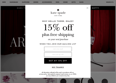
- The Phase of Aversion: In the early stages, the company relied on the "interruptive modal." This strategy relied on the sheer volume of traffic to generate sign-ups, ignoring the irritation it caused to the user base.
- The Recognition of Friction: After analyzing bounce rates and the quality of leads, the company identified that the timing of the pop-up was the primary source of user friction.
- The Shift to Contextual Engagement: The company removed the pop-ups entirely. In their place, they implemented "contextual nudges"—newsletter signup fields placed naturally within product pages, at the bottom of blog articles, and within the checkout flow.
- The Resultant Trust: By waiting until the user had demonstrated interest—such as reading a product description or finalizing a purchase—the company allowed the user to develop a rapport with the brand.
This evolution mirrors a broader trend in UX design: moving away from "dark patterns" and toward "humble interfaces." A humble interface respects the user’s journey. It understands that the right time to ask for a commitment is after the user has received value, not before.
Supporting Data: Why Quality Trumps Quantity
The disparity between a lead and a valuable lead is profound. Industry benchmarks indicate that email lists built through forced opt-ins suffer from significantly higher bounce rates and lower open rates. When a user is forced to sign up to view a site, they are not entering into a relationship; they are entering into a transaction of convenience.
Conversely, leads captured through intentional, non-disruptive touchpoints—such as a footer subscription form or a subtle, non-modal box near the price—tend to be more engaged. These users are opting in because they are genuinely interested in the brand’s offerings, not because they are trying to bypass a screen blocking their access to a product.
The Cost of Intrusive Design
Beyond the loss of potential sales, there is a tangible financial cost to poor lead quality:
- Infrastructure Costs: Maintaining large email databases incurs monthly fees. If 40% of your list is comprised of fake or inactive addresses, you are effectively paying a "tax" on your own bad design choices.
- Deliverability Issues: High bounce rates signal to email service providers (ESPs) that your domain may be sending spam. This can result in your legitimate, valuable emails being relegated to the "Promotions" or "Spam" folders of your most loyal customers.
- Brand Sentiment: In the era of social media, a brand that annoys its users is a brand that gets talked about for the wrong reasons. The cumulative effect of a "noisy" site is a degradation of brand equity.
The Implications for Modern eCommerce
The implications of these findings are clear: businesses must stop treating their users as data points to be captured and start treating them as guests to be courted. The shift toward "Smart Interface Design" requires patience, a trait that is often in short supply in performance-driven corporate cultures.
However, the reward for this patience is substantial. By integrating newsletter messaging subtly—perhaps as a collapsible non-modal dialog or a well-placed footer component—brands can foster an environment where the user feels in control. When a user feels in control, they are more likely to trust the brand. And in the world of eCommerce, trust is the primary driver of lifetime value (LTV).
Designing for Trust
To achieve this, design teams should focus on:
- Contextual Timing: Surface invitations to subscribe only after the user has interacted with core content.
- Value-Driven Copy: Instead of "Sign up for our newsletter," use language that focuses on the benefit to the user, such as "Join our community for exclusive access to upcoming collections."
- Respectful Persistence: If a user dismisses an invitation, respect that choice. Do not present the same prompt on every subsequent page load.
Conclusion: A New Standard for Digital Engagement
The era of the "loud" pop-up is reaching a natural decline. As users become more tech-savvy and privacy-conscious, the tolerance for intrusive marketing tactics is hitting an all-time low. Companies that continue to rely on these methods are essentially clinging to a broken model of digital engagement.

The path forward lies in the integration of thoughtful, respectful design patterns. By focusing on the user’s journey and finding the precise moments where a connection can be formed naturally, businesses can replace their bloated, low-quality lead lists with a database of engaged, loyal customers. It is a slower process, certainly, but it is one that leads to sustainable growth, higher conversion rates, and a brand identity built on the foundation of mutual respect rather than digital disruption.
For those looking to deepen their understanding of these principles, the field of UX design is constantly evolving. Resources such as Smart Interface Design Patterns offer a comprehensive look at how these small, practical changes—from the way dropdowns function to the placement of forms—can cumulatively transform a user’s experience. Ultimately, the best interface is one that the user barely notices, yet one that provides the exact information they need, exactly when they need it.