In an era defined by an unprecedented deluge of data, the challenge is no longer about access, but about discovery. We are drowning in a sea of digital content, yet we frequently find ourselves unable to locate the precise, relevant information we need at the moment of necessity. This friction between the abundance of data and the scarcity of clarity is where Information Architecture (IA) becomes the most critical discipline in the digital landscape.

As explored by industry practitioners, Information Architecture is the professional practice of categorizing and organizing information to instill structure and meaning. By delving into both the technical mechanics of IA and the broader sociological implications of the Information Age, we can better appreciate how structural design serves as a vital lighthouse for users navigating our complex, information-overloaded lives.

What Is Information Architecture and Why Is It Vital?
The Information Architecture Institute defines the field simply: "Information architecture is the practice of deciding how to arrange the parts of something to be understandable." However, in the modern UX (User Experience) paradigm, this definition expands. It requires a deep, empathetic understanding of how users think, what specific problems they are attempting to solve, and how they prioritize information within their unique context.

Whether designing a global enterprise website, a complex SaaS (Software as a Service) platform, or a minimalist mobile application, the objective remains the same: designing a structural skeleton that translates into a logical, intuitive navigation hierarchy. Without this architecture, users are left adrift in a sea of "mountains of data" that we have, quite ironically, created for our own convenience.
The Business Case for IA
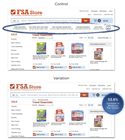
Good IA is not merely a design preference; it is a business imperative. A well-structured site navigation directly correlates with conversion rates. In one notable e-commerce case study, the removal of extraneous information between the search bar and product displays resulted in a 53.8% increase in revenue. By streamlining the path to the product, the business reduced cognitive load, allowing users to reach their goals with minimal friction. When users can find what they need, they buy; when they are forced to decipher an opaque hierarchy, they leave.
Search vs. Navigation: A Decades-Old Tug-of-War
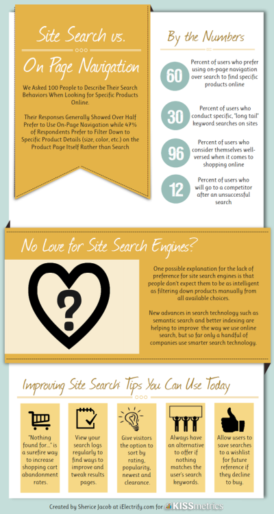
A common debate among UX designers is the relative importance of site search versus traditional navigation. Historical data provides a fascinating look into user behavior:

- 1997 (Jakob Nielsen): Research indicated that over 50% of users favored the search function over traditional site navigation.
- 2010–2012 (Gerry McGovern/Econsultancy): Subsequent studies solidified this, with 30% to 40% of users consistently preferring search as their primary entry point to content.
- Modern Context (MeasuringU): Recent research suggests that approximately 14% of users immediately default to search, while the overwhelming majority (86%) prefer to begin by browsing through navigation categories.
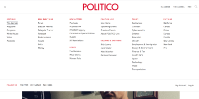
The conclusion is clear: effective digital products must offer both. For content-heavy sites—such as news outlets like Politico—the use of "megamenus" allows for organized browsing of sub-categories, while a robust, intelligent search function serves as the "escape hatch" for users seeking specific, known items.

The Problem of Synonyms and Metadata
Consider a user looking for "antibacterial hand wash." If the site only labels products as "Body Washing Products" or "Skin Cleansers," the user may struggle. This is where advanced IA practices, such as tagging and metadata, become essential. By mapping various search terms—"hygienic soap," "sanitizing wash," "germ-killing cleanser"—to a single product entry, designers ensure that the search function understands the user’s intent, regardless of the specific vocabulary they employ.
Evaluating Success: Good vs. Bad Architectures
Exemplary Navigation
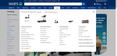
Retailers like Sears demonstrate the power of the mega drop-down menu. By utilizing clear groupings and visual aids, the site reduces the cognitive burden on the user. Visual cognition—the ability to recognize an object faster than text—is a key component of effective IA. When categories are paired with intuitive iconography, the speed of user navigation increases significantly.
The Perils of Overload
Conversely, many legacy sites suffer from "cramped" architecture. When a page is cluttered with too many choices and a lack of white space, it creates an "overwhelming navigation" scenario. Users are paralyzed by choice, leading to high bounce rates and abandonment. A hallmark of bad IA is the failure to prioritize content; if everything is important, then nothing is.

A Framework for Implementation: How to Get It Right
Designing effective IA is a methodical process. Designers should adhere to several foundational steps:

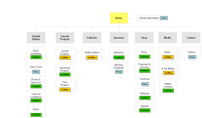
- Sitemap Mapping: Before writing a single line of code, map the entire structure of the site. Aim for a minimal number of sub-levels. The "Rule of Three" (ideally, no content should be more than three clicks away) remains a reliable heuristic.
- Labeling and Icons: On mobile devices, never rely on icons alone. Icons are subjective; text labels are universal. Always pair the two to ensure accessibility and clarity.
- Breadcrumbs: Essential for deep-nested content, breadcrumb navigation provides a constant "you are here" marker, reducing user anxiety and enabling easy backtracking.
Empirical Testing Methods
To validate your architecture, move beyond assumptions and into testing:
- Card Sorting: Provide participants with cards containing your navigation sections. An "open" sort asks them to create the groups, while a "closed" sort asks them to place items into your pre-defined categories. This identifies the mental model your users actually possess.
- Scenario Testing: Use wireframes or low-fidelity prototypes to observe users attempting to complete a specific task. If they fail to find the "checkout" button within a reasonable timeframe, your IA needs adjustment.
- Treejack Testing: Use specialized tools to test your hierarchy in isolation from visual design. This focuses the participant entirely on the logic of the navigation labels.
The Broader View: Information as a Commodity
Transitioning from the micro-level of website design to the macro-level of the Information Age, we encounter the true weight of our profession. We are currently living in an era where information is instantaneous, global, and virtually limitless. This has made "Information" the primary currency of the 21st century.

The Power and Responsibility of Data
The late Aaron Swartz, a visionary and co-founder of Reddit, famously fought for the "liberation" of information, believing that academic and public knowledge should be accessible to all. His life and tragic death serve as a poignant reminder that information is not neutral—it is a tool. In the right hands, it can protect public health and empower individuals. In the wrong hands, it can be used for propaganda, financial exploitation, and the systematic erosion of trust.

The Volatility of Information
World events are now dictated by the speed of information flow. During the COVID-19 pandemic, we witnessed how rapidly government policies shifted in response to incoming data. However, we also saw the dangers of misinformation. The "Fake News" phenomenon, the spread of baseless conspiracy theories, and the conflicting reports from competing media outlets demonstrate the fragility of our information ecosystem. When users cannot distinguish between authoritative sources and manufactured noise, the structural integrity of our social discourse suffers.

The Security Imperative
The responsibility of an information architect also extends to the security of the data they organize. The 2018 Facebook data breach and the massive 2017 Equifax incident—which exposed the private information of 147 million people—illustrate the catastrophic consequences of failing to treat user data as a sacred trust. Today, 132 countries have enacted strict data privacy laws, reflecting a global realization that personal information is a commodity that must be protected, not just stored.

Conclusion
Information Architecture is much more than the creation of site menus or the labeling of buttons. It is a fundamental bridge between the chaotic, infinite nature of the internet and the human need for order, logic, and truth.
As we move forward into an increasingly digital future, the role of the information architect becomes ever more significant. By mastering the tools of card sorting, scenario testing, and structural hierarchy, we can create digital environments that are not only efficient but also trustworthy. In an age of information overload, the greatest service we can provide to our users is the ability to find what they need, understand what they see, and navigate the world with clarity. We must continue to approach our work with the understanding that every structure we build has an impact on the user’s perception of reality. Whether we are designing a shop for cleaning products or a platform for global news, we are, in essence, designing the architecture of human understanding.