Main Facts
In the hyper-competitive landscape of mobile operating systems, the difference between a forgettable interface and an iconic user experience often boils down to a single, foundational element: a robust visual design language (VDL). Just as writers rely on words to communicate with readers, digital designers use fonts, colors, shapes, and iconography to converse with users.
In 2016, design agency Fantasy undertook a monumental challenge: creating the visual design language for Huawei’s EMUI 5 mobile operating system interface. At the time of its inception, Huawei lacked a cohesive design vocabulary of its own. Instead, the tech giant relied heavily on a fragmented, customized version of Android. Multiple teams—comprising UX designers, interaction specialists, and graphic artists—were operating in silos, resulting in a chaotic "Tower of Babel" scenario that hindered product development and confused consumers.
The collaboration between Fantasy and Huawei leadership, notably featuring former Apple creative director Abigail Brody, sought to dismantle these silos. By anchoring the project in deep user research, competitive analysis, and a philosophy of organic design, the team established a scalable, consistent, and clear visual framework. Despite hurdles during the final implementation phase, this design overhaul helped lay the groundwork for Huawei’s meteoric rise, culminating in the company briefly surpassing Apple in global smartphone sales by 2018.
Chronology of a Transformation: The 2016 EMUI 5 Project
The creation of a comprehensive visual design language for a global mobile OS requires a disciplined, multi-stage roadmap. For the Fantasy team, the project followed a rigorous consumer-product rubric: Research, Ideate, Design, Validate, and Implement.
Phase 1: Research and the UI Audit
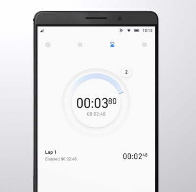
Before drafting a single icon, the team sought to understand the structural anatomy of Android. They initiated a comprehensive UI audit, breaking the mobile OS down into atomic elements—colors, shadows, lines, and transitions. This decomposition allowed designers to see how discrete components functioned individually and within a larger system.
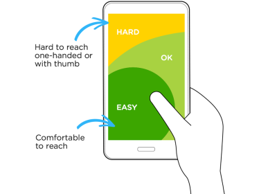
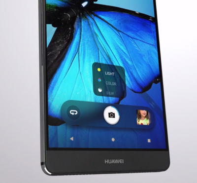
Simultaneously, UX researchers analyzed global user complaints, uncovering a critical ergonomic flaw: mobile screens were expanding rapidly, yet key functional controls remained anchored at the top of the display. This forced users to dangerously stretch their thumbs or alter their grips. By collaborating with Huawei’s engineering team, Fantasy validated the feasibility of relocating core navigational elements to the lower "thumb zone," establishing a new baseline for mobile ergonomics.
Phase 2: Ideation and the Philosophy of Organic Design
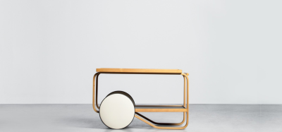
To appeal to an international audience spanning the Americas, Europe, Asia, Africa, and Oceania, the design language needed deep cultural resonance. Partnering with Abigail Brody, Chief UX Designer and VP of Huawei Devices, the team turned to organic design—a philosophy pioneered by architect Frank Lloyd Wright that emphasizes harmony between humans and nature.
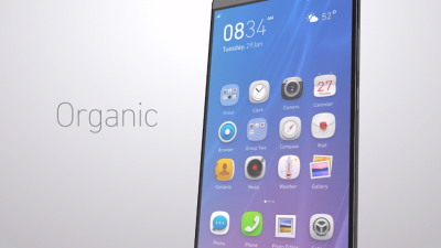
By integrating smooth curves, rounded shapes, and nature-inspired aesthetics into buttons, icons, and transitions, the team moved away from rigid digital geometry. They also codified a motion design manifesto, ensuring that every animation served a dual purpose: providing functional feedback while delivering moments of delight that leveraged the aesthetic-usability effect.
Phase 3: Design, Testing, and Iteration
With a clear philosophy in place, the team baked strict semantics into every design decision, ensuring no visual element was purely decorative. Designers conducted frequent, informal reviews, pinning screens side-by-side to ruthlessly critique and polish the interface.
To validate their work early and often, the team embraced a "build, measure, learn" approach. Functional prototypes featuring the new VDL were tested internally ("dogfooding") and externally with real users, allowing the team to iterate rapidly before final deployment.
Supporting Data and Strategic Insights
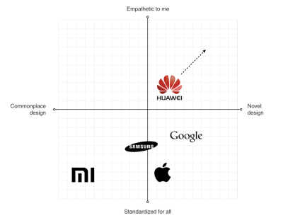
To carve out a distinct identity in a market dominated by established players like Apple, Samsung, and Google, Fantasy conducted an exhaustive competitive analysis. By evaluating major rivals, the team mapped out four distinct market directions on a quadrant diagram to identify strategic white space for Huawei.
| Competitor | Core Strengths | Notable Weaknesses |
|---|---|---|
| Apple iOS | Scalable across devices, rigorous standardization, unique identity | Inconsistent iconography, occasional overuse of blur effects |
| Competitor B | High customization, aggressive hardware integration | Fragmentation across software updates, visual clutter |
| Competitor C | Fast execution, broad market reach | Generic styling, weak emotional brand recall |
| Competitor D | Niche appeal, technical focus | Steep learning curve, uneven accessibility |
By synthesizing these insights, Huawei positioned its new visual language around three pillars:
- Consistency: Reusable, cross-platform components that ensured a seamless experience across diverse device form-factors.
- Brand Recall: A distinct personality utilizing bespoke typefaces, tailored color palettes, and fluid animations to prevent the product from blending into the sea of generic Android skins.
- Clarity: A minimalist interface architecture that drastically reduced on-screen clutter, directing user attention strictly to essential tasks.
The Implementation Gap: A Universal Corporate Challenge
The journey from a designer’s drawing board to a consumer’s pocket is fraught with organizational peril. As Gleb Kuznetsov noted regarding the rollout of EMUI 5, the production version that reached end-users diverged in notable ways from the initial design concepts proposed by Fantasy.
This disconnect highlights a pervasive issue within large-scale tech corporations: the exclusion of designers from the implementation phase. When engineering teams are left alone to translate external design languages into native code, they frequently default to the path of least resistance—modifying or abandoning sophisticated visual solutions to bypass immediate technical constraints.
True design excellence, however, requires executive sponsorship. Just as Steve Jobs famously fought Apple’s engineering division to ensure the iconic macOS window-minimization animation made it into production, transformative digital products require leaders who champion user experience as fiercely as technical performance. Without executive backing, visionary design systems risk being diluted by engineering compromises.
Implications for the Future of Digital Product Design
The Huawei EMUI 5 case study offers enduring lessons for the broader product design community:
- Visual Language is a Living Ecosystem: A robust VDL is not merely a static style guide; it acts as a shared cognitive framework that bridges the gap between multidisciplinary teams, aligning engineers, product managers, and designers under a singular vision.
- Form Follows Ergonomics: Hardware innovations—such as foldable screens, edge-to-edge displays, and varying form factors—must dictate software adaptations. Prioritizing user reach zones and natural interaction models is no longer optional.
- The ROI of Delight: Investing in intentional motion design and semantic consistency yields measurable returns. By reducing cognitive friction and evoking emotional resonance, companies build lasting user trust and brand equity.
Ultimately, the transformation of Huawei’s mobile operating system proves that a visual design language is the beating heart of user experience. When aesthetic form and functional utility are developed in tandem, digital products transcend mere tools, becoming intuitive extensions of the human experience.