
In the contemporary digital landscape, user experience (UX) is defined by the tension between exploration and efficiency. When faced with extensive data sets—be it e-commerce product listings, social media feeds, or complex administrative dashboards—designers are often forced to choose between the traditional, predictable structure of pagination and the immersive, fluid nature of infinite scroll. While infinite scroll promises a frictionless discovery process, it frequently introduces significant usability barriers that can alienate users and hinder task completion.
This article explores the core challenges of infinite scrolling, examines hybrid alternatives, and provides a framework for implementing navigation patterns that respect user agency while maintaining the speed of modern web interfaces.

The Core Conflict: Information Overload vs. Fluid Browsing
The primary appeal of infinite scroll lies in its ability to eliminate the "friction" of page reloads. By automatically fetching new data as the user reaches the bottom of the viewport, the interface encourages sustained engagement. However, this convenience often masks deeper structural flaws.
The Information Abyss
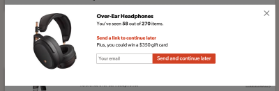
When users are presented with a continuous stream of content, they often struggle to maintain a mental map of their progress. As the number of items grows, the lack of a defined "end" can result in a sensation of being trapped in an information abyss. Research from the Nielsen Norman Group confirms that when content exceeds a comfortable, manageable threshold, user engagement drops significantly. The absence of a clear boundary—a "stop" point—can lead to decision fatigue, causing users to abandon the platform entirely rather than continue scrolling through an endless void.
The Loss of Context and Control
Beyond the psychological toll of endless content, technical implementation often strips users of essential navigation tools. A classic issue is the "broken" scrollbar: the scrollbar’s size and position serve as a reliable indicator of page length. In an infinite scroll setup, the scrollbar becomes a deceptive promise, resizing dynamically as new items load, which disorients the user.
Furthermore, the lack of URL synchronization is a common failure point. If a user finds a specific item of interest but refreshes the page, they are frequently reset to the top of the list, losing their place and the context of their search. This inability to bookmark a specific location—or share a deep link to a specific segment of the results—turns a simple browsing task into a frustrating exercise in repetition.
Chronology of the Debate: From Pagination to "Load More"
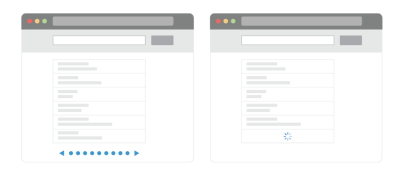
Historically, pagination was the industry standard, offering a clear beginning, middle, and end. Users understood that moving to "Page 2" represented a logical progression. However, as mobile usage surged, the "tap-to-load" action of pagination became perceived as a performance bottleneck.
The Shift to "Load More"
To bridge the gap between the speed of infinite scroll and the control of pagination, designers began adopting the "Load More" pattern. This approach typically involves:

- Automatic loading for the initial phase: The first 10–30 items load seamlessly to maintain initial momentum.
- The "Load More" threshold: Once the user reaches a certain point (e.g., 50–70 items), the system halts automatic loading and presents a "Load More" button.
- User-initiated progress: This transition shifts the control back to the user, providing a "psychological breather" and allowing them to reach the footer, which is frequently inaccessible in traditional infinite scroll implementations.
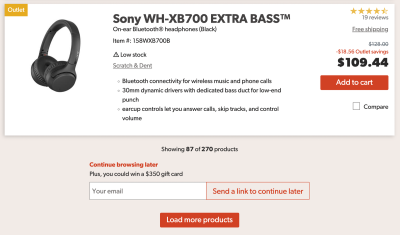
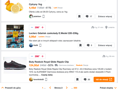
This hybrid model has proven highly effective in e-commerce, where users are often comparing multiple items. By requiring a deliberate action after an initial burst of content, the interface maintains high engagement while preventing the sense of being overwhelmed.
Supporting Data and User Behavior
Usability testing suggests that while infinite scroll can increase total time spent on a page, it does not always correlate with higher conversion rates or task success. In scenarios where users are looking for a specific item, the "speed" of infinite scroll is often counter-productive because the user cannot easily scan or return to previous segments.
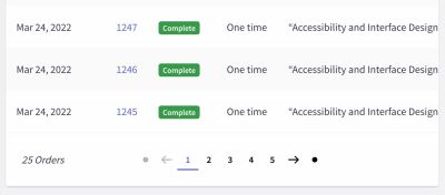
Conversely, in discovery-heavy environments—such as image galleries or social feeds—the lack of friction is a feature, not a bug. The key takeaway for designers is that the "correct" pattern is entirely context-dependent. If your users are performing data-heavy tasks, such as managing orders or auditing logs, pagination remains the superior choice for its predictability and reliability.
Strategic Enhancements: Making Infinite Scroll Work
If a project requires the speed of infinite scroll, designers must mitigate its inherent weaknesses through technical and visual scaffolding.

1. Visual Segmentation and Bookmarking
To prevent the feeling of a "continuous stream," designers should implement visual breaks between batches of content. These breaks serve as natural anchors, allowing users to mentally segment the list. Additionally, offering a "Continue browsing later" feature—perhaps via an email link or a session-persisted bookmark—solves the issue of losing one’s place. By allowing users to generate a link to their current position, you restore the "bookmarkability" of the page.
2. The Footer Reveal Pattern
The inability to reach the footer is a primary accessibility concern, as standard navigation links (Terms of Service, Support, Contact) are usually located there. A "footer reveal" or "sticky footer" component ensures that the essential utility of the site remains available, regardless of how far the user has scrolled. This can be implemented as a persistent bottom bar that triggers a modal or an accordion when accessed, ensuring that keyboard navigation remains functional.
3. Dynamic Pagination
For sites that require both infinite speed and navigation control, dynamic pagination offers a robust solution. As the user scrolls, the URL updates to reflect the current "page," and the page number is displayed in a sticky UI element. This allows users to jump directly to a specific page via a dropdown, effectively turning the scroll experience into a navigable map rather than a linear trap.
Implications for Accessibility and Performance
Implementation of these patterns carries significant implications for accessibility. A critical failure of many infinite scroll implementations is the lack of screen reader announcements. When new content is injected into the DOM, assistive technologies must be notified so that blind or low-vision users are aware that the list has expanded. Without proper aria-live regions or similar announcements, the user experience for those relying on screen readers is severely degraded.

Performance is equally paramount. Loading hundreds of elements into a single DOM tree can lead to memory leaks and sluggish interaction on lower-end devices or poor network connections. Implementing "windowing" or "virtualization"—where only the items currently in the viewport are rendered in the DOM—is essential for maintaining a high-performance, responsive interface.
Summary Checklist for Designers
When considering the implementation of infinite scrolling, designers should adhere to the following guidelines to ensure a robust user experience:
- Define the Goal: Does the user need to reach a specific point, or is the goal passive discovery? Choose the pattern (pagination vs. infinite) accordingly.
- Maintain Control: Always provide an explicit "Load More" button after a set interval to allow users to pause.
- URL Persistence: Ensure the browser URL updates as the user progresses through the list, allowing for deep-linking.
- Accessibility First: Use proper ARIA labels to announce dynamic content to screen readers.
- Footer Access: Implement a sticky footer or a persistent navigation element so that essential utility links are never out of reach.
- Visual Anchors: Clearly separate content segments to provide a sense of progress.
Conclusion
Infinite scroll is a powerful tool in the designer’s kit, but it is not a "set-it-and-forget-it" solution. Its success depends entirely on how well it is tempered by the principles of user control, transparency, and accessibility. By treating the list not as a never-ending void but as a navigable, segmented experience, designers can provide the best of both worlds: the rapid, frictionless discovery of infinite content, and the structured, predictable navigation that users expect from a professional-grade interface.
Ultimately, the best design is one that disappears—it should empower the user to find what they need without the interface itself becoming an obstacle. As we continue to push the boundaries of web interactivity, the focus must remain on the user’s intent, ensuring that our technical choices serve human needs rather than just testing the limits of our browsers.