
In the modern digital landscape, the challenge of presenting massive datasets—whether they are e-commerce product catalogs, social media feeds, or complex administrative dashboards—has become a central concern for UX designers. As users demand faster, more fluid experiences, the design community has long grappled with the tension between traditional pagination and the seductive, albeit problematic, allure of infinite scroll. While infinite scroll promises a frictionless browsing experience, it frequently leaves users feeling disoriented, trapped in an "information abyss," and unable to access vital site features like footers.
The Core Dilemma: Frictionless Discovery vs. User Agency
At its heart, the decision to implement infinite scroll is a trade-off. Proponents argue that it minimizes the cognitive load associated with clicking "next page" buttons, encouraging deeper exploration of content. However, usability research consistently points to significant flaws. When a page has no defined end, users lose their mental map of the site. They are unable to return to a specific item they saw minutes ago, nor can they easily bookmark their location.
The fundamental issue is the breakdown of the browser’s scrollbar as a reliable indicator of page length. When the page grows dynamically, the scrollbar’s handle becomes a faulty promise of content depth, leading to user frustration. Furthermore, accessibility remains a major hurdle; screen readers often struggle to communicate that new content has been injected into the DOM, leaving visually impaired users behind.
Chronology of a Design Pattern: From Pagination to Modern Hybrids
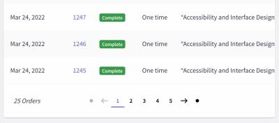
The history of content delivery on the web began with rigid, server-side pagination. This was a reliable, albeit "slow," method. Users had a clear sense of progress—"Page 1 of 10"—and a defined end point. As web performance improved, designers moved toward "Load More" buttons, which acted as a bridge between the predictability of pagination and the speed of infinite loading.

Today, we are witnessing the rise of hybrid patterns. Developers and designers are no longer forced to choose between the two. Instead, they are integrating the speed of auto-loading content with the structural integrity of page markers. By utilizing URL parameter manipulation, sticky footer reveals, and dynamic pagination bars, modern interfaces are attempting to provide the best of both worlds.
Supporting Data: Why User Engagement Fluctuates
Usability studies from organizations like the Nielsen Norman Group and the Baymard Institute provide a clear picture of how these patterns impact user behavior. While infinite scroll can increase the total number of items viewed, it often leads to a decline in conversion and engagement if the user feels overwhelmed.
Data suggests that while infinite scroll excels in "discovery" contexts—such as browsing an image-heavy social feed—it performs poorly in "utility" contexts, such as e-commerce, where users are actively comparing specific products. In the latter, the absence of a "footer" (which typically contains critical information like shipping policies, contact details, and site maps) is a primary driver of page abandonment. When users cannot reach the footer because the page keeps expanding, they lose trust in the interface.
Strategic Implementation: How to "Fix" Infinite Scroll
If an organization decides that infinite scroll is necessary for its specific use case, it must be implemented with a rigorous set of safeguards to protect the user experience.
1. Visual Segmentation and Bookmarking
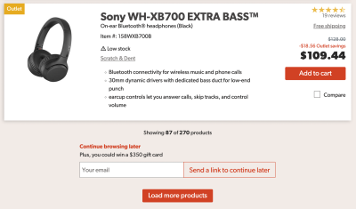
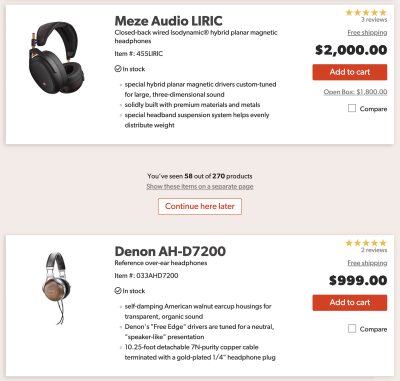
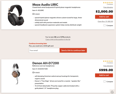
To prevent the feeling of the "information abyss," developers should implement visual breaks between content batches. By adding whitespace or clear delimiters between sets of data, users can mentally segment their progress. Additionally, providing a "Copy link to this position" feature allows users to save their exact location, effectively solving the bookmarking issue.
2. The Footer Reveal Pattern
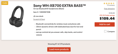
The "footer problem" is one of the most critical accessibility and usability failures of the traditional infinite scroll. A superior alternative is the footer reveal. By keeping a persistent, accessible control—often a small, sticky button or an auto-triggering mechanism—at the bottom of the viewport, the interface ensures that the user can always access the site’s vital information, even while the infinite stream continues to load.
3. Dynamic Pagination
Dynamic pagination is perhaps the most robust solution for high-volume content. As a user scrolls, the URL updates in the background, and a small, sticky indicator displays the current "page" number. This allows users to jump to specific sections via a drop-down menu while still benefiting from the perceived speed of infinite loading.
Implications for Design and Accessibility
The move toward these hybrid models has significant implications for both frontend architecture and accessibility compliance.
Performance and Technical Overhead
Implementing these patterns is not trivial. It requires sophisticated handling of the browser’s History API to ensure that back-button behavior is intuitive. If a user clicks a product and then hits "back," they should be returned to their exact previous scroll position. If the browser resets to the top of the page, the user experience is effectively broken.
Accessibility as a Priority
For developers, the challenge is ensuring that dynamic content injection is accessible. When new content is loaded, it must be announced to assistive technologies using aria-live regions. Failure to do so creates an exclusionary experience that violates modern web standards and legal requirements in many jurisdictions.

Conclusion: Is the Effort Worth the Reward?
The ultimate question remains: is the effort required to make infinite scroll "usable" actually worth the investment? For many sites, the answer is no. If your primary goal is to help users compare items or locate specific information, traditional, well-designed pagination remains the gold standard.
However, for platforms where browsing is the primary activity—such as long-form content feeds or discovery-based e-commerce—infinite scroll can be a powerful tool. The key is to stop treating it as a "set it and forget it" feature. It requires a thoughtful, multi-layered approach that respects the user’s need for control, predictability, and access to site navigation.
As we look toward the future of interface design, we must stop viewing design patterns as binary choices. Instead, we should look at how we can synthesize the best elements of the old with the technological capabilities of the new. Whether through dynamic URL updates, sticky footer controls, or improved bookmarking, the goal remains the same: to create a seamless, accessible, and user-centric journey through the vast, ever-growing sea of digital information.
By prioritizing the user’s mental model over the developer’s desire for "endless" engagement, we can move toward a web that is both fast and navigable—a web that doesn’t just show more, but helps users find exactly what they are looking for.