In the modern digital landscape, the challenge of presenting vast quantities of data—be it e-commerce product catalogs, social media feeds, or complex administrative dashboards—has become a fundamental hurdle for UX designers. While users demand speed and efficiency, the interface must prevent them from feeling overwhelmed by an endless stream of information. This tension has reignited a long-standing debate: is infinite scroll a transformative navigation tool or a usability trap?
While the instinct to rely on traditional pagination remains strong, the allure of the "endless feed" persists. To bridge the gap, designers are moving away from binary choices, instead opting for sophisticated hybrid patterns that prioritize user control, accessibility, and discoverability.
The Problem with the Infinite Abyss
The primary criticism leveled against infinite scroll is the psychological toll it takes on the user. As research from the Nielsen Norman Group highlights, an endless stream of content can create an "information abyss." When a user cannot discern the start or end of a list, they lose their sense of orientation.
Furthermore, infinite scroll frequently compromises fundamental browser behaviors. The scrollbar, once a reliable indicator of page length and progress, becomes a volatile, unreliable "promise" that shifts as new content loads. This creates a disorienting experience, particularly for users with motor impairments or those relying on screen readers, who may struggle to navigate through the dynamically injected content.
Additionally, the inability to bookmark specific locations or easily reach the site footer—often pushed further down by new content—leads to significant user frustration. When a user navigates away from a page, they are rarely able to return to the exact point of their previous discovery, effectively erasing their progress.
The Resilient Alternative: Pagination and the "Load More" Hybrid
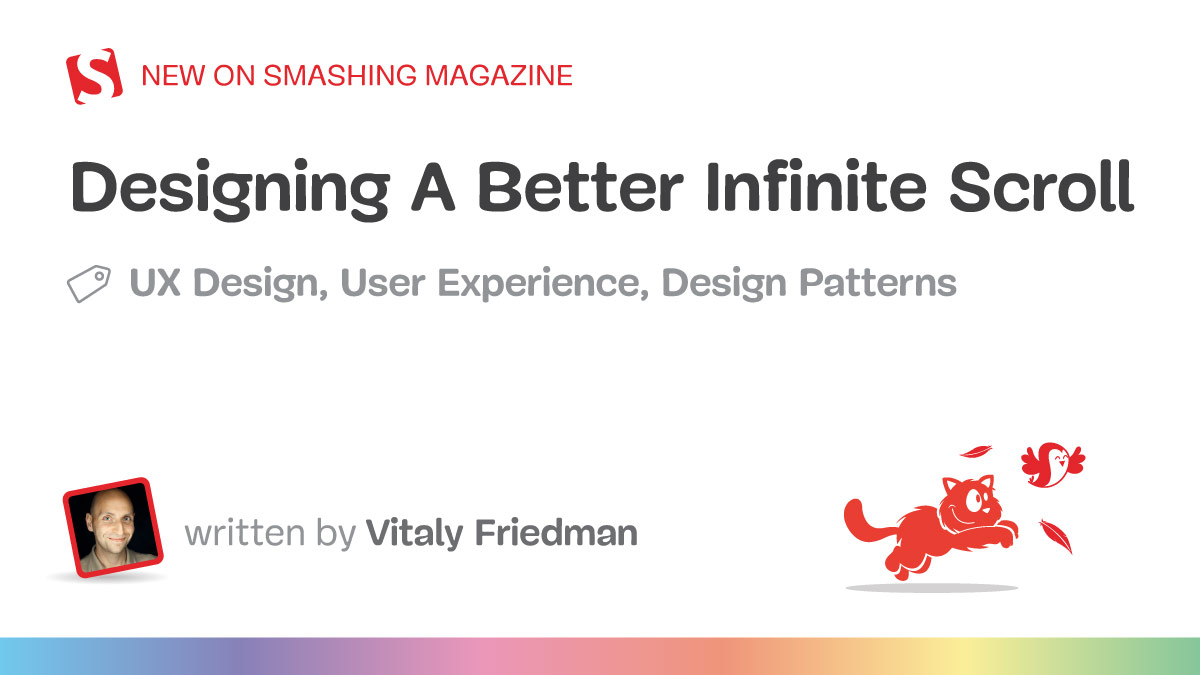
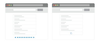
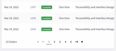
Traditional pagination is often maligned for being "slow" or "old-fashioned," yet it remains the gold standard for clarity. It provides a distinct beginning and end, offering users a sense of accomplishment and control. However, when performance data suggests that users are less engaged with paginated lists, the "Load More" button emerges as a compelling compromise.
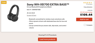
The "Load More" pattern functions as a controlled release. By displaying an initial set of 10 to 30 items, designers allow the user to browse at their own pace. When the user reaches the end of the initial batch, they are invited to load more, or, in more advanced implementations, the system automatically loads subsequent batches until a specific threshold is met. At that point, the interface switches to a manual trigger. This transition preserves the speed of infinite scroll while restoring the user’s agency.
Technical Strategies for Refined Navigation
To mitigate the risks associated with infinite scrolling, designers are increasingly adopting "smart" patterns that borrow the best of both worlds.
Bookmarking and State Management
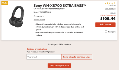
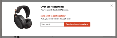
A critical innovation in modern interface design is the ability to maintain the user’s position. By updating the URL in the address bar as a user scrolls, developers can allow users to bookmark their exact spot in a list or share a specific view with others. Furthermore, some platforms now offer "Continue Browsing Later" features, allowing users to save their current session via an email link, ensuring that the exploration can resume on a different device or at a later time.
The Footer Reveal
One of the most persistent issues with infinite scroll is the "lost footer." To solve this, developers are implementing sticky footer mechanisms. These components stay persistent at the bottom of the viewport, allowing users to access critical navigational links—such as account settings, help centers, or legal information—without having to fight the tide of an ever-expanding content feed.
Dynamic Pagination
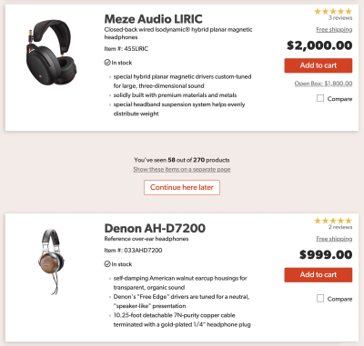
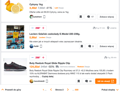
Perhaps the most robust solution is the integration of "dynamic pagination." In this model, as the user scrolls, the page number is updated in a persistent, sticky bar. Users are not forced to rely on the scrollbar alone; they can jump to specific pages via a dropdown menu, combining the fluidity of a scroll-based interface with the structured, jump-to-location capability of traditional pagination.
Implications for Accessibility and Performance
Designers must acknowledge that these enhancements are not just "nice-to-haves"—they are requirements for inclusive design. For screen reader users, the injection of new DOM elements must be explicitly announced. Without proper ARIA live regions, the "infinite" nature of the feed remains invisible to those relying on assistive technology.
Moreover, performance on low-bandwidth connections remains a hurdle. Heavy images and massive data fetches can lead to "choppy" scrolling. Implementing lazy loading, optimizing asset delivery, and ensuring that the browser’s memory is managed efficiently are paramount. If an application cannot maintain a smooth, performant experience, the "infinite" aspect of the design becomes a liability rather than a feature.
Evaluating User Intent: When to Use What
The decision to implement infinite scroll should be dictated by user intent. Research from organizations like the Baymard Institute suggests that infinite scroll is most effective in discovery-oriented environments, such as social media or visual-heavy retail feeds, where the goal is to keep the user engaged in a continuous stream of inspiration.
Conversely, for goal-oriented tasks—such as finding a specific technical component, comparing prices, or managing an administrative list—the efficiency of pagination is unmatched. If the user’s primary task is to "find" rather than "explore," pagination or a "Load More" button is the safer, more user-centric choice.
A Checklist for Implementation
For designers and developers tasked with implementing an infinite scroll that doesn’t alienate the user, consider the following guidelines:

- Visual Segmentation: Use whitespace or clear delimiters to separate "newly loaded" batches from existing content.
- URL Synchronization: Update the URL to reflect the user’s scroll position or the current segment of the list.
- Persistent Footer: Ensure that vital navigation is accessible regardless of how much content has been loaded.
- Keyboard Accessibility: Allow for keyboard navigation to trigger "Load More" events and provide clear focus states.
- Predictable Scrollbars: Use dynamic labels or markers on the scrollbar to indicate progress through the dataset.
- Graceful Degradation: If the user’s connection is poor, ensure the page remains functional and that "Load More" buttons are readily available.
Conclusion: The Path Forward
The narrative that infinite scroll is inherently bad is outdated. The reality is that the pattern was often implemented poorly, ignoring the basic requirements of navigation, state, and accessibility. By integrating pagination, clear state management, and accessible triggers, designers can create experiences that feel infinite in possibility but finite in frustration.
As we continue to iterate on these patterns, the focus must shift from the "novelty" of the scroll to the "usability" of the content. Whether through mini-maps that allow users to pin areas of interest, or sophisticated dynamic pagination, the goal remains the same: helping the user navigate an ever-growing digital world with confidence and ease.
For those looking to deepen their expertise in these complex interface challenges, industry-led resources—such as comprehensive video courses on interface design patterns—provide the necessary blueprints to turn these theoretical ideas into functional, high-performance, and truly user-friendly interfaces. The tools are available; it is now up to the design community to ensure they are used with purpose and precision.