In the high-stakes world of B2B SaaS, the "Request a Demo" button is often treated as the ultimate trophy. Marketing teams drive traffic to it, sales teams clamor for more of it, and stakeholders obsess over it. Yet, for many organizations, the lead-to-opportunity ratio remains stagnant. The consensus among top-tier conversion experts is clear: the problem is rarely the page itself—it is the strategy behind who is being sent there and what they expect to find.
As of July 2026, industry benchmarks indicate that the average B2B customer journey has stretched to 211 days, involving a staggering 88 touchpoints. In such a climate, treating a demo request as a "low-friction" call to action (CTA) is a fundamental error. A request for a demo is not a download; it is a commitment to enter a sales cycle. If your landing page isn’t meticulously architected to address the hesitations of a high-intent buyer, you are likely wasting significant ad spend on traffic that simply isn’t ready to talk.
The Anatomy of the Buyer Journey: Why "Cold" Traffic Fails
The most common mistake in SaaS marketing is the "one-size-fits-all" approach to traffic. Marketers frequently push cold, top-of-funnel (TOFU) traffic directly to a demo landing page, hoping that the product’s value proposition will magically convert them.
Data shows this is a statistical impossibility. According to industry reports, only 3% to 5% of your total addressable market is in an active buying cycle at any given time. By forcing the other 95% to engage with a "Request a Demo" form, you are asking them to skip the crucial research, education, and trust-building phases.
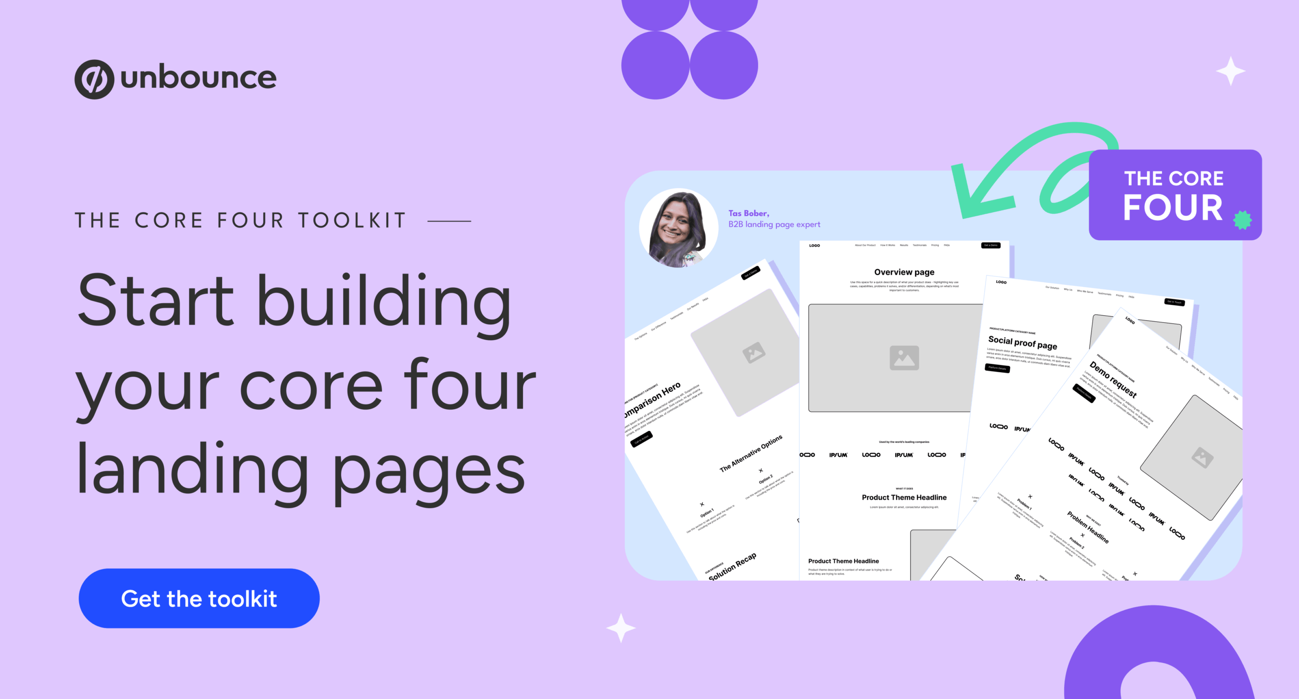
Landing page expert Tas Bober advocates for the "Core Four" framework, which segments pages based on where the buyer is in their journey. A demo landing page should be the final destination, not the first encounter. By the time a prospect reaches this page, they should have already consumed your educational content, understood your unique value proposition, and identified your solution as a contender on their shortlist.
The Reality of Conversion Benchmarks
If you are currently seeing conversion rates for your demo pages in the 3% to 4% range, you are performing at the industry median. However, this benchmark is not a ceiling; it is a baseline.
The shift in performance occurs when you stop treating the demo page as an island and start treating it as the anchor of a coherent ecosystem. If you are sending high-intent, well-researched buyers to your page, your conversion rates should climb. Conversely, if you are attempting to optimize a page for cold traffic, you will inevitably hit a "performance wall." No amount of A/B testing on button colors or headline copy will compensate for the fact that the visitor has not yet been nurtured.
Seven Common Pitfalls in SaaS Demo Landing Pages
Before attempting to overhaul your design, audit your page for these seven classic failures:
- Misaligned Traffic: Driving TOFU visitors to a bottom-of-funnel (BOFU) offer.
- Form Bloat: Demanding too much information too early, which spikes abandonment rates.
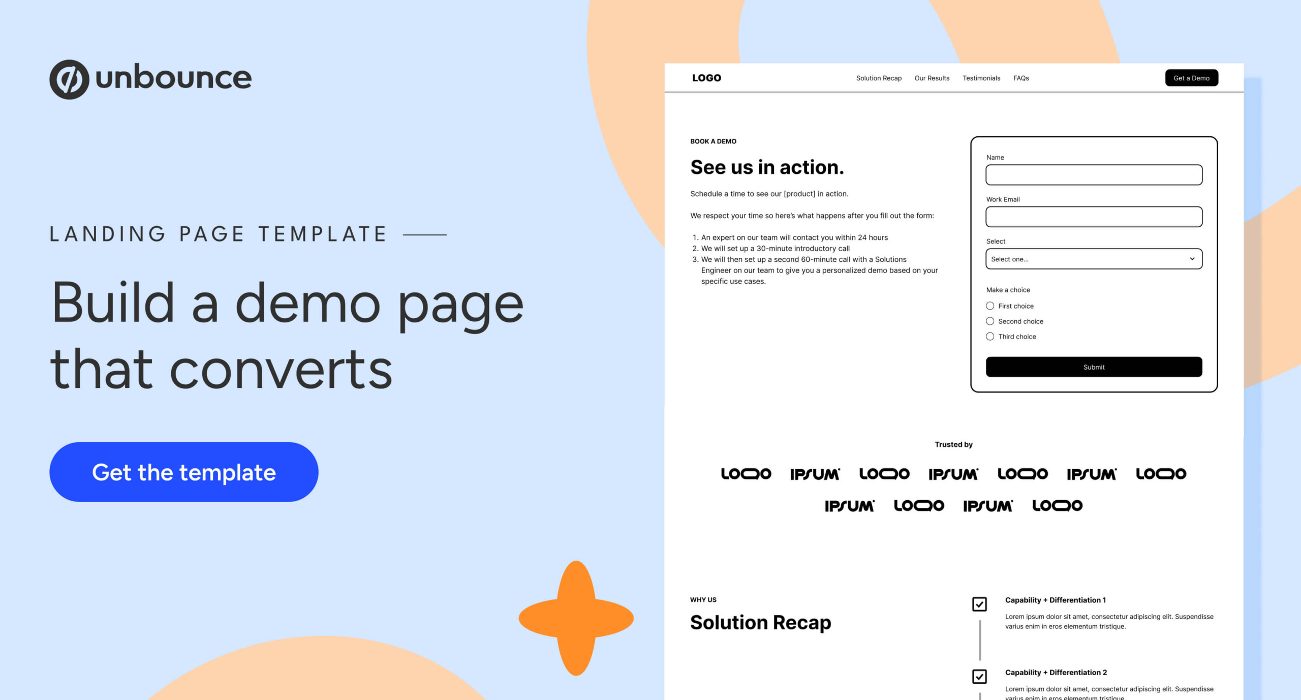
- Missing "Post-Submit" Context: Failing to explain what happens after the form is filled.
- Lack of Social Proof: Neglecting to show that others like them have already succeeded with your product.
- Absence of Pricing Transparency: Forcing a sales call just to get a ballpark figure, which alienates cost-conscious buyers.
- Poor Navigation/Exit Points: Ignoring Google’s modern preference for pages that offer relevant, helpful paths for further research.
- The "Mystery" Sales Process: Not clearly defining the consultation/demo process, leaving the buyer fearful of high-pressure tactics.
The Block-by-Block Blueprint for High Conversion
To build a world-class demo page, you must design for the "warm but hesitant" buyer. Every section should systematically dismantle their last remaining objections.
1. The Hero Section: The "What Happens Next" Guarantee
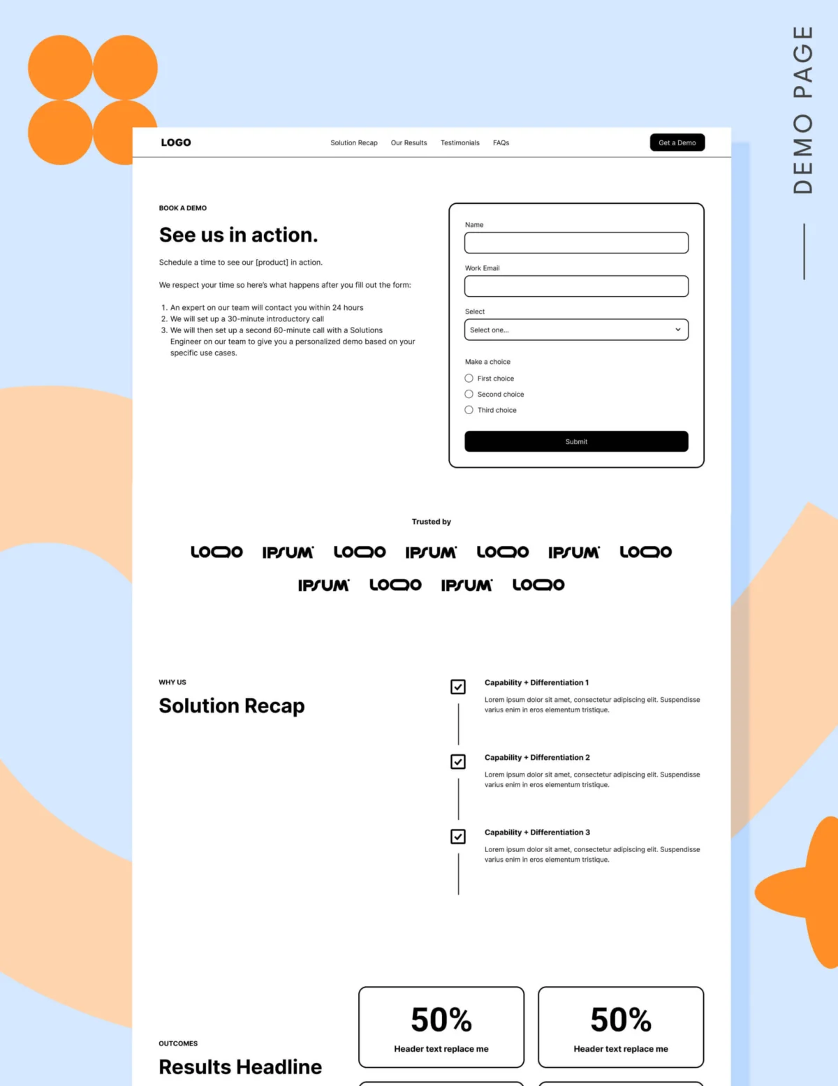
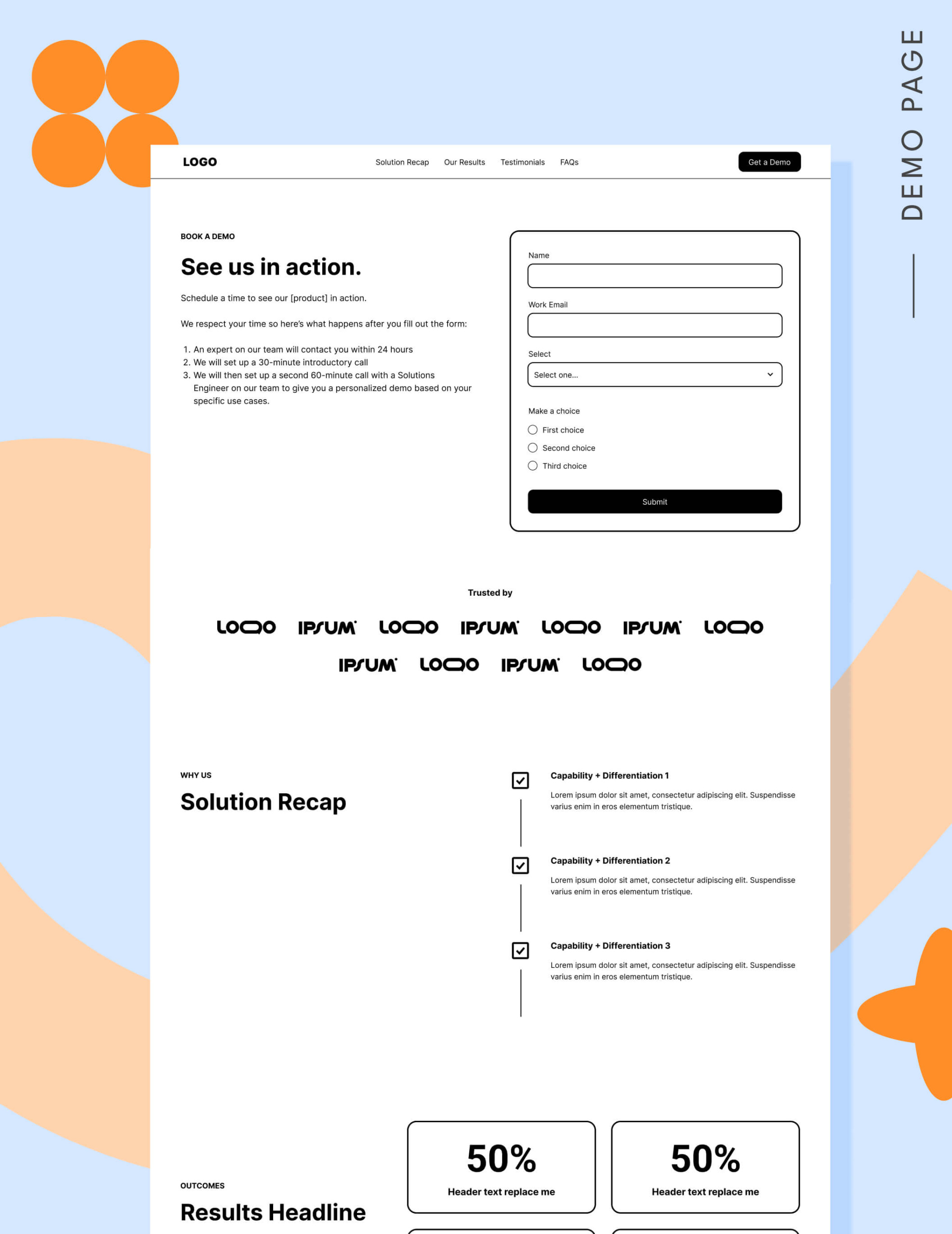
While traditional wisdom suggests removing distractions, the hero of a demo page must be purposeful. Beyond the form and the value proposition, the hero should explicitly state the post-submission journey. Tell them: "You will receive an email within 24 hours," or "A product expert will walk you through a 20-minute tailored consultation." Clarity eliminates the anxiety of the unknown.

2. The Credibility Garden (Logos and Testimonials)
Social proof is the engine of conversion. If your target audience consists of enterprise-level firms, a logo garden of recognizable brands provides immediate institutional trust. If your brand is newer or targeting smaller teams, use detailed testimonials. Aim for 6 to 12 quotes rather than the standard three; volume suggests a massive, satisfied user base, which reduces perceived risk.
3. The Solution Recap and Results
Buyers often skim. By providing a "Solution Recap" section, you re-anchor the conversation on the specific problems you solve. Follow this immediately with a "Results" section using quantifiable metrics. Phrases like "Reduced onboarding time by 40%" are far more powerful than "We help you get started faster."
4. The FAQ: Addressing the Elephant in the Room
The FAQ section is your final opportunity to intercept objections. Use it to answer the questions your sales team hears most: "Do you integrate with X?" or "What is the typical implementation timeline?" This builds confidence and ensures that when the sales call happens, it is focused on closing, not on basic qualification.
The Pricing Debate: Transparency as a Tool
Many sales-led organizations fear that showing pricing will drive away leads. In reality, hiding pricing often creates distrust. Even if you don’t publish a full grid, providing a "starting at" range or a condensed table allows buyers to self-qualify. If a lead is not a good fit due to budget, it is better they find out before they book a meeting, saving your sales team from wasting time on dead-end conversations.
The Form Factor: Finding the "Sweet Spot"
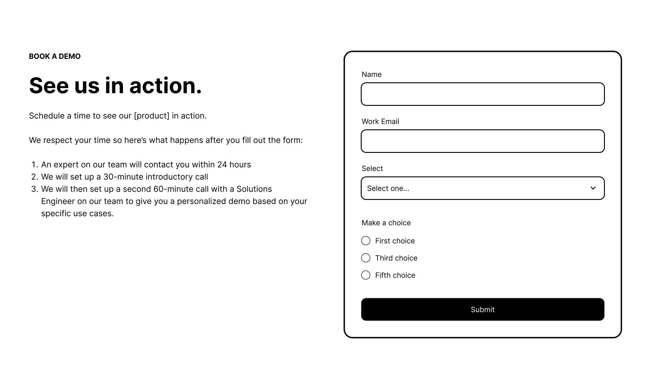
Data from 2026 suggests a sharp decline in conversion once a form exceeds five fields. If your sales team requires more data, use progressive profiling or move secondary questions to the calendar booking stage. Remember: the primary goal is to get the hand-raise. You can qualify them during the call.
The Role of Calendly vs. Traditional Forms
The choice between a static form and a direct scheduling tool (like Calendly) depends on your volume. Use a form if you need to manually vet leads before they reach a rep. Use a scheduling tool if your traffic is already highly qualified and you want to reduce the "time-to-first-meeting" friction. When using a scheduling tool, consider adding a single, non-intrusive qualifying question to filter out poor-fit leads.
Final Implications: Targeting First, Optimization Second
The overarching implication for SaaS marketers is a return to the fundamentals of the buyer journey. You cannot optimize your way out of poor targeting.
If your demo requests are down, look at your paid media strategy before you look at your landing page. Are you nurturing these leads? Are they seeing your case studies, your webinar content, and your social proof before they land on your demo page? If not, no amount of conversion rate optimization (CRO) will save the campaign.
Fix your targeting, build a page that answers the buyer’s final doubts, and provide a transparent, low-pressure path to the conversation. When you stop treating the "Request a Demo" button as a goal and start treating it as a natural, earned conclusion to a journey, your conversion rates will follow.