By Luke Bailey, Colin Loughran, and Paul Park
Updated: February 3, 2026
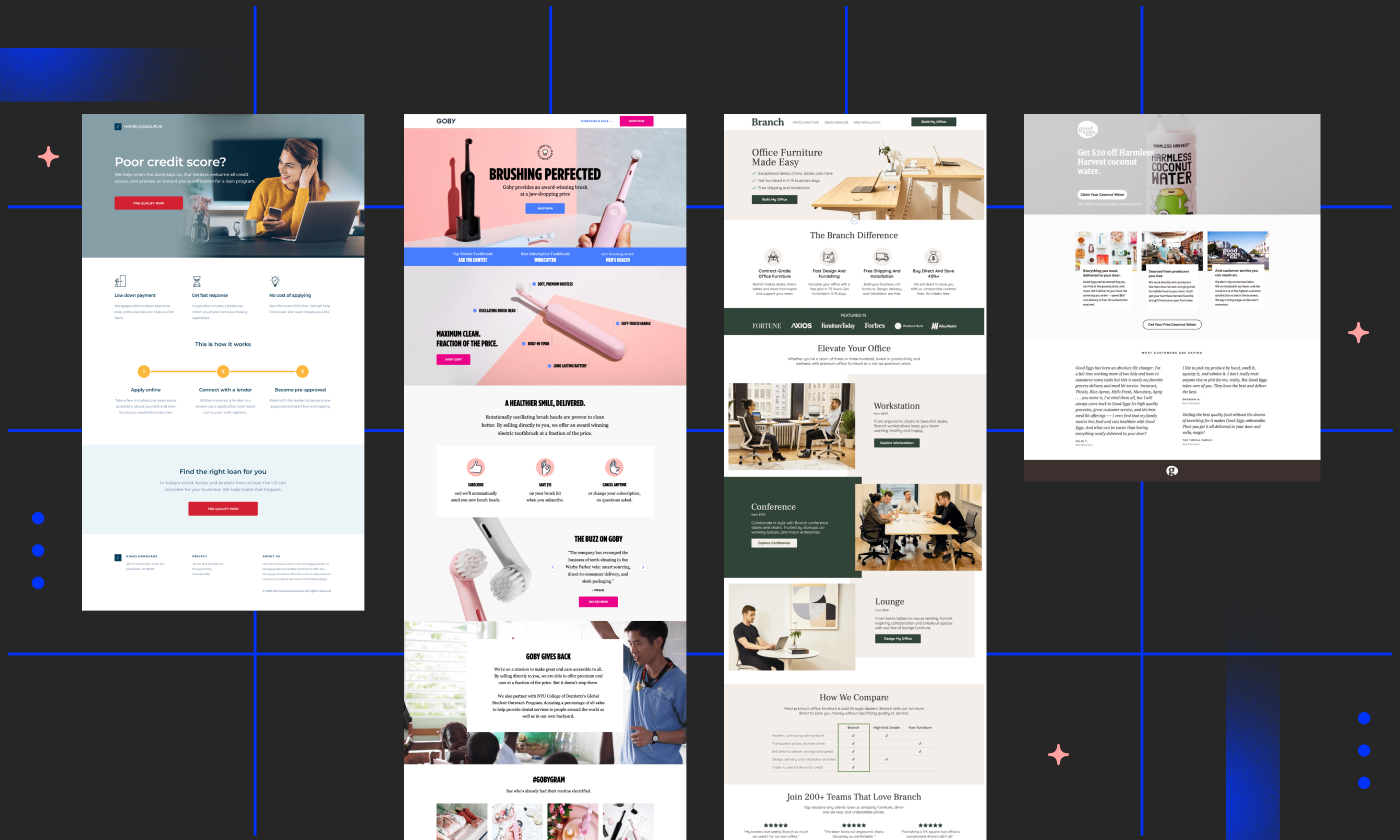
In the high-stakes world of digital marketing, the landing page is the final frontier. It is the digital equivalent of a retail storefront, where the window shopping ends and the transaction begins. Our core philosophy is simple: A polished, professional landing page is the single most effective lever for improving conversion rates. Conversely, a cluttered, disjointed, or confusing page is a silent killer of your marketing ROI.

But what does it truly mean to be "polished" in an era where user attention spans are shrinking by the second? What is the elusive "x-factor" that separates high-performing campaigns from those that vanish into the noise of the internet? To answer these questions, we have curated a master list of 40 exceptional landing page examples. These aren’t just pretty designs; they are battle-tested frameworks that drive leads, sales, and long-term brand loyalty.
What is a Landing Page?
Before dissecting the best, we must define the baseline. A landing page is a standalone web page created specifically for a marketing or advertising campaign. Unlike a homepage, which serves as a navigational hub for a brand’s entire ecosystem, a landing page has one singular, uncompromising goal: to convert the visitor. Whether that goal is a newsletter signup, a product purchase, or a demo request, the landing page is designed to guide the user toward a specific action by minimizing distractions and maximizing value.
The Pillars of Effective Landing Page Design
What makes a page "work"? While design trends evolve, the psychology of conversion remains remarkably consistent. High-converting pages share several fundamental traits:

- Message Match: The headline of your landing page should mirror the language used in the ad or email that brought the user there.
- The "Above the Fold" Hook: The most critical information—the value proposition and the call-to-action (CTA)—must be visible without requiring the user to scroll.
- Visual Hierarchy: Use whitespace, color, and contrast to guide the user’s eye toward the conversion button.
- Social Proof: Trust badges, testimonials, and user counts act as psychological safety nets for potential buyers.
- Frictionless Forms: Every unnecessary field in a form is a barrier to conversion. Ask for only what you absolutely need.
Case Studies: 40 Examples of Excellence
We have categorized these examples across industries to demonstrate that regardless of your niche—be it SaaS, Ecommerce, or Professional Services—the principles of conversion remain the same.

1. Calm (Health & Wellness)
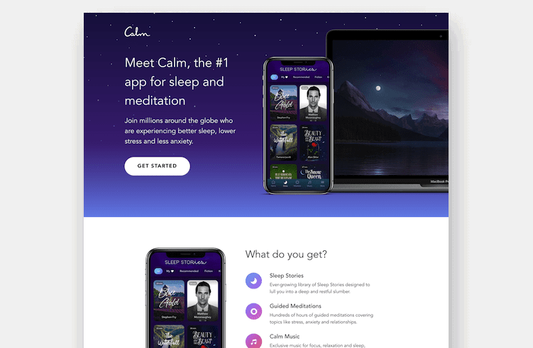
Calm utilizes a serene, minimalist aesthetic that mirrors its product. By focusing on the immediate benefit (tranquility), they eliminate the anxiety often associated with app signups.

2. Zola (Weddings)
Zola revolutionized wedding registries by acting as a one-stop-shop. Their landing page focuses on the ease of the user journey, removing the stress of planning by providing a clean, organized interface.

3. Netflix (Entertainment)
Netflix is the gold standard for simplicity. With a massive library, they could easily overwhelm the user. Instead, they lead with a punchy value proposition: "Unlimited movies and TV shows." It’s an offer that requires no explanation, and the conversion numbers (over 300 million subscribers) speak for themselves.

4. LinkedIn (Professional Services)
The LinkedIn Premium landing page is a masterclass in segmentation. By targeting users who are specifically looking to advance their careers, the copy addresses the "pain" of the job market while offering the "solution" of premium insights.

5. Good Eggs (Grocery Delivery)
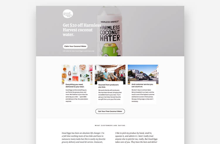
Good Eggs demonstrates the power of restraint. By using a specific promotion (free coconut water) as an incentive, they capture emails without feeling overbearing. It’s a classic "soft conversion" strategy that nurtures the lead toward a future purchase.

(Editor’s Note: The full list of 40 examples continues to showcase diverse strategies, from the B2B rigor of SEMRush to the high-energy fitness appeal of Zumba.)

Supporting Data: Why Small Tweaks Matter
The impact of landing page optimization is not merely anecdotal. Data consistently shows that small, data-driven changes can lead to exponential growth:

- Video Integration: Landing pages that incorporate relevant video content have been shown to increase conversion rates by up to 86%.
- The Power of Focus: Removing navigation menus on a landing page—which prevents users from "leaking" out to other parts of your site—typically results in a 15–20% increase in conversion.
- Speed Matters: A one-second delay in page load time can result in a 7% reduction in conversions. Performance is, quite literally, profit.
Implications for Your Marketing Strategy
The primary implication of these findings is that "gut feeling" is no longer enough. The most successful marketers treat their landing pages as living experiments.
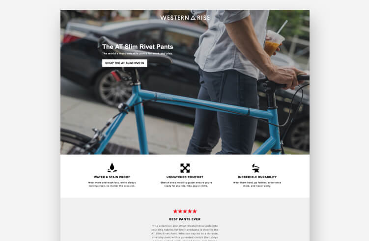
If you are a B2B SaaS company, your page should focus on building trust and educating the buyer through case studies. If you are an Ecommerce brand, your page should focus on product visuals and a frictionless path to the cart. Regardless of your sector, the goal is to reduce the cognitive load on the visitor. If a user has to think about what to do next, you have already lost them.
Frequently Asked Questions (FAQ)
What is the biggest mistake marketers make on landing pages?
The most common error is the "leaky bucket" approach: including too many exit points, such as social media icons, full navigation bars, and footer links. A landing page should be a one-way street.
Is A/B testing actually necessary?
Absolutely. Even a well-designed page can be improved. A/B testing allows you to isolate variables—like headline copy, button color, or image placement—to see what truly drives your specific audience to convert.
How important is mobile optimization?
In 2026, mobile optimization is not an "extra"—it is the standard. If your page does not render perfectly on a smartphone, you are effectively turning away more than half of your potential traffic.

Conclusion: The "Michael Jordan" Mentality
It is easy to look at the massive success of companies like Amazon or Netflix and feel intimidated. You might think, "I’ll never get to that level, so what’s the point?"
However, it is vital to remember that even the most iconic brands started with a single, blank page. They didn’t start with complex AI-driven interfaces; they started with a clear offer, a simple design, and a commitment to testing.

Most of the examples provided above were built using accessible, drag-and-drop tools. You don’t need a team of twenty developers to create a high-converting page. You need a clear understanding of your customer’s problem and a commitment to solving it as quickly as possible.
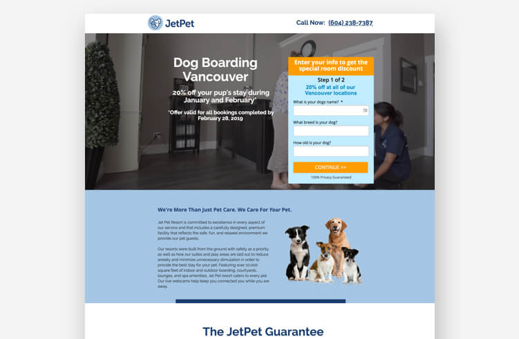
So, use these 40 examples as your "swipe file." Borrow the structure, adapt the copy to your brand voice, and, above all, keep testing. Be the Michael Jordan of your industry—start with the fundamentals, practice until you’re perfect, and never stop looking for the next point.