In the high-stakes world of digital marketing, your landing page is the digital handshake that can either secure a lifelong customer or result in a lost opportunity. While many marketers focus on traffic acquisition, the true masters of the craft understand that a polished, professional landing page is the ultimate conversion engine. As the saying goes: a clean, purposeful page drives results, while a cluttered, confusing one serves only to erode trust and drain your ad budget.
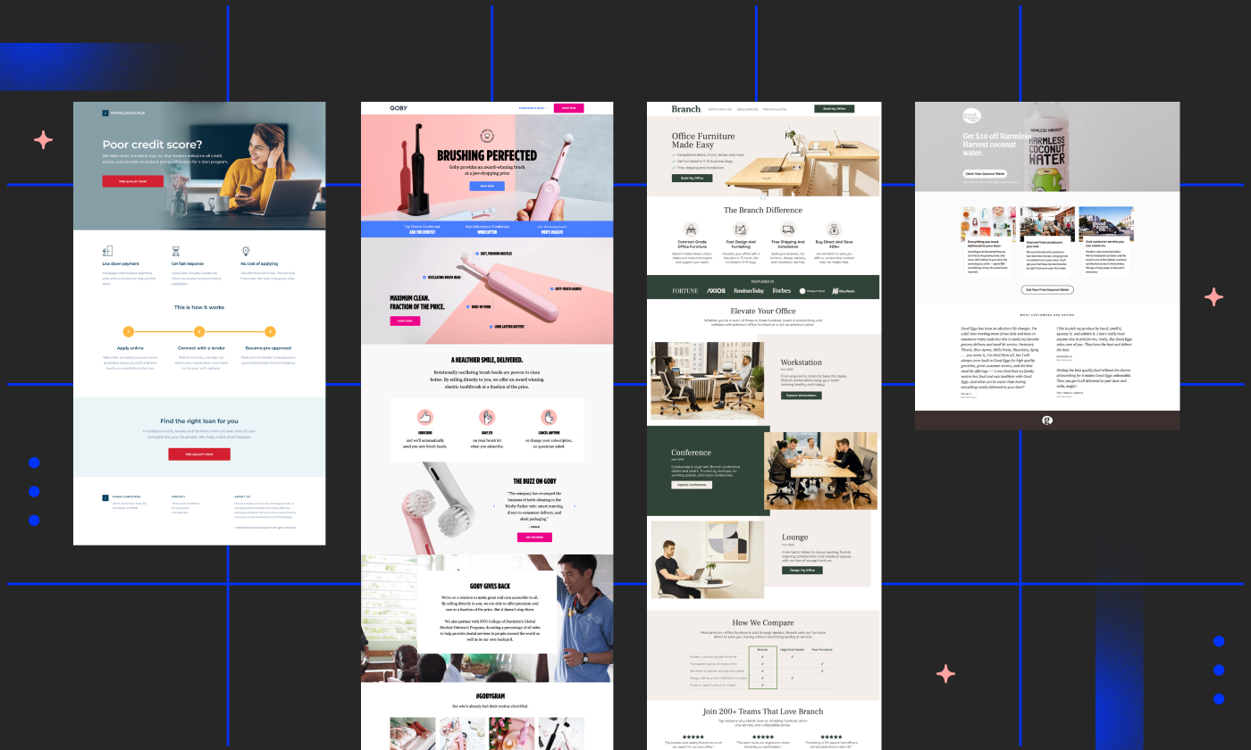
But what truly defines "professionalism" in the context of a conversion-focused web page? Is it the aesthetic, the copy, or the strategic placement of the Call-to-Action (CTA)? To answer these questions, we have curated a comprehensive analysis of 40 of the most effective landing page examples, providing an expert-level breakdown of the elements that drive modern growth.

The Strategic Foundation: Defining the Landing Page
A landing page is not merely a website extension; it is a standalone, purpose-built asset designed for a specific campaign. Unlike a homepage—which acts as a corporate brochure offering broad navigation—a high-converting landing page is narrow in focus. It is the destination where visitors arrive after clicking an ad, an email link, or a social media promotion, and its primary mission is to convert them into leads or customers.
Effective pages share a common DNA: they respect the visitor’s time, communicate value immediately, and eliminate friction.
Chronology of Conversion: The Evolution of Design
The history of the landing page is a narrative of decreasing friction. In the early 2000s, landing pages were often text-heavy and cumbersome. Today, the standard has shifted toward minimalism, video integration, and hyper-personalized user journeys.

Modern design trends, as evidenced by the 40 examples analyzed, prioritize the "above the fold" experience—ensuring that the core value proposition is visible before a user even scrolls. This evolution has been fueled by the rise of sophisticated drag-and-drop builders, which have empowered marketers to iterate on their pages in real-time, moving away from slow, developer-dependent update cycles.

Data-Driven Insights: What Makes a Page Convert?
Research consistently shows that landing page optimization is the highest-leverage activity a digital marketer can undertake. Consider these critical benchmarks:

- Video Integration: Landing pages that incorporate relevant video content have been shown to increase conversion rates by as much as 86%. Video acts as a proxy for physical interaction, building trust in a fraction of the time.
- The Power of Focus: Pages that restrict exit points and maintain a single, clear CTA consistently outperform pages that offer multiple "distraction" links.
- A/B Testing: The difference between a 2% conversion rate and a 10% conversion rate is rarely luck; it is the result of continuous A/B testing—methodically refining headlines, imagery, and button copy to align with user intent.
Case Study Analysis: Excellence Across Industries
1. Calm (Health and Wellness)
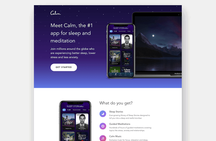
Calm excels by utilizing a serene, minimalist design that mirrors its product. By focusing on immediate engagement, it avoids the "clinical" look often found in health apps, opting instead for an inviting, tranquil aesthetic that lowers the barrier to entry for the user.

2. Netflix (Entertainment)
Netflix is the gold standard for value proposition clarity. By stripping away everything except the essential promise—unlimited content for a flat, low fee—they have scaled to over 300 million subscribers. They prove that you don’t need a complicated page to win; you just need a compelling offer.

3. Grass Roots (Food and Nutrition)
In partnership with agency MuteSix, the Grass Roots landing page is a masterclass in the customer journey. It moves the user from "problem awareness" (why factory-farmed meat is inferior) to "consideration" (why their cooperative model is the solution) to "purchase" (a clear, discounted CTA).

4. Mailchimp (SaaS/Marketing)
Mailchimp’s use of bold, vibrant color palettes—specifically their signature yellow—demonstrates how color psychology can be leveraged to evoke energy and optimism. This isn’t just decoration; it’s a strategic effort to align their visual identity with their brand personality.

Implications: Why These Lessons Matter for Your Growth
The data collected from these 40 examples indicates a clear trend: the most successful brands are those that treat their landing pages as living documents. They are not "set it and forget it" assets.

The 10-Step Optimization Framework
To build a high-converting page, marketers should follow this rigorous methodology:

- Define the singular goal: What one action must the visitor take?
- Align with the ad source: Ensure the headline of the page matches the messaging of the ad that brought the user there.
- Optimize the hero section: Place your most compelling value proposition above the fold.
- Use high-quality imagery: Visuals should demonstrate the product in action.
- Minimize form fields: Every extra field is a point of friction that decreases conversion.
- Incorporate social proof: Testimonials, badges, and user counts build necessary trust.
- Ensure mobile responsiveness: A significant portion of your traffic is on mobile; if it’s not perfect there, you are losing money.
- Implement A/B testing: Never assume your first draft is your best draft.
- Clear, singular CTA: Use high-contrast colors and action-oriented copy.
- Analyze and iterate: Use analytics to track where users drop off and fix those specific pain points.
Expert Perspectives on Modern Challenges
Industry experts note that while "best practices" provide a baseline, they are not universal laws. What works for a B2B SaaS platform like Gusto will differ significantly from what works for an e-commerce brand like Woolx.
The primary challenge today is the "attention economy." Users are bombarded with information. Consequently, the pages that succeed are those that act as filters—removing the noise and providing the visitor with a direct, simplified path to solving their specific problem.
Final Thoughts: Becoming the "Michael Jordan" of Your Niche
It is easy to feel intimidated when looking at the polished output of major brands like Spotify or LinkedIn. However, the secret is that even these global giants began with a blank page and a hypothesis. The most significant takeaway from these 40 examples is that conversion is not a result of genius; it is a result of discipline.
By swiping the best elements from industry leaders—whether it’s the storytelling prowess of Grass Roots or the simplicity of Netflix—and rigorously testing them against your own audience, you can build a library of high-performing assets.
Stop viewing landing pages as a technical chore and start viewing them as your most valuable marketing asset. The tools, the templates, and the proven strategies are all at your fingertips. Now, it is up to you to build the page that turns your visitors into your greatest advocates.