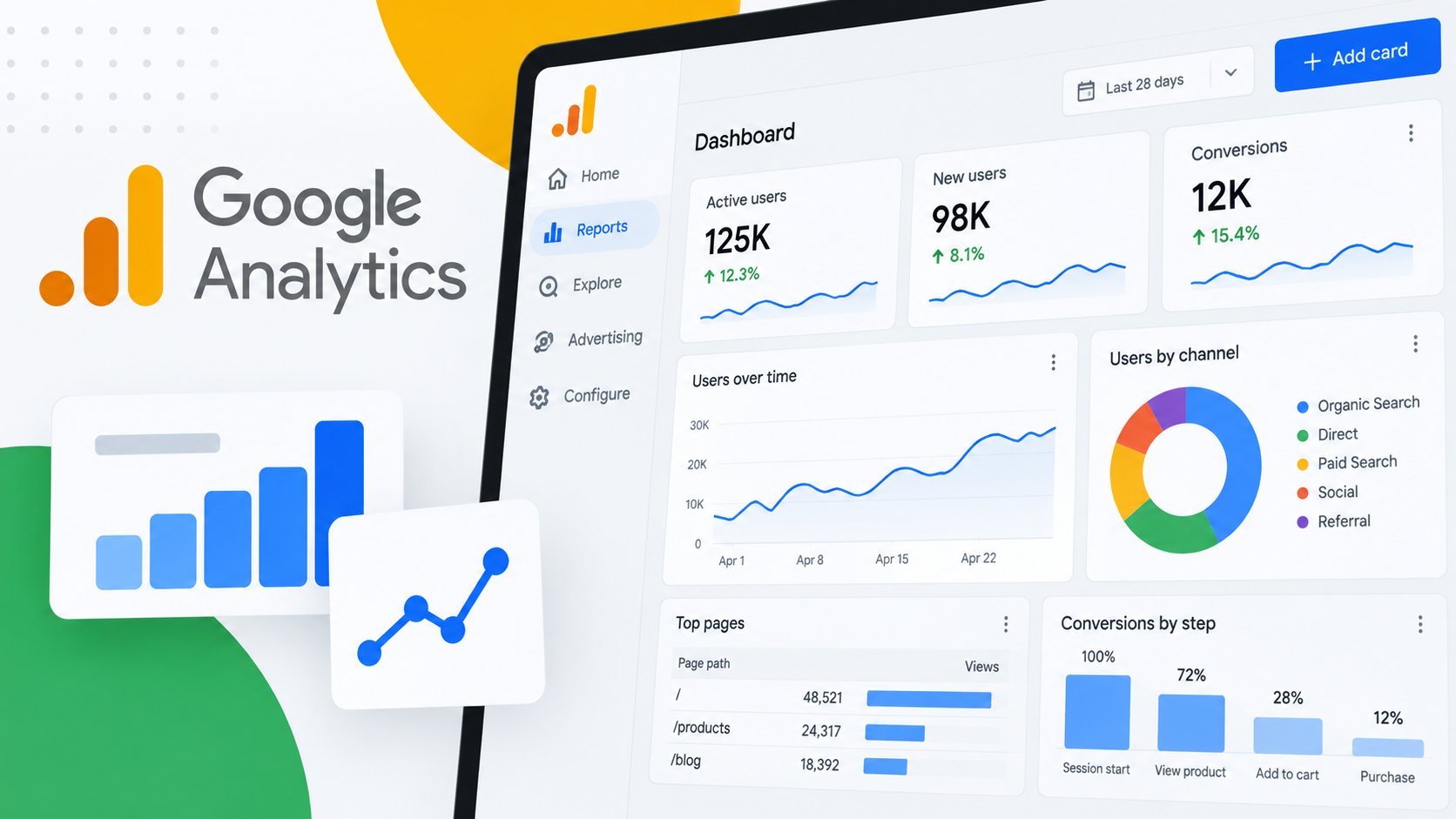
Google Analytics Introduces Drag-and-Drop Dashboards to Streamline Enterprise Reporting and KPI Tracking
SAN FRANCISCO — In a move designed to radically simplify how marketing teams monitor performance, Google Analytics has officially rolled out a brand-new feature: Dashboards. This powerful addition allows businesses to consolidate their most critical Key Performance Indicators (KPIs) and data visualizations onto a single, highly customizable canvas directly within the native GA interface.
The update eliminates the historically fragmented workflow of jumping between disparate, pre-built reports to stitch together a comprehensive view of campaign performance. By introducing a flexible grid system, drag-and-drop customization, and an array of native visualization types, Google is giving enterprise users and digital marketers the tools to build bespoke, centralized war rooms for their web and app data.
Main Facts: What is the New Google Analytics Dashboard Feature?
The newly launched Google Analytics Dashboards represent a fundamental shift in how users interact with their analytics data. Rather than relying solely on standard, siloed reports or exporting data to external Business Intelligence (BI) tools like Looker Studio, teams can now curate tailored reporting experiences natively.
Core Functionality and Interface
At the heart of the new release is a grid-based canvas designed for intuitive layout management. Users no longer need to navigate complex configuration menus to build out custom reporting views. Instead, the building process relies entirely on a modern drag-and-drop mechanism:
Direct Canvas Manipulation: Users can manually position, resize, and align various visualization cards on the canvas.
Seamless Dimension and Metric Dragging: Marketers can drag dimensions and metrics directly onto the workspace to instantly generate and tailor charts on the fly.
Direct Navigation Publishing: Once a dashboard is finalized, it can be published directly to the "Reports" left-hand navigation menu. This bypasses the need to archive items in the Google Analytics library first, making key views instantly accessible to broader team members.
Launch Visualization Types
To support diverse analytical needs from day one, Google Analytics has launched with six distinct visualization types:
Scorecards: Ideal for high-level KPI tracking, complete with support for percentage changes when date comparisons are active.
Tables: Built for detailed, tabular data reporting and granular analysis.
Line Charts: Designed for tracking trends over time, supporting daily, weekly, and monthly view intervals.
Bar Charts: Perfect for making side-by-side comparisons across different dimensions.
Donut Charts: Suited for understanding categorical breakdowns and proportional data.
Funnel Charts: Essential for monitoring multi-step conversion paths and pinpointing drop-off points in user journeys.
Chronology: The Evolution of Reporting in Google Analytics
To understand the significance of this release, it is helpful to look at how reporting workflows within Google’s web analytics ecosystem have evolved over the years, leading up to this milestone.
The Universal Analytics Era (Pre-2020)
In the legacy Universal Analytics (UA) platform, customizable dashboards were a staple feature. Marketers frequently relied on "Dashboards" and "Custom Reports" to group widgets together. These early iterations allowed users to place multiple widgets (such as timelines, maps, and tables) onto a single tabbed interface, making it a favorite for quick client check-ins and executive summaries.
The Transition to GA4 and the "Library" Model (2020–2025)
When Google introduced Google Analytics 4 (GA4), the platform underwent a complete architectural rebuild centered around event-based tracking. In doing so, legacy dashboards were retired in favor of the GA4 Library and Explorations tab.
While Explorations offered advanced, flexible analysis techniques (like free-form tables, funnel exploration, and path exploration), they lacked the simple, centralized dashboard aesthetic of Universal Analytics.
Marketers found themselves building individual summary reports or relying heavily on third-party tools like Looker Studio (formerly Google Data Studio) to achieve a unified single-page dashboard view.
The 2026 Rollout of Native Dashboards
Recognizing the persistent user demand for native, high-level summary views without the friction of external platform exporting, Google developed the new Dashboards feature. Released globally, this update bridges the gap between GA4’s powerful event model and the user-friendly, modular reporting structures that analysts have historically relied upon.
Supporting Data, Limits, and Technical Specifications
While the new dashboard feature offers immense flexibility, Google has implemented specific technical guardrails regarding property limits, sharing protocols, and current feature availability.
Card and Property Limits
The capacity of a dashboard depends directly on the tier of the Google Analytics property being utilized:
Standard Properties: Standard GA properties are restricted to a maximum of 15 cards per dashboard. This provides ample space for core KPIs while encouraging concise, high-impact reporting.
Premium Properties: Enterprise-grade (GA360) properties unlock a higher ceiling, supporting up to 30 cards per dashboard for more complex, multi-departmental tracking requirements.
Access Control and Sharing Mechanics
Collaboration and data governance have been streamlined, though with strict permission hierarchies:
Creation and Publishing Rights: Only users assigned an Editor or Administrator role can create, edit, and publish a dashboard.
Global Visibility: Unlike private, user-specific custom reports, published dashboards are shared across the entire property. Once published, any user with access to the Google Analytics property can view the dashboard through the standard Reports navigation.
Current Limitations
As of the initial launch, Google has noted a few architectural boundaries that teams should keep in mind:
No API Support: Programmatic access to pull or manage these new dashboards via the Google Analytics Reporting API is not currently supported.
Segments and Comparisons: Card-level comparisons and advanced segment applications are temporarily absent from the initial feature set.
User-Level Privacy: Because dashboards are published globally across the property rather than saved privately to individual user profiles, teams must establish internal governance protocols to prevent cluttered or conflicting dashboard creations.
Official Responses and Industry Reception
The digital marketing community has greeted the announcement with considerable enthusiasm, viewing the update as a direct response to years of user feedback regarding reporting friction in GA4.
Industry analysts and veteran practitioners have pointed out that while Looker Studio remains a powerhouse for multi-source data blending (combining Google Ads, Meta Ads, SEO data, and GA4 into one report), the absence of a quick, native single-page view inside GA4 was a glaring omission.
"Marketers can finally consolidate reporting inside GA," notes industry commentary following the release. "Instead of jumping between multiple reports to monitor performance, businesses can build a single-page view of the metrics that matter most to them."
By bringing the dashboard-building workflow directly into the platform, Google is acknowledging that modern digital marketing teams value speed and contextual relevance. Rather than forcing analysts to export raw streams or navigate through nested reporting menus, teams can now spin up purpose-built performance views in a matter of minutes.
Implications for Digital Marketers and Enterprises
The introduction of native Dashboards carries profound implications for day-to-day operations, agency-client relationships, and cross-functional team communication.
1. Accelerated Routine Performance Monitoring
For agencies, in-house marketing teams, and e-commerce managers, time is money. Routine morning checks—verifying traffic spikes, monitoring conversion rate dips, or reviewing campaign revenue trends—traditionally required clicking through acquisition reports, engagement reports, and monetization tables individually. With a well-structured dashboard combining scorecards, line charts, and funnels on a single screen, a comprehensive health check can occur in seconds rather than minutes.
2. Bridging the Gap Between Analysts and Executives
Executive stakeholders often struggle with the granular depth of modern analytics tools. They do not want to parse through dozens of dimensions and secondary metrics; they want to see top-line trends, revenue, conversion rates, and primary traffic drivers. By utilizing scorecards with date comparison percentage changes and clean trend lines, data teams can craft executive-ready views right inside GA4, minimizing the need to build redundant slides or external dashboard decks for routine updates.
3. Workflow Efficiency and Reduced Tool Switching
While external BI solutions will always have their place for cross-platform data blending, many small-to-medium businesses (SMBs) and lean marketing departments used external tools merely to achieve basic single-page visibility for their GA data. By shifting this capability natively into Google Analytics, Google reduces tool fatigue and keeps analysts inside the ecosystem where the data originates.
4. The Need for Internal Governance
With great power comes great responsibility—especially when anyone with Editor or Administrator permissions can publish a dashboard view to the global property navigation. Organizations will need to institute clear naming conventions and internal policies to prevent "dashboard sprawl," ensuring that teams do not crowd the Reports navigation with redundant or overlapping metrics trackers.
Bottom Line
The rollout of Google Analytics Dashboards marks a mature step forward for GA4, directly addressing long-standing user requests for more intuitive, customizable, and centralized reporting interfaces. By combining a flexible grid canvas, drag-and-drop metric placement, and six versatile visualization types into a native workflow, Google is empowering businesses to turn raw data into actionable intelligence faster than ever before.
Whether monitoring high-level KPIs via scorecards or tracking multi-step drop-offs with funnel charts, marketing teams now have a streamlined, single-page command center right where their data lives.