In the hyper-competitive world of B2B SaaS, the "Request a Demo" button is often treated as the holy grail of conversion. Marketing teams push aggressive budgets behind these pages, only to be met with mounting friction from sales departments complaining about poor lead quality and low volume. When the numbers don’t add up, the knee-jerk reaction is to tweak a headline or change a button color. However, industry data suggests the problem is far more systemic.
According to the 2025 LinkedIn Ads Benchmark Report by Dreamdata, the average B2B customer journey now spans 211 days and incorporates 88 touchpoints. In this context, expecting a stranger to click an ad and immediately surrender their time for a sales conversation is a fundamental misunderstanding of the modern buying cycle. To truly convert, SaaS companies must stop treating demo requests as low-friction CTAs and start viewing them as high-stakes commitments.
The Buyer Journey: Why "Request a Demo" is a High-Stakes Ask
Asking a prospect to book a demo is asking them to enter a sales funnel, share personal contact information, and sacrifice their limited time. This is not a "low-friction" action like downloading a white paper or watching a short video. It is a commitment that requires a high degree of trust.
Most SaaS teams fail because they attempt to force a "Request a Demo" CTA on cold traffic. Market research consistently shows that only 3% to 5% of a total addressable market is in an active buying cycle at any given time. If your landing page is the first point of contact for a prospect, you are essentially asking for a marriage proposal on a first date.
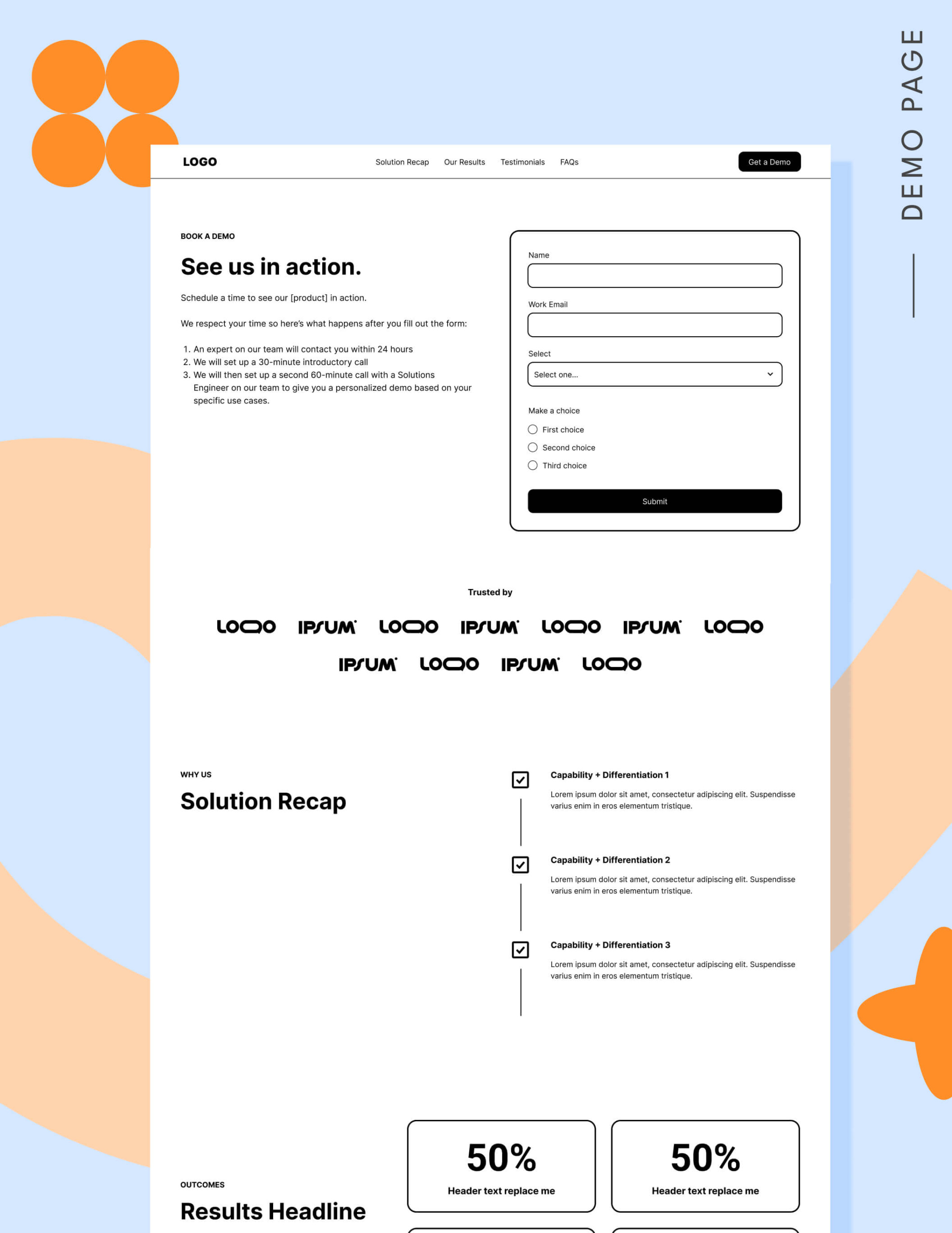
Success starts with education. By utilizing frameworks like the "Core Four" landing page strategy—which guides users through the research, consideration, and decision phases—marketers can ensure that by the time a visitor reaches the demo page, they are already warm, well-researched, and convinced that your solution belongs on their shortlist.
Decoding the Performance Benchmarks
The question of what constitutes a "good" conversion rate for a demo page is a point of contention for many CMOs. Unbounce’s 2024 Conversion Benchmark Report places the median conversion rate for SaaS landing pages at approximately 3.8%. Landing page expert Tas Bober notes that for teams actively optimizing their demo flow, 3.1% is a realistic, sustainable benchmark.
These numbers confirm that the demo page is a narrow funnel. If your conversion rate is significantly lower, you are likely suffering from one of the seven common SaaS pitfalls:
- Traffic Mismatch: Sending cold, top-of-funnel traffic to a bottom-of-funnel page.
- Obscure Value Prop: Failing to clearly state why your solution is the only choice.
- Form Overload: Requiring too much information before the prospect feels value.
- Lack of Proof: Ignoring the need for social validation (logos, testimonials).
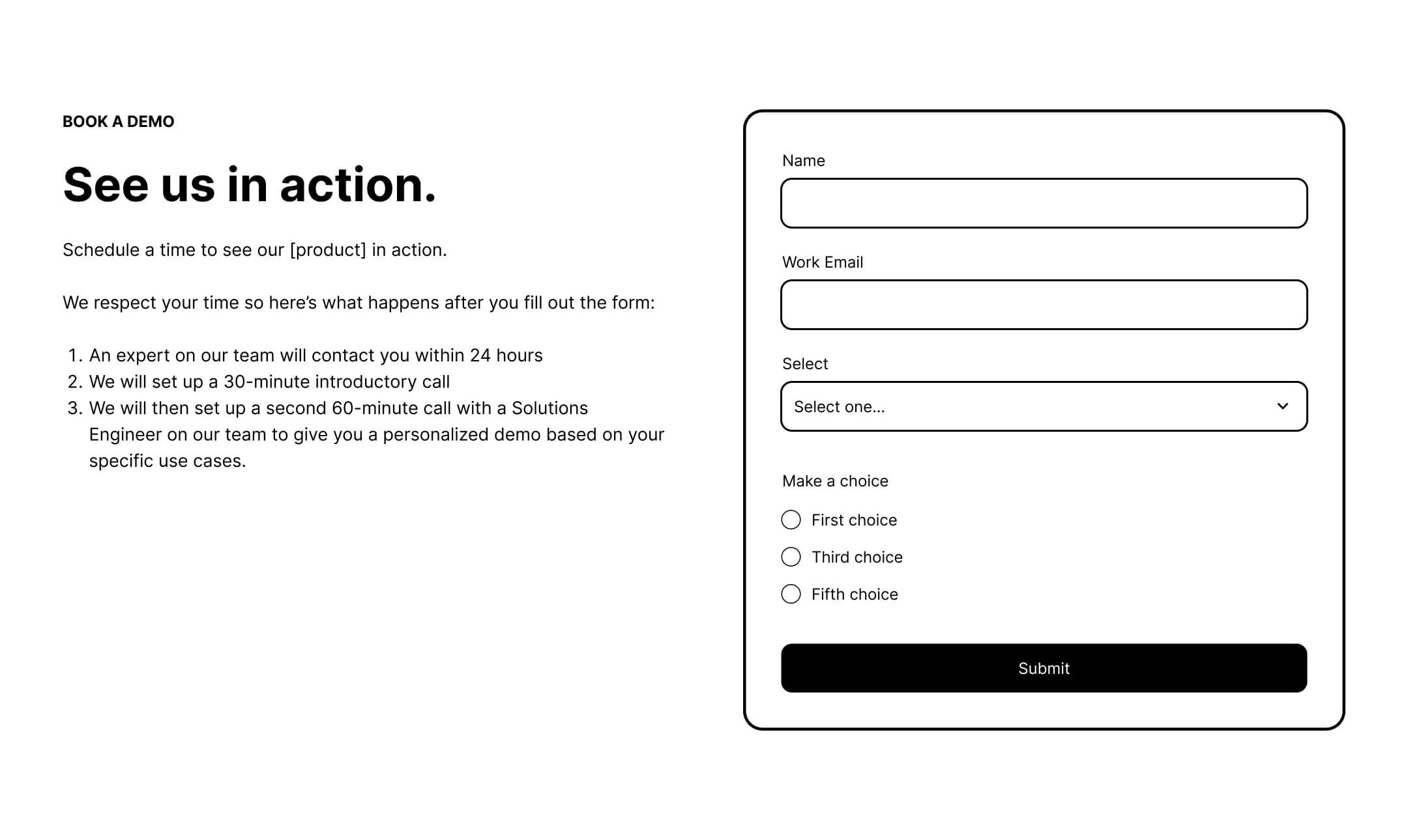
- Unknown Next Steps: Leaving the prospect in the dark about what happens after the form submission.
- Aggressive Sales Culture: Projecting the image of a pushy, high-pressure sales call.
- Pricing Ambiguity: Hiding cost information when the prospect is clearly in the evaluation phase.
Strategic Infrastructure: A Block-by-Block Guide
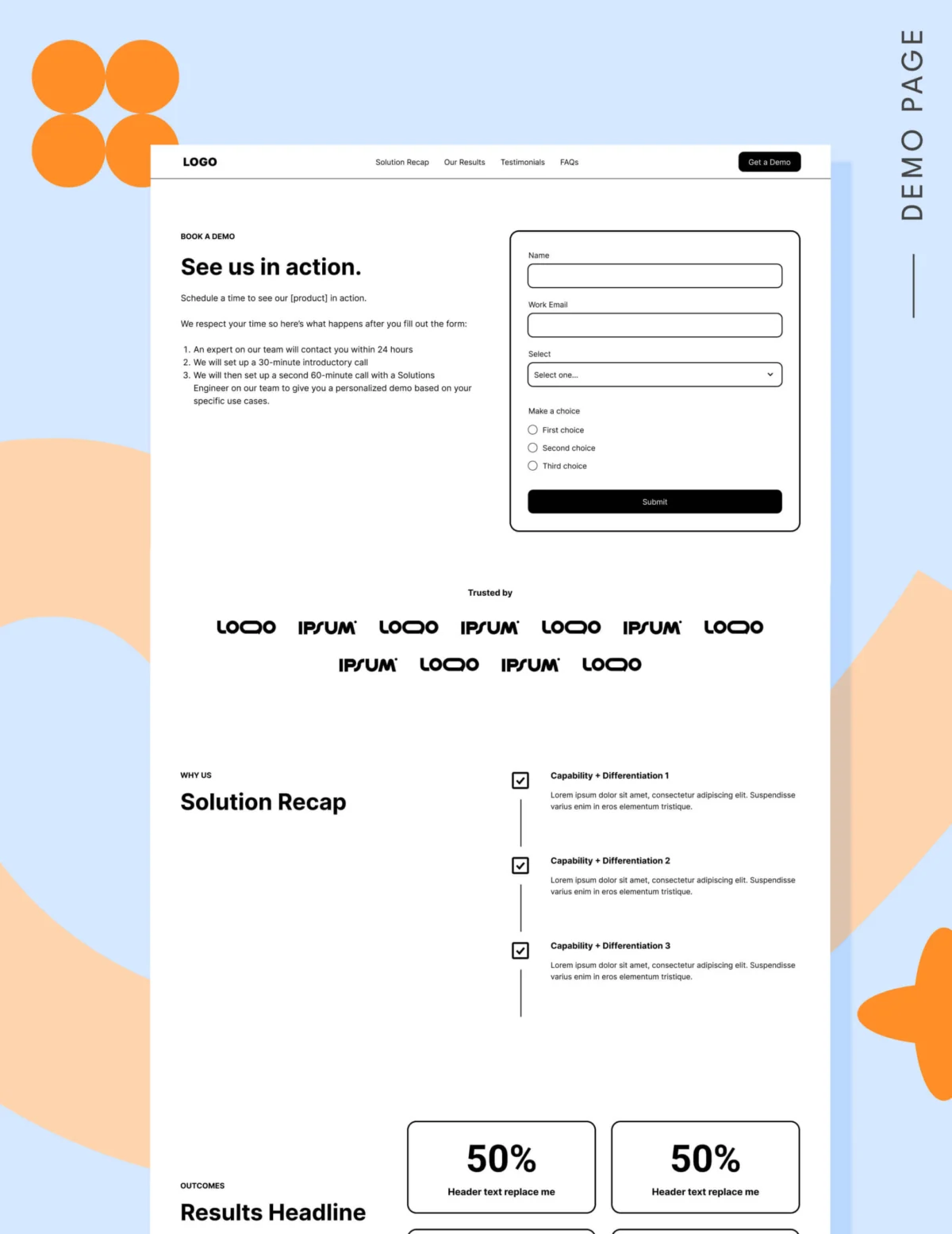
If you have successfully qualified your traffic, the demo page must then serve as a final bridge to the sales conversation. Every element should be designed to remove doubt and provide clarity.
1. Navigation and User Flow
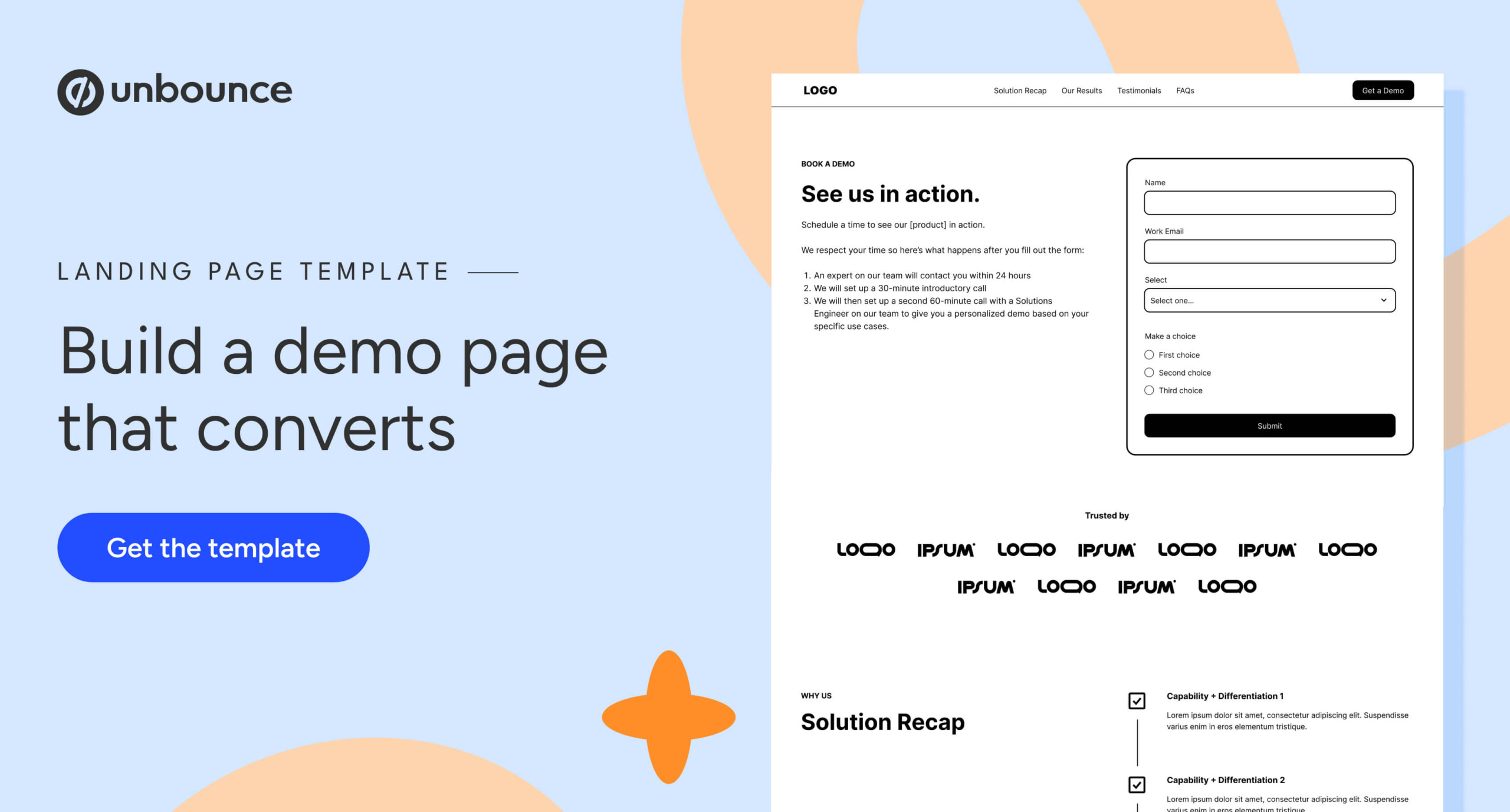
While traditional landing page theory suggests removing all exit points, the modern B2B buyer is more sophisticated. Google’s 2025 search quality updates suggest that pages aligning with user intent—providing access to relevant, helpful information—are rewarded. An anchor-based navigation that allows users to jump to specific sections of the demo page, combined with a footer that links to other critical research assets (pricing, case studies, product tours), keeps the buyer in your ecosystem rather than forcing them to hit the "Back" button.
2. The Hero Section: Setting Expectations
The hero is the only place on a demo page where a form must be present. However, the copy surrounding it is crucial. Don’t just say "Request a Demo." Explain what the user gets. Will they see a live product walkthrough? Will they get a 20-minute tailored consultation? Transparency here acts as a filter; it attracts serious buyers while deterring those who aren’t ready.

3. Social Proof: The "Logo Garden" and Testimonials
For established brands, a "logo garden" with a credibility statement (e.g., "Trusted by 10,000 agencies") is essential. For smaller or newer SaaS players, qualitative proof is more powerful. Use 6 to 12 strong testimonials that specifically address the "why" behind the purchase. Buyers look at the volume of reviews to determine the level of risk—the more social proof, the lower the perceived risk.
4. The Solution Recap and Results
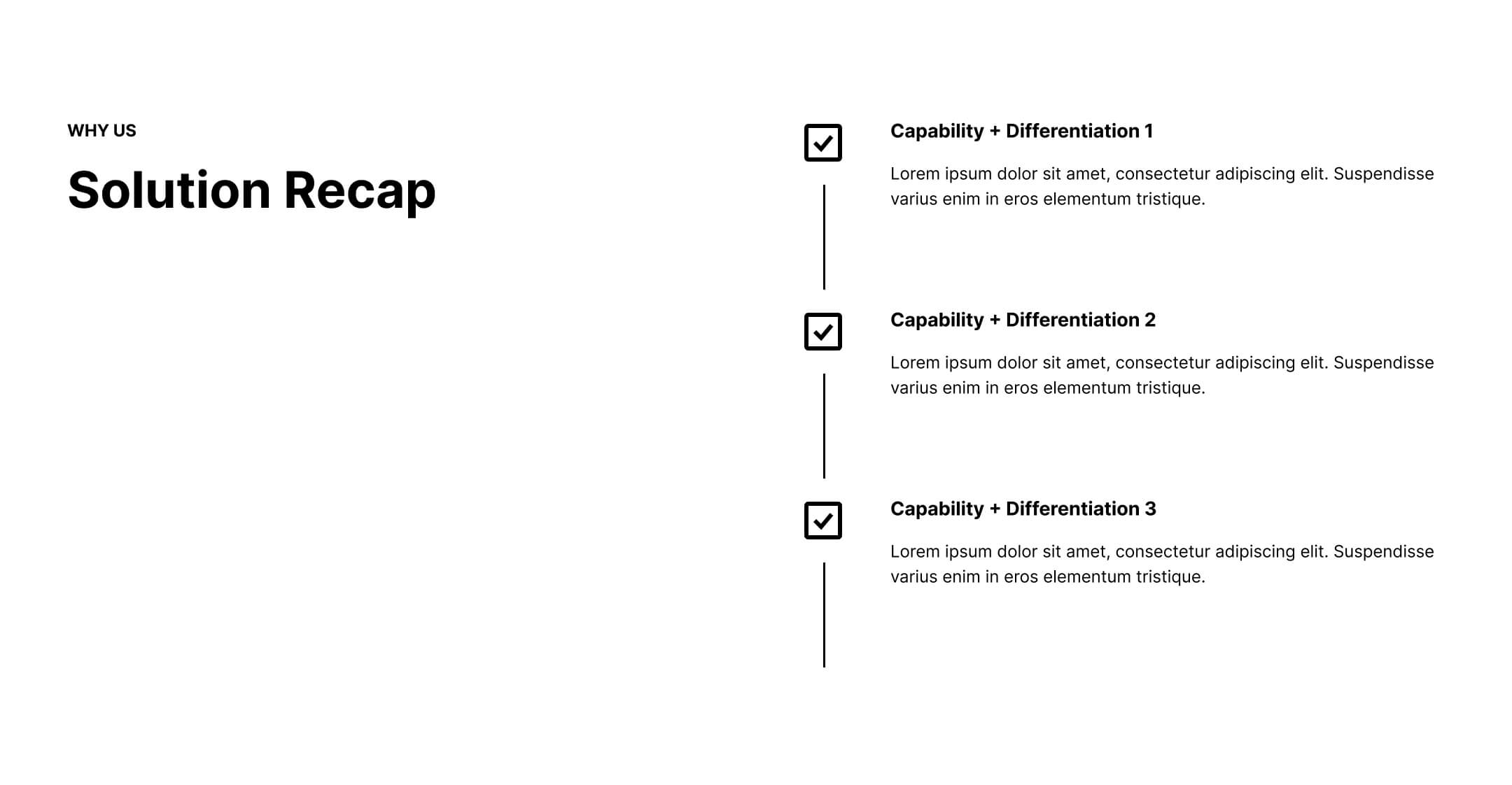
Don’t assume the buyer remembers your value proposition from previous touchpoints. Reiterate your primary differentiators in a dedicated section. Follow this with quantifiable results. Use metrics that matter: "Reduced churn by 20%," or "Saved 15 hours per week."
5. FAQs: Addressing Final Objections
The FAQ section is your last line of defense. Use it to answer the questions your sales team hears most frequently on discovery calls. It is also the perfect place to demystify the "what happens next" aspect of your sales cycle.
The Pricing Debate: Transparency as a Conversion Driver
Many sales-led organizations fear that showing pricing will scare away potential enterprise clients. However, withholding pricing often results in wasting time on prospects who don’t have the budget, or losing prospects who don’t want to engage in a "guess the price" game.
Consider a "starting at" range or a condensed pricing grid. By being transparent about your tiers, you allow prospects to self-qualify, which leads to higher-quality conversations for your sales representatives.
Form Optimization: The Five-Field Rule
Conversion data from 2026 suggests a sharp drop-off in performance after five form fields. While lead qualification is important, you must strike a balance. Choose the one or two fields—such as "Company Size" or "Primary Use Case"—that are absolute deal-breakers for your sales team, and eliminate the rest.
Furthermore, the debate between using a static form versus a scheduling tool like Calendly depends entirely on your lead volume. A form allows for internal routing and qualification, while Calendly provides instant gratification for the prospect. If you choose the latter, consider adding a pre-qualifying question to the booking flow to prevent calendar chaos.
Implications for Future Growth
The key to fixing a broken demo pipeline is not found in the code of the landing page, but in the strategy of the buyer journey. Marketing and Sales must align on the definition of a "ready" lead. If your sales team is complaining about lead quality, stop buying more ads and start improving the educational content that leads to your demo page.
By treating the demo landing page as a resource for the well-researched, highly-intent buyer, you can transform it from a source of frustration into a powerful revenue engine. As you refine your page, remember the lesson from companies like FORM: changing a button from "Request a Demo" to "Take a Tour" can shift the psychological barrier, potentially increasing conversion rates by significant margins.
Fix the targeting. Fix the messaging. Then, and only then, will the demo request become the natural, logical next step in your buyer’s journey.