In the high-stakes world of B2B SaaS, the "comparison page" has long been a staple of the marketing playbook. For years, the standard approach was predictable: a side-by-side table engineered to make your product look superior, peppered with thinly veiled digs at competitors and a aggressive call-to-action (CTA).
However, the modern B2B buyer has evolved. Today’s decision-makers are more informed, deeply skeptical, and increasingly intolerant of marketing fluff. In a landscape where budgets are under constant scrutiny, a biased comparison page doesn’t just fail to convert—it actively erodes brand credibility.
To explore the shift in strategy, we sat down with B2B landing page expert Tas Bober to uncover how companies can build comparison content that functions less like a sales pitch and more like a trusted guide.
The Death of the "Us vs. Them" Playbook
The traditional, one-to-one matchup page is losing its effectiveness. When a prospect lands on a page and immediately senses a manufactured bias, their defensive walls go up. According to Bober, the most successful SaaS companies are pivoting away from aggressive persuasion toward radical helpfulness.
The core problem is that most marketers view comparison pages as an SEO checklist item rather than a critical stage in the buyer’s journey. When a buyer is evaluating software, they aren’t looking for a cheerleader for your product; they are looking for a risk-mitigation tool. They need to know if your solution fits their specific workflow, budget, and team structure. If your page pretends that your competitor has no strengths, you lose the one thing that matters most: trust.

Chronology of the Modern Comparison Strategy
The transition toward "honest comparisons" didn’t happen overnight. It was driven by three distinct factors:
- The Rise of Informed Buyers: With access to peer-review sites and social media, buyers often know more about a product’s limitations than the vendor does before they even reach a sales call.
- The "Inaction" Problem: Research from the Harvard Business Review indicates that 40% to 60% of B2B deals are lost not to a competitor, but to customer indecision. Buyers often choose to stick with manual workarounds or "no decision" because they aren’t confident in the alternatives.
- The Search Engine Evolution: Modern algorithms and Large Language Models (LLMs) are becoming increasingly adept at penalizing content that is vague, overly promotional, or lacking in genuine utility.
The Three Pillars of Comparison Content
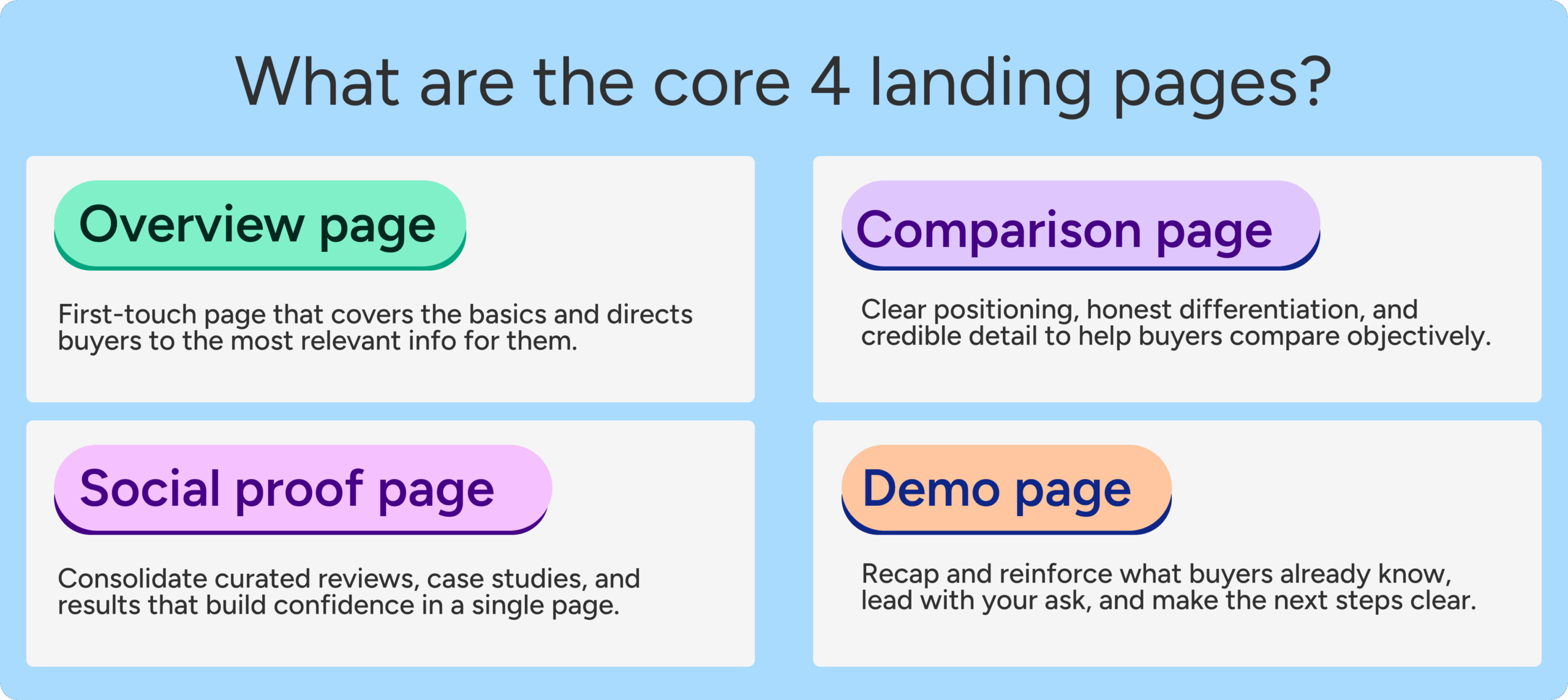
To move from "persuader" to "guide," Bober categorizes comparison content into three distinct formats, each serving a specific stage of the buying cycle:
1. The Comparison Overview Page
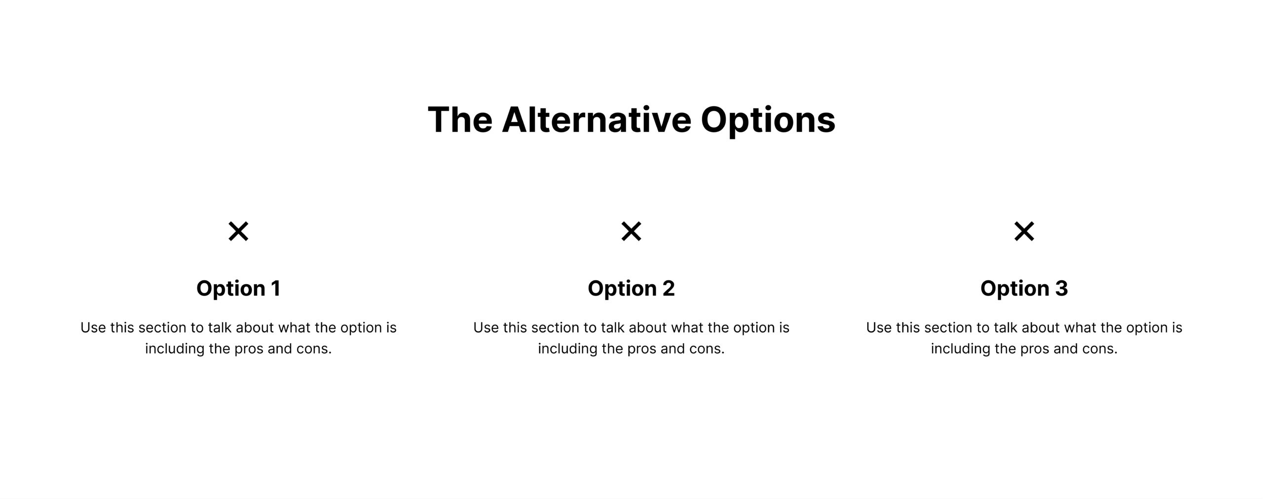
This is your most important asset. It answers the fundamental question: What are my options for solving this problem? Instead of comparing just two brands, this page maps out the landscape. It should address the "big" competitors, niche alternatives, and even manual, non-software workarounds. By providing this map, you position your brand as the expert authority.
2. The One-to-One Competitor Page
Reserved for prospects who have already narrowed their shortlist. This page shouldn’t be a takedown; it should be a diagnostic tool. Use this space to explain why a customer might choose your tool over the other—and, crucially, where the competitor might actually be a better fit. This level of transparency is rare in SaaS and acts as a powerful trust-builder.
3. The Competitor Alternatives Page
Targeting the "switcher" segment. These buyers are already using a legacy tool and are actively looking for an exit strategy. These pages should focus on the "why now" of switching: migration ease, modern features, or pricing transparency.
Anatomy of a High-Trust Comparison Page
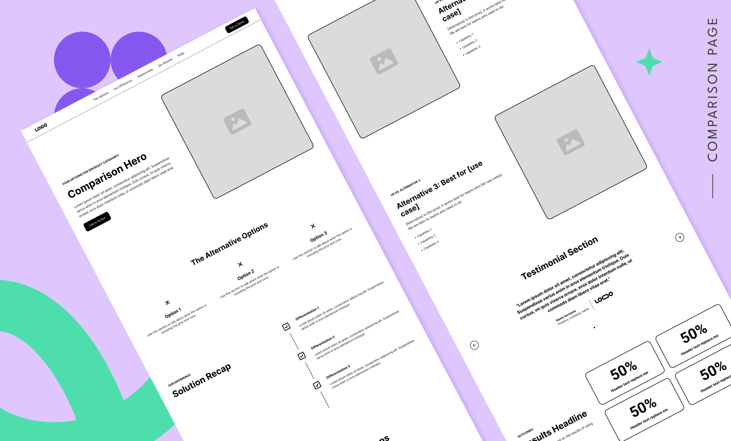
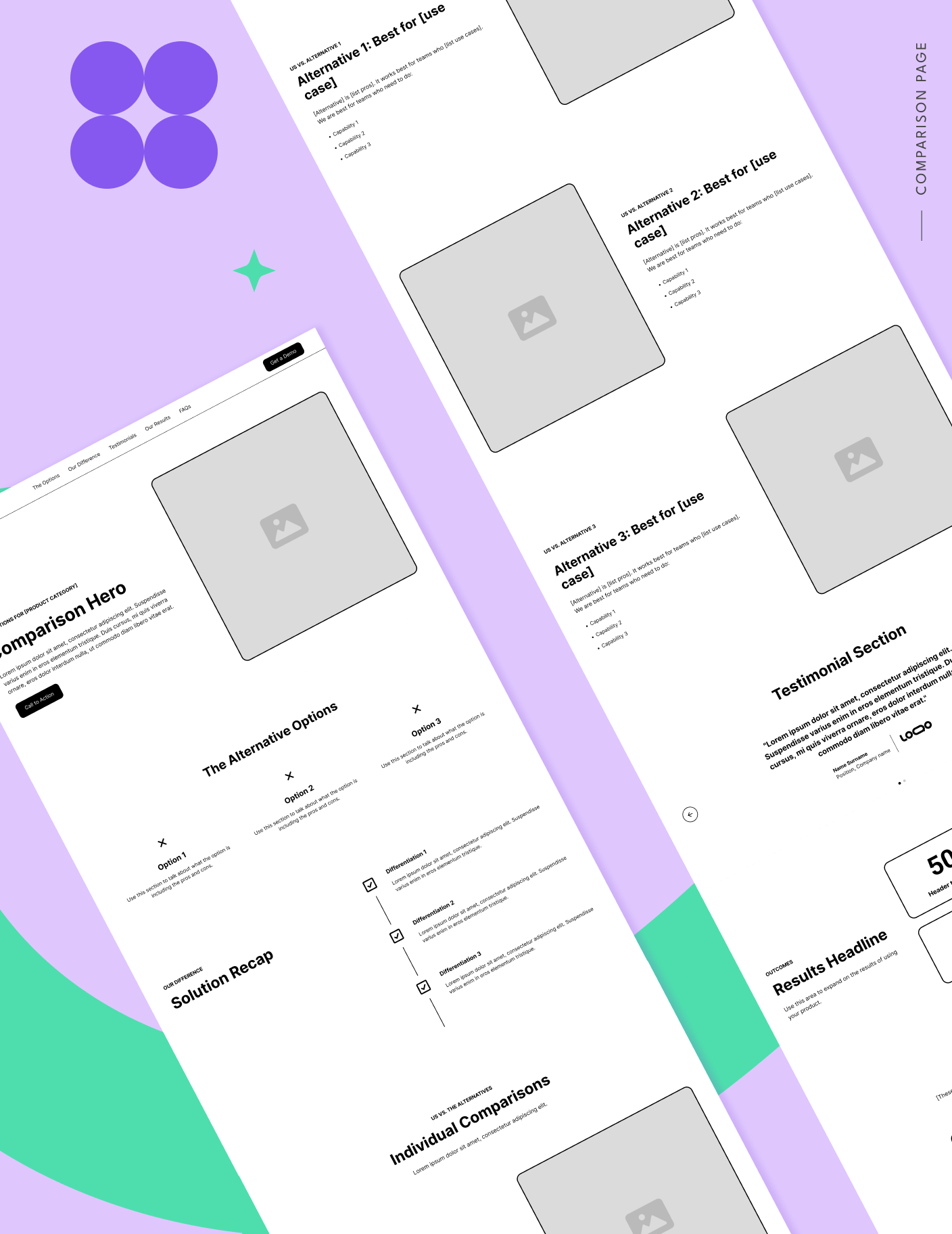
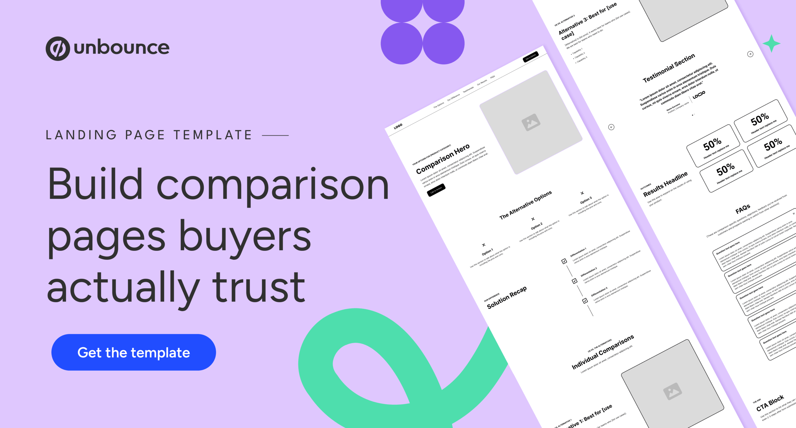
If you are building your first "human-centric" comparison page, follow this structural template advocated by Bober:
- The Navigation Anchor: Don’t remove your header navigation. It keeps the page from being a "dead end," which is a metric Google uses to evaluate ad quality.
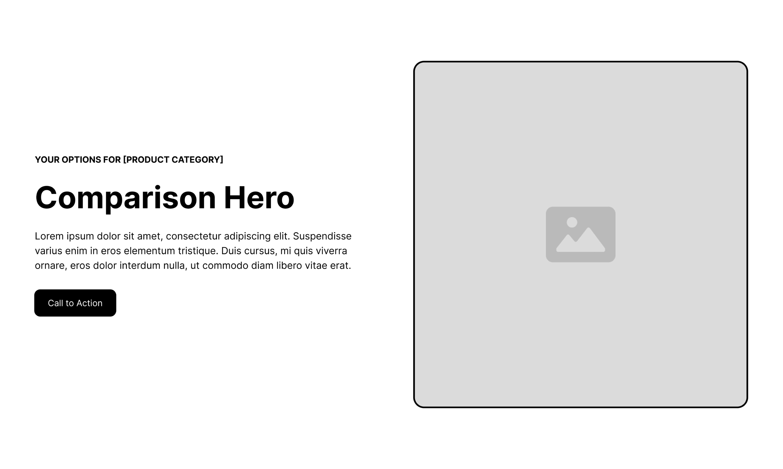
- The Helpful Hero: Your headline should mirror the buyer’s search intent. Use an "eyebrow" label to set expectations, such as "Your options for [Category] Software."
- The "Guide, Not Seller" Section: Group alternatives into clear categories. Discuss the pros and cons of each with objectivity.
- Proof with Context: Move away from generic testimonials. Use case studies that specifically mention the migration process from the competitor being discussed.
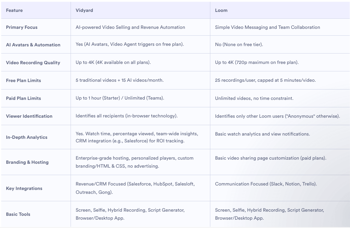
- The "No-Table" Philosophy: Interestingly, Bober advises against the classic feature table. Most are cluttered and easily manipulated. If you must use a table, ensure it compares themes and outcomes rather than simple "Yes/No" checkboxes.
Implications: The New Competitive Advantage
The shift toward transparent comparison content has profound implications for SaaS growth.
First, it reduces churn before it begins. By helping buyers understand your product’s limitations during the evaluation phase, you attract "right-fit" customers who are less likely to experience buyer’s remorse.
Second, it enhances brand authority. When you are willing to concede a point to a competitor, you gain credibility. Prospects begin to view your company as a partner in their success rather than a vendor looking for a quick signature.
Finally, it creates a defensive moat. In an era where AI-generated content is flooding the web with generic "Top 10" lists, a deeply researched, honest, and helpful comparison page stands out as high-value human insight.

Conclusion: Building for the Long Term
Building a SaaS comparison page that earns trust is not about tricking the prospect; it is about respecting their intelligence. By providing a clear, objective, and helpful evaluation of the market, you move the buyer from a state of indecision to a state of confident action.
As Tas Bober emphasizes, the next time you draft a comparison page, ask yourself one question: "Is this actually helpful to the buyer?" If the answer is no, start over. Your future customers—and your brand’s reputation—depend on it.