In the canon of user-interface (UI) design, Steve Krug’s seminal book Don’t Make Me Think remains the undisputed guide. Krug posits that whenever a consumer lands on a digital storefront, micro-questions such as "Where do I click?" or "What does this mean?" create subtle yet corrosive moments of hesitation.
Each cognitive hurdle distracts the user from their primary objective—finding a product or completing a transaction—turning what should be a seamless purchasing journey into a frustrating exercise in decoding a website. According to Krug, shoppers enter a digital store with a finite "reservoir of goodwill." Every instance of uncertainty drains that reservoir. Once it is depleted, the consumer abandons the cart entirely.
While prominent conversion roadblocks—such as unexpected shipping costs or complicated checkout sequences—frequently dominate optimization discussions, a myriad of lesser-known visual and written cues routinely sabotage conversion rates. By addressing hidden ambiguities surrounding quantities, pricing metrics, and serving sizes, leading e-commerce brands are redefining intuitive design.

Main Facts: The Psychology of Cognitive Friction
Cognitive load theory in e-commerce dictates that the human brain has a limited capacity for processing information at any given moment. When online shoppers are forced to stop and calculate numbers—such as converting ounces to servings, counting individual units in a bulk pack, or figuring out how many tablets are required for a specific household size—their mental bandwidth is diverted away from the desire to buy.
Recent audits of top-performing direct-to-consumer (DTC) brands reveal a strategic shift toward removing numerical math entirely from the buyer’s journey. Instead of presenting raw data and leaving the interpretation up to the consumer, UX designers are employing contextual framing, visual portioning, and outcome-based naming conventions.
These interventions rest on a simple retail maxim: If a shopper has to do math, they are more likely to close the tab.

Chronology: The Evolution of E-Commerce Usability
The understanding of digital friction has evolved significantly over the past two decades:
- The Early 2000s (The Feature-Heavy Era): Websites focused heavily on displaying maximum data. Product pages prioritized technical specifications, raw counts, and dense text blocks, assuming that more information inherently equaled better consumer trust.
- The Rise of Mobile Commerce (2010–2015): As smartphone screens shrunk viewport sizes, the cost of clutter became immediately apparent. Brands realized that dense text and complicated quantity drop-downs resulted in massive mobile drop-offs.
- The UX Minimalism Movement (2015–2020): Guided by mobile-first design principles, user experience designers began stripping away non-essential elements. Clean white space, prominent call-to-action buttons, and simplified checkout flows became the industry standard.
- The Contextual Design Era (2020–Present): Modern brands are moving beyond mere minimalism. Instead of just making pages look clean, companies are actively engineering the cognitive experience, eliminating the need for shoppers to interpret quantities, calculate daily costs, or translate units of measurement.
Supporting Data: Real-World UX Solutions
To understand how modern brands eliminate cognitive friction, we can examine specific tactical interventions implemented by leading e-commerce companies across various sectors.
1. Eliminating Counting Through Situational Framing
- The Brand: Gush (DrinkGush.com)
- The Problem: Beverage brands typically sell multi-packs by absolute numbers (e.g., 12-pack, 24-pack, 48-pack). This forces the consumer to pause and mentally calculate: How many people are coming over? Will 24 pouches be enough for Friday night?
- The UX Solution: Gush labels its pack sizes by real-world occasions: "With a Friend," "With the Crew," and "For the Party," while still displaying the raw pouch count. By tying the quantity directly to a social scenario, the occasion does the math for the shopper. Consumers no longer calculate units; they simply pick the kind of night they are planning.
2. Ensuring Crystal-Clear Unit Metrics
- The Brand: Waju (DrinkWaju.com)
- The Problem: Bulk-ordering beverages online frequently introduces ambiguity. Does a quantity selector of "2" mean two individual cans, two six-packs, or two full cases? This ambiguity creates immediate anxiety about over- or under-spending.
- The UX Solution: Waju’s product page clearly labels its quantity selector as "Cases," accompanied by an explicit explanatory line: “1 case (12 cans), $34.99.” Furthermore, the quantity field is housed against a high-contrast white background that visually commands attention, ensuring that a shopper can never mistake the unit of purchase.
3. Shifting from Contents to Outcomes in Product Naming
- The Brand: Blueland (Blueland.com)
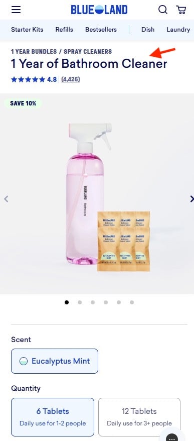
- The Problem: Eco-friendly cleaning brands often sell concentrates in tablet form. A listing offering "6 tablets" or "12 tablets" forces the customer to do domestic arithmetic: How fast do I go through these? Is six enough for a month or a year?
- The UX Solution: Blueland re-engineered its nomenclature entirely. Instead of focusing on the physical contents of the package, the product is named after the outcome it provides—such as “1 Year of Bathroom Cleaner.” Sub-options clarify that six tablets serve a 1–2 person household for a year, while twelve tablets serve three or more. The consumer buys a span of time, bypassing the need to calculate chemical longevity.
4. Illustrating Portions Visually and Normalizing Cost
- The Brand: The Farmer’s Dog (TheFarmersDog.com)
- The Problem: Ordering fresh pet food online is notoriously complex, requiring owners to convert dog weights, calorie counts, and package grams into daily feeding schedules. Furthermore, showing a lump sum for a multi-week box can cause sticker shock.
- The UX Solution: The Farmer’s Dog solves the amount-to-order dilemma by utilizing three distinct visual portion illustrations. Each option features an image of a dog bowl filled to a specific level (full, half, smallest portion). Crucially, the pricing is displayed per day rather than per box, matching how pet owners naturally budget for their animals. A straightforward explanatory line underneath—“Contains two weeks of food”—anchors the context without requiring the user to convert grams, boxes, or monthly totals.
Official Industry Responses and UX Expert Perspectives
Usability experts and conversion rate optimization (CRO) specialists widely agree that reducing mental friction is no longer a luxury feature—it is a baseline requirement for survival in a crowded digital marketplace.

"When you force a customer to pause and think about what a number means or how much product they actually need, you are introducing friction into an environment that should be greased for momentum," notes Lihi Lothan, a leading digital commerce UX analyst. "The brands winning today are those that take on the cognitive burden themselves. They don’t give the customer data; they give them clarity."
Retail psychologists emphasize that consumer patience online has reached historic lows. With infinite competitors sitting just a browser tab away, any micro-hesitation caused by poor UI design acts as an invitation for the consumer to comparison shop elsewhere. By shifting the design paradigm from self-service information displays to guided decision-making, brands are seeing tangible improvements in conversion metrics, average order value, and customer retention.
Implications for the Future of E-Commerce
The shift toward zero-friction design carries profound implications for the broader retail landscape:
- The Death of the Traditional Grid: Standard e-commerce grids that rely on uniform product cards with stark, uncontextualized numbers are increasingly becoming obsolete. Expect to see more dynamic, lifestyle-integrated selection interfaces across fashion, beauty, food, and home goods.
- AI-Driven Personalization as a Friction Reducer: As predictive analytics and AI become more sophisticated, digital storefronts will increasingly pre-calculate these metrics automatically based on user profiles, rendering manual quantity selection entirely invisible.
- Competitive Advantage for DTC Innovators: Smaller direct-to-consumer brands often outpace legacy brick-and-mortar digital extensions simply because they are unburdened by legacy software. By rethinking basic UX fundamentals like naming conventions and portion illustrations, nimble startups can dramatically outperform legacy giants in conversion efficiency.
Ultimately, the lesson for digital merchants is clear: respect the consumer’s cognitive load. In an age of infinite digital distractions, the website that requires the least amount of thought will almost always secure the sale.