In the digital marketing ecosystem, the landing page is the ultimate proving ground. It is the singular point where intent meets opportunity—a standalone web experience designed specifically to turn a casual visitor into a committed lead or customer. As the digital landscape becomes increasingly cluttered, the difference between a high-converting page and a bounce-heavy liability often comes down to the subtle art of "polish" and "professionalism."
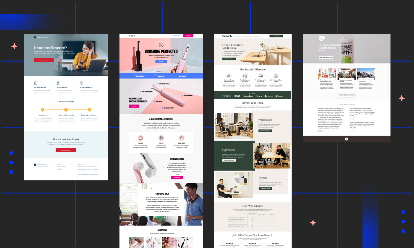
But what does it actually mean to be professional in a space that prioritizes speed and action? By analyzing 40 of the most effective landing pages across industries ranging from SaaS to e-commerce, we can identify the universal principles—and the specific "x-factors"—that separate exceptional marketers from the rest.

The Foundation: Why Landing Pages Matter
A landing page is not merely a page on a website; it is a tactical asset. Unlike a homepage, which acts as a central hub for broad exploration, a landing page is built for a singular, focused objective. It is the destination for traffic arriving from paid advertising, targeted email campaigns, or social media outreach.
The core principle is simple: A polished, focused page builds trust, whereas a cluttered, unfocused page introduces friction. When a user clicks an ad, they are looking for immediate validation that they have arrived in the right place. If your page provides that validation, you win the conversion. If it doesn’t, you lose the lead.
Anatomy of an Effective Landing Page
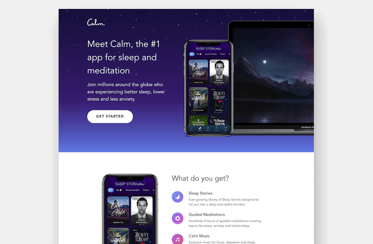
While design trends shift, the fundamental elements of a high-converting page remain remarkably consistent. To build a page that resonates, marketers must focus on:

- A Compelling Value Proposition: Your headline must answer the "why" immediately. Visitors should understand the benefit of your offer within seconds.
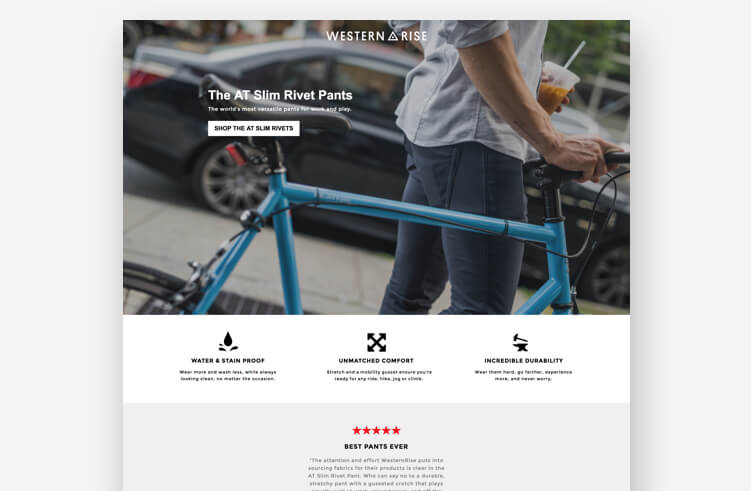
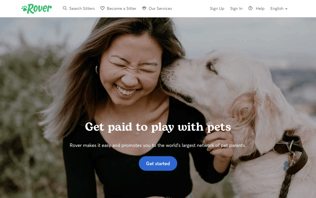
- Visual Hierarchy: Use design to guide the eye toward the Call to Action (CTA). The most important element—the button—should never be a mystery.
- Social Proof: Whether through testimonials, user statistics, or industry awards, external validation reduces the perceived risk for the user.
- Minimalist Friction: If you are asking for a lead, keep your forms short. Every additional field in a contact form is a potential barrier to conversion.
Chronology of a Conversion: Examining the Examples
To understand how these principles manifest, we can categorize several industry-leading examples by their strategic focus.

The SaaS Strategy: Simplicity as a Service
Companies like Netflix and LinkedIn have mastered the art of the minimal landing page. Netflix, which has scaled to over 300 million subscribers, utilizes a stark, benefits-first approach. They don’t overwhelm the user with technical details about streaming resolution or data usage; they focus on the core value: "unlimited movies and TV shows."

Similarly, SEM Rush demonstrates the power of focus. Rather than attempting to sell their entire suite of marketing tools at once, their landing page focuses exclusively on competitive intelligence. By narrowing the scope, they lower the cognitive load on the visitor, making it easier to say "yes."

E-commerce: Selling the Experience
In the e-commerce sector, the goal is often to bridge the gap between the screen and the physical product. Goby, a dental care brand, uses the headline "Brushing perfected" to promise an upgrade to a daily habit. By combining high-quality product imagery with a money-back guarantee, they remove the risk associated with buying a new product online.

Coco Village takes a different, emotional approach. By showcasing beautiful, aspirational imagery of their furniture and bedding, they tap into the customer’s desire for a curated lifestyle. As noted by industry experts, this approach proves that for e-commerce, the landing page is as much about selling a "feeling" as it is about selling an item.

Supporting Data: Why Small Tweaks Yield Big Results
The data supporting these design choices is overwhelming. For instance, landing pages that incorporate video content have been shown to increase conversion rates by as much as 86%. This isn’t just a aesthetic choice; it’s a psychological one. Video allows for faster information delivery, enabling users to understand a product’s utility without reading a single paragraph of text.

Furthermore, context matters. Mooala, an organic dairy-alternative company, utilized landing pages specifically to capture email addresses during the "consideration" phase of their social ad campaigns. By offering a coupon in exchange for an email, they turned a cold lead into a nurtured prospect. As their CEO noted, "Most brands have a huge opportunity to lower their CPA by focusing on awareness and consideration."

Official Perspectives: The Experts Speak
We reached out to various marketing agencies, including ConversionLab and MuteSix, who have consistently produced top-tier results. The consensus among these experts is that "testing is everything."

Even the most beautiful page is a failure if it doesn’t convert. Agencies emphasize that you should never guess what your audience wants; you should use A/B testing to let the audience tell you. By testing different headlines, button colors, and layouts, marketers can move from intuition-based design to data-driven performance.
Implications: The "Michael Jordan" Effect
There is a common pitfall when studying successful landing pages: the "Michael Jordan effect." When marketers see a flawless, high-converting page, they often feel discouraged, thinking, "I could never build something that professional."
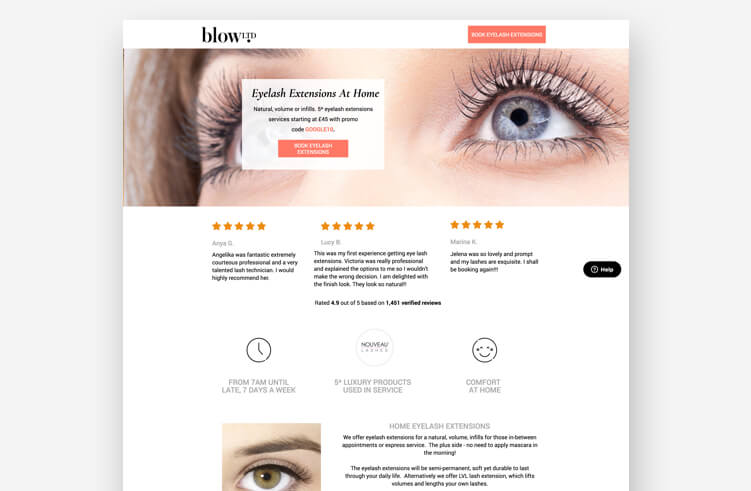
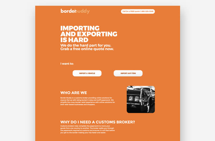
This is a dangerous misconception. Most of the 40 examples cited—from Zumba to Panda7—started with the same tools available to everyone else. Many were built using drag-and-drop builders, starting with a blank template and a clear idea. The difference between those pages and yours isn’t necessarily a multi-million dollar budget; it is the discipline of testing, the clarity of the message, and the willingness to iterate.
Summary: A Checklist for Success
If you are looking to revitalize your landing page strategy, consider these ten steps:
- Define a singular goal for the page.
- Craft a headline that matches your ad copy exactly.
- Include a hero shot that shows the product or service in action.
- Use bullet points to highlight key benefits.
- Add social proof to build credibility.
- Create a high-contrast CTA that stands out from the page colors.
- Minimize navigation links to prevent visitors from leaving.
- Optimize for mobile devices—most of your traffic will be on a phone.
- Include a thank-you page to confirm the conversion.
- A/B test everything, from the CTA text to the background image.
The pursuit of a high-converting landing page is a marathon, not a sprint. No page is perfect from the start, but every page has the potential to be better than it was yesterday. By focusing on the user’s needs, maintaining a singular focus, and committing to constant, iterative testing, any business can transform their digital presence into a consistent engine for growth. The tools are available; the principles are clear. The only remaining variable is your action.