In the digital landscape of modern e-commerce, few user interface elements evoke as much visceral annoyance as the aggressive, immediate newsletter pop-up. Picture the scenario: a consumer lands on an online retail storefront, eager to explore product offerings, compare price points, and evaluate material specifications or delivery timeframes. Before their eyes can even adjust to the hero banner, a brightly colored modal slams down across the viewport. It demands an email address in exchange for a meager discount code before the visitor has even established whether the brand sells anything of actual value to them.
Instinctively, the user scrambles to locate the tiny, often deliberately obscured "X" icon to dismiss the interruption. They leave the interaction feeling hurried, undervalued, and mildly antagonized.
For years, digital marketers have leaned heavily on these aggressive overlays, driven by rigid Key Performance Indicators (KPIs) tied directly to lead generation volume. However, a growing body of UX research and real-world case studies reveals a sobering truth: quantity does not equate to quality. Pushing calls-to-action (CTAs) before building a foundational relationship with the user is not just bad design—it is a fundamentally flawed business strategy that burns through marketing budgets, alienates prospective buyers, and fills database lists with garbage data.
Main Facts: The Illusion of High-Volume Lead Generation
At the heart of the modern e-commerce dilemma lies a fundamental disconnect between corporate metrics and human psychology. Business stakeholders are routinely pressured to hit aggressive growth targets. In many organizations, marketing teams are evaluated primarily on the sheer volume of email sign-ups generated within a given quarter.
- The Interruption Problem: UX studies consistently demonstrate that users view any unexpected disruption of their primary task—whether it is a modal, pop-up, or full-screen banner—as a major distraction. When an interface forces a choice upon a user prematurely, it triggers defensive behaviors.
- The Vanity Metric Trap: Loud, intrusive pop-ups are undeniably effective at capturing something, but that something is frequently worthless. When forced to bypass a modal to view content, users often input disposable email addresses, temporary alias accounts, or random keyboard strokes just to clear the screen.
- The Financial Toll: Far from being a harmless tactic, aggressive pop-ups actively cost companies money. Not only do they drive high-intent shoppers away from the site due to friction, but they also inflate Email Service Provider (ESP) billing costs with unengaged, non-existent, or dead email addresses that instantly bounce or get flagged as spam.
Great interface design is ultimately about showing the right things at the exact right moment. True optimization requires understanding when to display a call to action and, just as importantly, how to cultivate brand trust before asking for a user’s personal data.
Chronology: A Case Study in Quantifying the "Bad Lead" Phenomenon
To understand how deceptive optimization metrics can derail a digital strategy, consider the trajectory of a large-scale e-commerce retailer that recently overhauled its approach to lead capture.
Phase 1: The Quest for Maximum Yield
Operating under standard corporate directives to scale its mailing list, the retailer’s digital team spent weeks optimizing a high-impact modal pop-up. They meticulously A/B tested headings, persuasive microcopy, vivid color contrasts, visual backgrounds, and prominent call-to-action buttons.
By the end of the optimization cycle, the pop-up was unmissable. It occupied a dominant space across multiple pages, triggering almost immediately upon arrival.
Phase 2: The Dashboard Celebration
Within weeks of deployment, the strategy appeared to be a resounding success. An internal dashboard lit up with steady, minute-by-minute metrics celebrating a massive surge in new leads. Leadership rejoiced, viewing the soaring subscriber count as concrete proof of marketing efficiency.
Phase 3: The Revenue Disconnect
Weeks turned into months, and management noticed a glaring discrepancy: while the mailing list was expanding exponentially, top-line revenue derived from email campaigns remained completely stagnant.
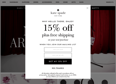
An audit of the database revealed the harsh reality. The list was bloated with "noisy" leads—disposable emails, temporary aliases, and gibberish strings. Because the pop-up interrupted users indiscriminately across nearly every page, it had effectively driven away genuine, high-intent shoppers while attracting only those desperate to dismiss the obstacle.
Phase 4: The Pivot to Subtlety
Recognizing the failure of the aggressive model, the retailer made a bold executive decision: they completely eliminated the intrusive pop-up. In its place, they integrated subtle, contextually relevant newsletter messaging embedded naturally throughout the user journey—strategically positioned near product pricing, embedded within category listings, and neatly woven into post-purchase confirmation emails.
Supporting Data and UX Research: The Psychology of Interruption
The retail case study aligns closely with decades of human-computer interaction (HCI) research. Usability institutions, such as the Nielsen Norman Group, have repeatedly documented user reluctance toward modal dialogs that hijack the browsing experience.
+-----------------------------------------------------------------+
|                    THE USER JOURNEY SPECTRUM                    |
+-----------------------------------------------------------------+
| INTENT: Arrival -> Exploration -> Consideration -> Conversion   |
| ACTION: [Bad UX]  -> Immediate Pop-up (High Friction, Low Trust)|
| ACTION: [Good UX] -> Contextual Prompt (Low Friction, High Trust)|
+-----------------------------------------------------------------+
When a user visits an e-commerce site, their cognitive load is initially directed toward orientation: What is this site? Can I trust it? Do they carry what I am looking for?
Interrupting this critical discovery phase forces the user out of an exploratory mindset and into a defensive stance. Urgency rarely serves the user experience. When a system demands immediate action before value has been demonstrated, it violates foundational principles of reciprocity.
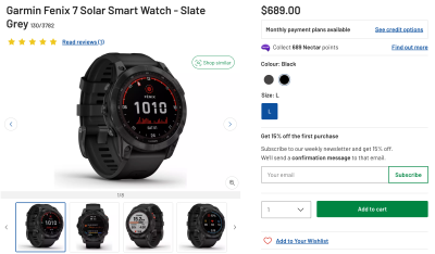
Furthermore, data from email marketing analytics underscore the qualitative difference between forced opt-ins and earned subscriptions:
- Open Rates: Contextually integrated newsletter sign-ups yield significantly higher open rates because the subscriber actually remembers and values the brand interaction.
- Conversion Rates: Users who opt in voluntarily after exploring product quality and pricing demonstrate higher lifetime customer value (LTV).
- Spam Complaints: Subtle, non-modal integrations experience drastically lower spam-flagging rates compared to aggressive overlays.
Strategic Implications: How to Build Sustainable Lead Generation
Transitioning away from high-volume, low-quality lead generation requires a cultural shift within digital teams. It demands moving away from short-term quarterly metrics and embracing a longer, more patient path toward customer acquisition.
1. Master the Timing of the Journey
If brands want a positive response, they must introduce prompts when users are most likely to appreciate them. For an e-commerce site, this might mean offering a newsletter subscription or updates after a user has scrolled through a product specification, added an item to their cart, or completed a purchase.
2. Implement Collapsible, Non-Modal Dialogs
Instead of blocking the screen, modern interfaces should utilize polite design patterns. For instance, placing a clean, collapsible newsletter box adjacent to key product details—such as pricing or shipping info—allows interested users to engage on their own terms. It remains visible yet unobtrusive, respecting the user’s autonomy.
3. Cultivate Trust Before Asking for Data
Brand loyalty cannot be manufactured via aggressive copywriting. It is built by offering transparent pricing, clear delivery options, rich product imagery, and seamless navigation. Once a consumer feels respected by the interface, they are exponentially more willing to exchange their email address for genuine value, such as curation, curation guides, or authentic discounts.

Conclusion: The Path Forward for Interface Designers
The e-commerce retailer that abandoned its massive pop-up learned a valuable lesson: fewer leads, when they are of high quality and genuine intent, outperform millions of dead-end addresses every single time.
By shifting from aggressive interruption to respectful, contextual integration, digital designers can build interfaces that honor the user’s intelligence and time. In doing so, companies secure not just temporary metrics, but loyal, engaged customers who return willingly—proving that in interface design, patience is always the ultimate conversion tool.