In the modern digital landscape, the landing page is the frontline of your marketing strategy. It is the digital "moment of truth" where a curious click turns into a tangible lead or a paying customer. As the fundamental principle of conversion optimization suggests: a polished, professional landing page serves as the bridge to growth, while a cluttered, disjointed experience acts as an immediate barrier to your business goals.
But what defines "professional" in the context of a conversion-focused web page? Is it the aesthetic, the copy, or the technical flow? By analyzing 40 of the most effective landing pages across diverse industries—from SaaS and e-commerce to health and professional services—we can decode the “x-factor” that separates average campaigns from industry-leading performers.

The Foundation: What is a Landing Page?
Before dissecting high-performing examples, we must define the scope. A landing page is a standalone web page created specifically for a marketing or advertising campaign. Unlike a homepage, which acts as a central hub for a business, a landing page is singular in its focus. It is designed to receive traffic from a specific source—an ad, an email, or a social post—and guide the visitor toward one primary conversion goal.

Whether the objective is lead generation, software sign-ups, or e-commerce purchases, the most effective pages share a common DNA: they remove friction, clarify the value proposition, and provide a clear, singular path to action.
Anatomy of an Effective Landing Page
High-converting pages do not rely on luck. They are engineered to guide the human eye and the user’s decision-making process. Several universal qualities define these pages:

- Laser-Focused Messaging: The headline must immediately address the visitor’s intent and align with the ad or link they just clicked.
- Benefit-Driven Copy: Great pages don’t just list product features; they explain how the solution solves a specific pain point.
- Visual Hierarchy: Using clean design to draw attention to the Call-to-Action (CTA).
- Social Proof: Testimonials, user counts, and trust badges reduce anxiety and build credibility.
- Optimized Friction: Forms should ask only for what is necessary to reduce the psychological barrier to conversion.
A Chronology of Conversion: Analyzing the Leaders
To understand how these principles manifest, we can categorize these 40 examples by their strategic focus.

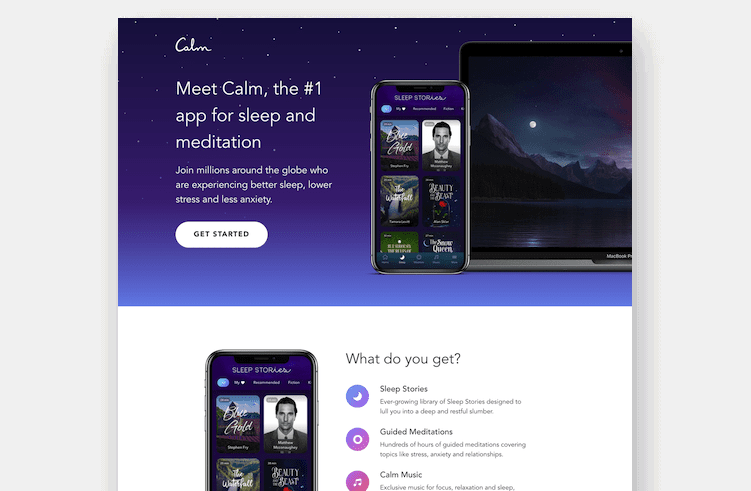
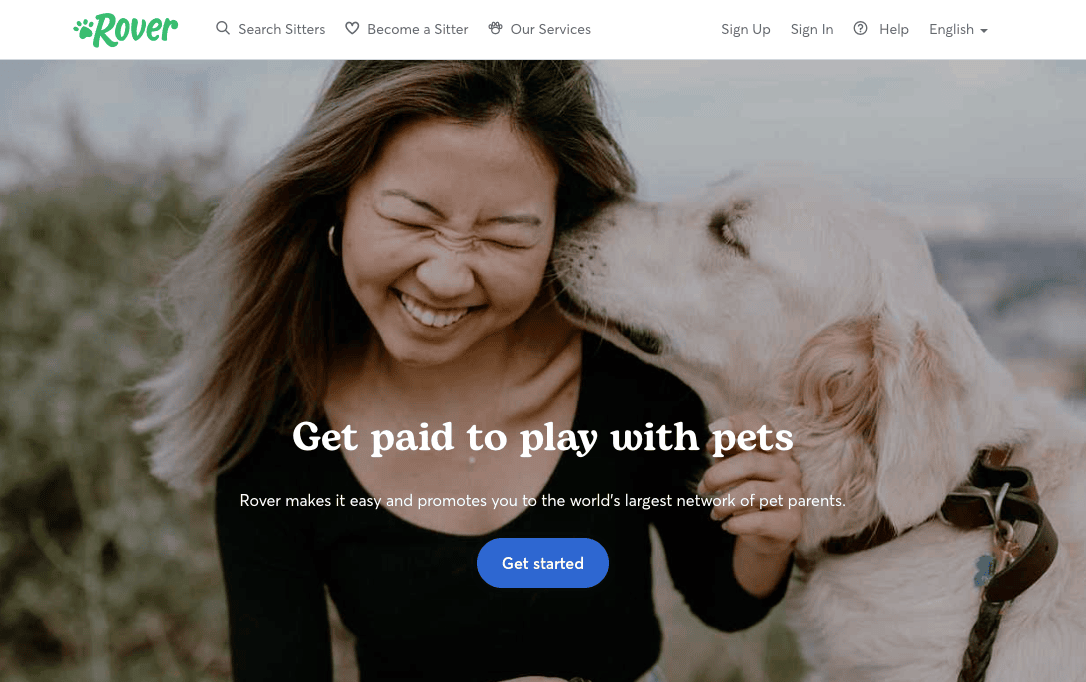
1. The Power of Simplicity (SaaS and Entertainment)
Brands like Netflix and Spotify have mastered the art of minimalism. Netflix, which has scaled to over 300 million subscribers, utilizes a landing page that focuses exclusively on its core value proposition: unlimited entertainment at a low cost. There is no clutter, no distracting navigation, and the path to a paid subscription is immediate.

Similarly, Spotify doesn’t waste real estate explaining the basics of music streaming. Their brand recognition is universal, so they focus entirely on the "stream now" action, shortening the time from arrival to audio playback.

2. Solving Complex Problems (Finance and Real Estate)
Industries like finance and real estate often face high consumer skepticism. Panda7 (car insurance) and HomeLoanGurus (mortgage leads) combat this by breaking down complex processes into simple, digestible steps. By using clear, benefit-oriented language, they transform a boring, high-friction process into a manageable task, encouraging users to apply with confidence.

3. Emotional Storytelling (Health and Nutrition)
For lifestyle brands like Grass Roots or Smalls (pet food), the emotional connection is paramount. These brands use their landing pages to guide the visitor through a customer journey—from identifying a problem (e.g., poor quality food) to providing a premium, human-grade solution. Their pages are designed to build trust through transparency and imagery, which is often more effective than aggressive, sales-heavy tactics.

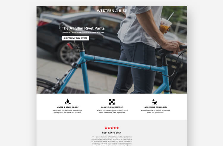
4. Direct, Benefit-Oriented Design (E-commerce)
Western Rise and Goby excel at showing, not just telling. By using high-quality photography and punchy, benefit-driven copy, they make the "why" behind their products immediately apparent. These pages are effective because they tap into the user’s desire for an elevated experience, whether that’s a better toothbrush or a more comfortable pair of trousers.

Data-Driven Implications
Research consistently shows that technical elements significantly impact performance. For instance, adding video content to a landing page can increase conversion rates by as much as 86%. Furthermore, studies on mobile responsiveness show that pages failing to load or function seamlessly on smartphones lose nearly 50% of their potential traffic before the visitor even engages with the content.

The most successful campaigns, such as those analyzed for Bariatric Eating, have demonstrated that a strong, unique brand personality—coupled with a user-centric design—can yield conversion rates exceeding 39%. These metrics underscore a vital truth: conversion rate optimization (CRO) is not about "tricking" users into clicking; it is about providing the clearest possible path for a user to achieve what they came for.

The "Michael Jordan" Effect: Why You Shouldn’t Be Intimidated
When looking at these high-performing examples, it is easy to fall into a trap of "conversion envy." It’s common to feel that because your business is smaller or your budget is tighter, these levels of success are unreachable.
However, it is crucial to remember that almost all these companies—even the industry giants—started exactly where you are: with a blank page, a brand identity, and a core hypothesis. Many of the pages listed were built using drag-and-drop builders, meaning they were constructed without the need for an army of developers.
The secret is not the budget; it is the iterative process. No page is ever truly "finished." The best marketers treat their landing pages as a continuous experiment. By employing A/B testing, they constantly refine their headlines, CTA buttons, and form lengths to better serve their specific target audience.
Conclusion: Implementing Your Strategy
To move from inspiration to action, follow this 10-step framework:
- Define your goal: Ensure you have one, and only one, conversion objective.
- Match your intent: Ensure the headline of your page matches the messaging of your ad or email.
- Draft compelling copy: Focus on benefits, not features.
- Simplify your form: Only ask for information you truly need to start the relationship.
- Use a strong hero shot: Show the product in use or the result of the service.
- Add social proof: Use testimonials or trust symbols.
- Optimize for speed: Ensure your page loads in under three seconds.
- Ensure mobile-first design: Most traffic will reach you via a smartphone.
- Include a clear CTA: Make it pop with high-contrast colors.
- Test and iterate: Never settle for the first version; always be A/B testing.
Landing pages are not a "set it and forget it" component of your business. They are living, breathing assets that require constant care and attention. By studying these 40 examples, you aren’t just looking at pretty designs; you are looking at the mechanics of growth. Take the lessons, start with your own blank canvas, and build a page that turns your visitors into your biggest fans.