In the high-stakes world of B2B SaaS, the "Request a Demo" button is often treated as the ultimate holy grail of conversion. Yet, for many marketing teams, this button has become a source of intense friction. Sales departments complain about a lack of lead volume or, worse, poor lead quality. In response, marketing teams often reflexively funnel more budget into paid ads, hoping to brute-force their way to higher numbers.
The reality, however, is that this approach often backfires. Treating a demo request as a "low-friction" call to action (CTA) is a fundamental miscalculation. Asking a prospect to commit their time to a sales conversation is a significant hurdle, far removed from the ease of downloading an e-book or attending a webinar. As the B2B landscape shifts toward longer, more complex buying cycles—averaging 211 days with 88 distinct touchpoints, according to Dreamdata’s 2025 LinkedIn Ads report—the "demo-first" mentality is proving to be obsolete.
The Anatomy of the Buyer Journey
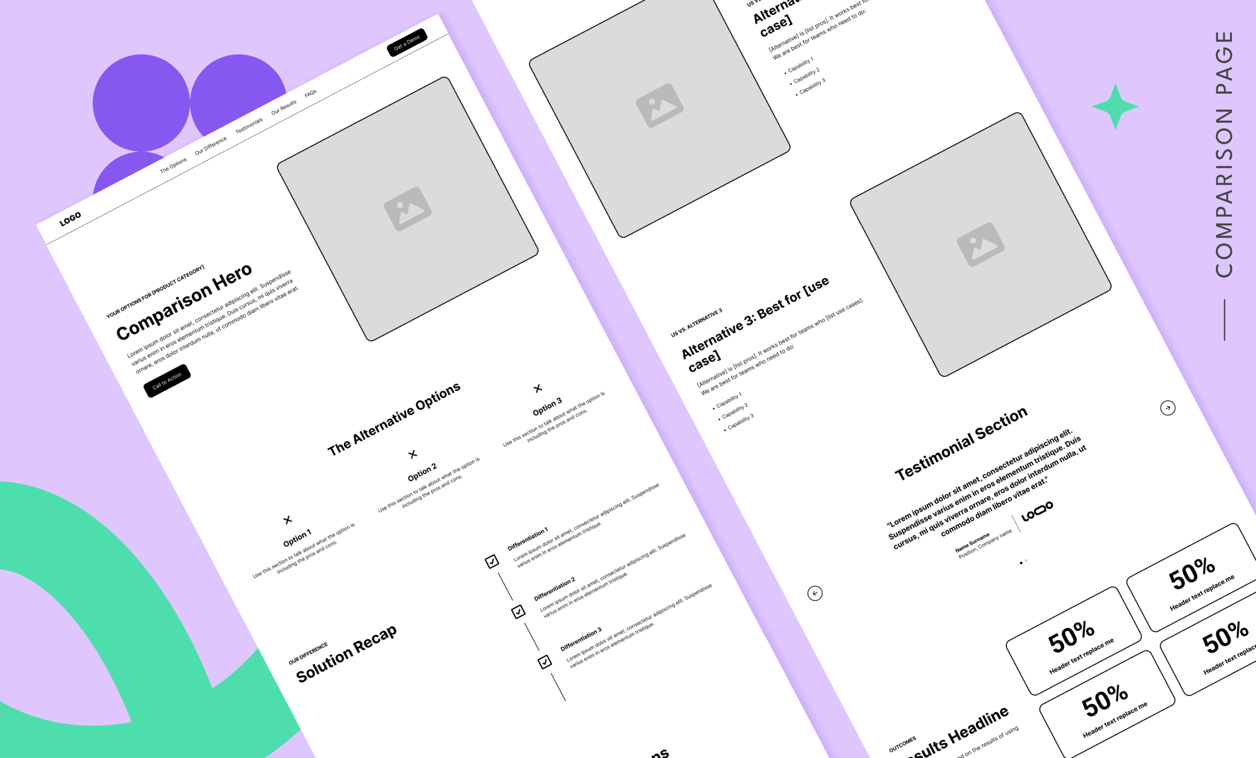
To understand why demo pages fail, one must first understand where they sit in the buyer’s journey. A "Request a Demo" form should never be the first point of contact. By the time a user arrives on a demo landing page, they should have already navigated through the "Core Four" stages of research: they understand their problem, they have explored potential solutions, they have compared alternatives, and they have identified your company as a viable, trustworthy contender.
According to industry data, only 3% to 5% of your target market is in an active buying cycle at any given moment. When you blast cold traffic at a demo page, you are effectively trying to force a stranger to checkout before they have even browsed the aisles. The landing page is not a magic wand that transforms cold, uneducated visitors into sales-ready leads; it is a final, critical checkpoint for those who are already warm and ready to move.
Data-Driven Benchmarks: What Success Looks Like
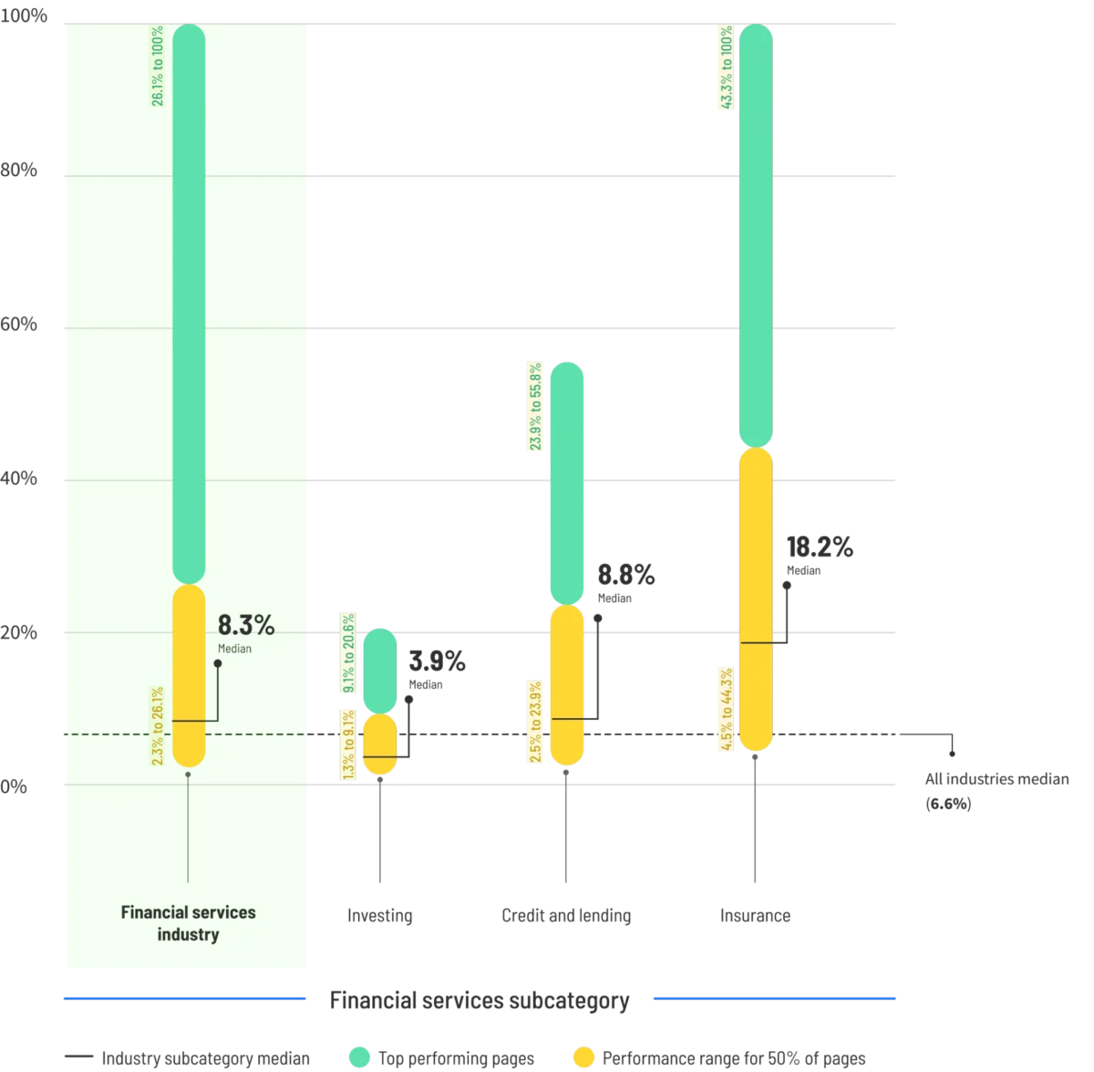
Performance metrics for demo pages are often misunderstood. Unbounce’s 2024 Conversion Benchmark Report places the median conversion rate for SaaS landing pages at approximately 3.8%. Landing page strategist Tas Bober suggests that a realistic, high-intent benchmark hovers closer to 3.1%.
These figures are not merely targets; they are indicators of traffic quality. If your conversion rate is significantly lower, the problem is likely not your headline font or your button color—it is your targeting. You cannot optimize your way out of a funnel that is being fed by the wrong audience. Once you shift your strategy to sending only high-intent, well-researched buyers to your page, these benchmarks become the floor, not the ceiling.
Seven Common Pitfalls in Demo Landing Page Design
Before attempting to optimize, teams must audit their existing pages for these seven common mistakes:
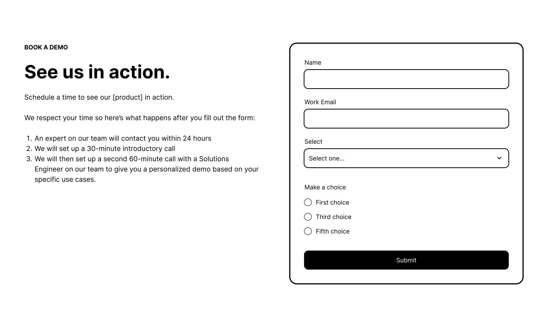
- Ignoring the "What Happens Next" factor: Buyers are often afraid of being bombarded by aggressive sales calls. If you don’t explain the process, you create anxiety.
- Over-complicating the form: Data indicates that every field added after the fifth one leads to a significant drop in conversion.
- Missing a navigation structure: Modern search algorithms reward pages that provide clear paths to relevant information. Removing all exit points is an outdated strategy.
- Lacking social proof: A single testimonial isn’t enough. You need to demonstrate scale and credibility.
- Hiding the "Who": If your solution is for a specific industry, your page needs to speak their language, not generic SaaS buzzwords.
- Neglecting the "Core Four" alignment: The demo page should feel like a natural evolution of the content the user consumed earlier in the journey.
- Failing to disclose pricing: While often a point of contention, failing to provide even a price range can deter serious, budget-conscious buyers.
Structuring the Perfect Demo Page: A Block-by-Block Guide
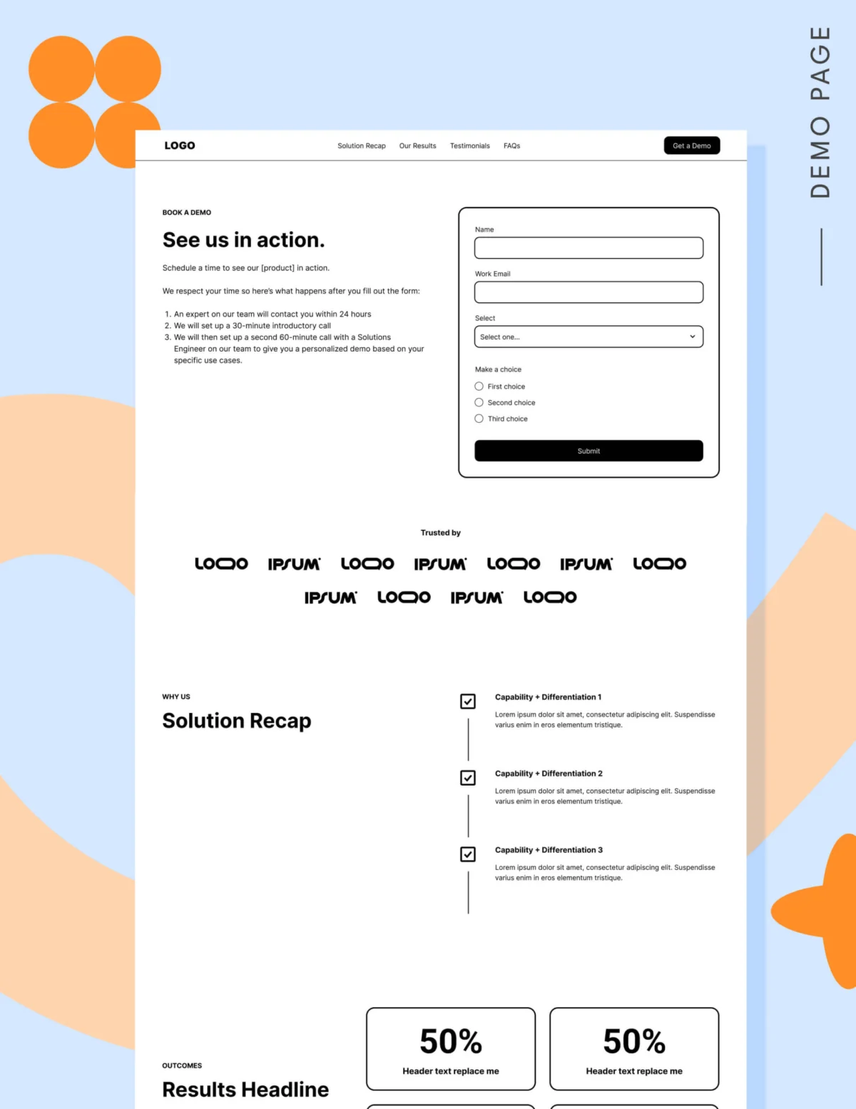
A high-converting demo page must be engineered to remove friction. Here is how to construct the essential components:
The Hero Section
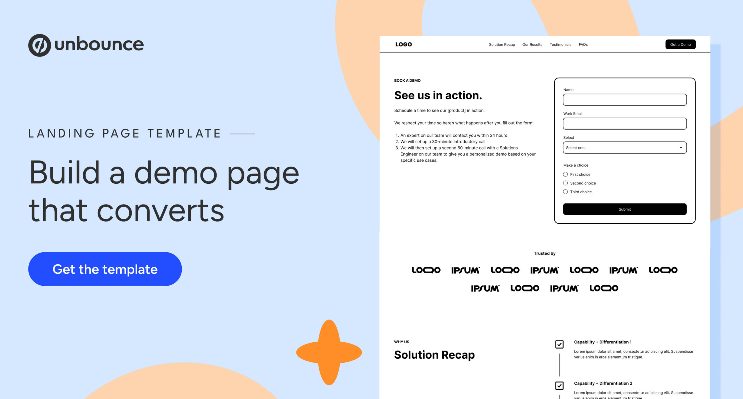
This is the only place on your site where the form belongs "above the fold." The hero should clearly state the value proposition while explicitly detailing what happens after the submission. Are they getting a 15-minute consult? A personalized demo? Be clear to minimize apprehension.
The Navigation and Footer
While older strategies dictated removing all navigation to prevent "leaks," current best practices—and updated Google ad quality models—suggest otherwise. Use an anchor-link navigation for the page itself, and use the footer to link to your other educational resources. This allows the hesitant buyer to continue learning without leaving your ecosystem.

Logo Gardens and Social Proof
Credibility is currency. If you have recognizable clients, display them prominently. If not, use high-quality, specific testimonials. Aim for a volume of reviews; the number of testimonials is often just as important as their content in signaling that others have safely navigated the decision-making process.
The "Solution Recap" and Results
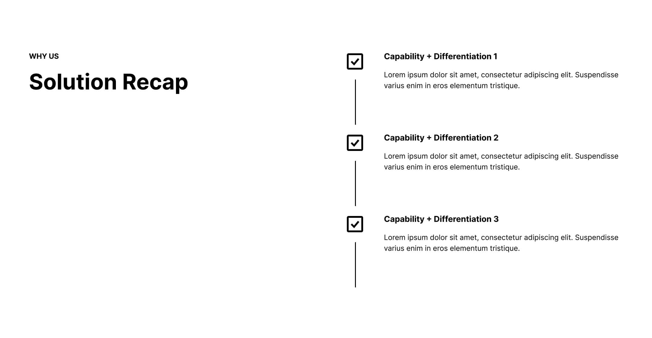
Buyers don’t absorb information linearly. Reiterate your differentiators—why you, and why now—and support these claims with hard, quantifiable results. Use metrics like "saved 10 hours per week" or "increased ROI by 25%."
Addressing Objections through FAQs
Use the FAQ section to tackle the "last-mile" concerns. What is the implementation timeline? Do you integrate with our current stack? Use this space to mirror the objections your sales team hears most often during discovery calls.
The Pricing Debate: To Show or Not to Show?
For sales-led organizations, the debate over showing pricing is intense. However, providing a starting range or a condensed pricing grid can act as a powerful qualification filter. It prevents your sales team from wasting time on prospects with mismatched budgets and empowers the buyer to self-select, which creates a more transparent, trusting dynamic from the first interaction.
Optimizing for the Human, Not the Bot
When deciding between a traditional form and an automated scheduling tool like Calendly, consider your sales process. A form is generally superior when you need to qualify leads through specific questions (e.g., "What is your primary use case?"). Scheduling tools are excellent for high-velocity, high-intent traffic, but they can lead to "calendar chaos" if not managed correctly.
Regardless of the tool, remember that the buyer’s primary fear is a lack of control. By using language like "Book a 20-minute consultation" rather than the generic "Request a Demo," you change the psychology of the click. You aren’t asking them to buy; you are asking them to collaborate.
Final Implications: The Holistic View
Fixing your demo page is a secondary task. The primary task is fixing your alignment between marketing and sales. If marketing sends the right traffic—people who have moved through the education phase—the sales team’s job becomes significantly easier.
The ultimate goal of a demo landing page is not to capture a lead at any cost; it is to offer a seamless bridge to the next stage of the partnership. By focusing on clarity, providing adequate proof, and respecting the buyer’s position in their own journey, you stop treating the demo request like a demand and start treating it like the partnership it is meant to be.
When you stop trying to trick the buyer into a conversation and start providing the exact information they need to say "yes," you will find that the quality—and the quantity—of your demo requests will naturally follow.