
In the seminal text on user-interface design, Don’t Make Me Think, author Steve Krug introduced a foundational truth of digital architecture: every question a website forces a user to ask introduces hesitation. When shoppers are confronted with ambiguous phrasing, confusing layouts, or unclear product specifications, their attention shifts away from discovering a product or completing a transaction. Instead, they are forced to spend mental energy decoding the website itself.
According to Krug’s model, consumers approach an e-commerce platform with a finite "reservoir of goodwill." Every moment spent calculating pack sizes, wondering whether a price applies to individual units or bulk cases, or trying to convert measurements drains that reservoir. Once the goodwill is exhausted, shoppers abandon the cart entirely.
While pricing and shipping transparency are widely discussed strategies for reducing cart abandonment, forward-thinking direct-to-consumer (DTC) brands are taking friction reduction a step further. By utilizing intuitive visual cues, situational labeling, and outcome-based naming conventions, these companies are eliminating minor cognitive hurdles before they can compound into lost sales.
Main Facts: The Psychology of E-Commerce Friction
The modern e-commerce landscape is hyper-competitive, and attention spans are shorter than ever. When consumers land on a product page, they are looking for immediate validation of their purchasing intent.

- The Cost of Hesitation: Ambiguity regarding product quantities, packaging formats, and serving sizes forces customers to pause. This pause creates mental friction, disrupting the smooth flow from discovery to checkout.
- The "Goodwill Reservoir": Every instance of confusion—whether it is calculating how many fluid ounces equal a serving or determining whether a price represents a single item or a bundle—chips away at the buyer’s patience.
- Proactive Clarity: Leading brands are shifting the burden of calculation away from the consumer. By replacing abstract numbers with relatable contexts, they make purchasing decisions frictionless.
Chronology: The Evolution of User Experience (UX) in Digital Retail
To understand why modern brands are obsessing over micro-details like quantity labels, it is helpful to look at how e-commerce interfaces have evolved over the past three decades:
- Late 1990s – Early 2000s (The Digital Catalog Era): Websites simply mirrored physical mail-order catalogs. Product pages featured dense blocks of text, static images, and basic dropdown menus. The primary goal was simply getting inventory online.
- Mid-2000s (The Rise of Usability): With the publication of Steve Krug’s Don’t Make Me Think in 2000, web designers began prioritizing simplicity. Navigation bars became cleaner, and checkout processes were streamlined into fewer steps.
- 2010s (The Mobile-First Shift): As smartphones transformed shopping habits, screen real estate shrank dramatically. Long descriptive paragraphs became liabilities. Brands had to convey value, pricing, and sizing instantly on small screens.
- Present Day (Contextual and Outcome-Based Design): Today’s top-performing brands recognize that removing friction goes beyond clean layouts. They are redesigning product options around human behavior—such as social occasions, household sizes, and daily routines—eliminating the need for mental math altogether.
Supporting Data: Real-World Examples of Frictionless Design
Several innovative brands have restructured their product pages to eliminate the specific types of math and guesswork that typically frustrate online shoppers.
1. Contextual Occasions Instead of Abstract Quantities: Gush
Beverage brand Gush approaches pack-sizing through the lens of human experience rather than raw numbers. On its product pages, pack sizes are labeled by social scenarios: "With a Friend" (12-pack, $35.99), "With the Crew" (24-pack, $64.99), and "For the Party" (48-pack, $124.99).
By pairing the exact pouch counts with intuitive lifestyle labels, Gush does the math for the consumer. Instead of forcing shoppers to calculate how many drinks they need for an upcoming weekend gathering, the interface allows them to simply select the kind of night they are planning.

2. Absolute Clarity on Unit Formats: Waju
One of the most common friction points in online shopping is ambiguity regarding packaging units—specifically, whether a displayed price and quantity field refers to an individual unit or an entire case.
Beverage maker Waju addresses this head-on. The brand’s mobile product page features a prominent, high-contrast quantity selector labeled "Cases." Directly beneath the field, a clear explanatory line reads: "1 case (12 cans), $34.99." By making the packaging structure unmistakable, Waju ensures that customers never experience the anxiety of second-guessing what will arrive at their doorstep.
3. Outcome-Based Product Naming: Blueland
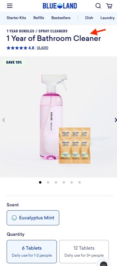
Cleaning product innovator Blueland transcends traditional inventory descriptions by naming products after consumer outcomes rather than raw material counts.
Instead of forcing users to calculate how many dissolvable tablets are required for a specific number of household members over a given timeframe, Blueland offers options such as "1 Year of Bathroom Cleaner." The accompanying interface guides the user with straightforward household brackets (e.g., 6 tablets for daily use by 1–2 people; 12 tablets for 3 or more). The shopper buys a defined span of time and cleanliness, rather than a collection of chemical refills.

4. Visual Portions and Daily Pricing: The Farmer’s Dog
Subscription pet food brand The Farmer’s Dog completely re-engineers how pet owners evaluate the cost and quantity of dog food. Rather than displaying arbitrary box weights, total grams, or bulk shipment totals, the brand presents the decision through three distinct visual bowl sizes (representing full, half, and smaller portions).
Crucially, the pricing is displayed per day rather than per box, aligning precisely with how dog owners budget for pet care. A concise explanatory sentence below the options—"Contains two weeks of food"—anchors the selection, ensuring shoppers never have to manually convert shipment sizes into daily realities.
Official Responses and Industry Perspectives
UX researchers and conversion rate optimization (CRO) experts have long advocated for the removal of cognitive friction, noting that minor design adjustments often yield disproportionate revenue gains.
Industry analysts point out that digital consumers operate in a state of continuous partial attention. When a retail site introduces an unnecessary cognitive tax—such as forcing a user to multiply cans per case or calculate monthly consumption rates—the biological response is hesitation.
"The best e-commerce interfaces do not merely present information; they absorb cognitive load," notes one leading digital retail strategist. "When a brand like The Farmer’s Dog shows a dog bowl instead of a box weight, or when Gush labels a 24-pack as ‘With the Crew,’ they are speaking the customer’s native language. They are replacing math with empathy."
Furthermore, usability labs consistently find that cart abandonment spikes not just at the checkout screen, but upstream on product detail pages (PDPs) where users feel uncertain about what they are actually purchasing. By building clarity directly into selectors and nomenclature, brands build long-term trust and protect their "goodwill reservoir."
Implications for the Future of E-Commerce
As direct-to-consumer retail continues to mature, the brands that win market share will be those that master invisible design—interfaces so intuitive that shoppers move from curiosity to purchase without experiencing a single moment of doubt.
- The Death of Raw Data Displays: Displaying raw numbers (e.g., "12 oz pouches," "24-count cases") without context is becoming an outdated practice. E-commerce design is shifting toward relational metrics that tie products directly to human routines.
- Visual-First Decision Making: As demonstrated by pet food and beverage brands, visual aids—such as serving bowls, lifestyle situations, and daily cost breakdowns—outperform traditional text descriptions in reducing hesitation.
- Reduced Reliance on Customer Support: When product pages clearly communicate quantities, outcomes, and portions, customer service inquiries regarding shipping contents and order sizes naturally decrease, lowering operational overhead.
Ultimately, Steve Krug’s core philosophy remains more relevant than ever. In an online store, every question is an obstacle. By anticipating shopper uncertainties and answering them before they are even articulated, modern e-commerce brands are proving that the most successful conversion strategy is simply making the right choice feel effortless.