In the realm of digital product development, language is our primary conduit for connection. Just as writers rely on syntax and vocabulary to convey nuance, designers employ a sophisticated "visual language"—a lexicon of fonts, colors, shapes, and iconography—to facilitate interaction between humans and machines. A robust visual design language (VDL) is not merely an aesthetic layer; it is the cornerstone of functional excellence. As Steve Jobs famously remarked, "Design is not just what it looks like and feels like. Design is how it works."
This article explores the fundamental role of design language through the lens of a massive undertaking: the 2016 redesign of Huawei’s EMUI 5 interface, led by the team at Fantasy.
The Tower of Babel: Why Design Language Matters
At its inception, Huawei’s mobile operating system faced a systemic crisis of identity. The company relied on a heavily customized iteration of Android, but the result was a disjointed experience plagued by inconsistency. This was not due to a lack of talent, but a lack of a unified system. Multiple teams—UX designers, interaction specialists, and graphic designers—worked in silos, each "grasping at straws" to communicate.
Without a singular, cohesive design language, the OS became a "Tower of Babel." User experience suffered, and integrating updates became an engineering nightmare. For global tech giants, a VDL serves as the connective tissue that aligns brand identity with user perception. When a brand’s visual system is fragmented, the consumer’s trust in the product’s reliability begins to erode.
The Pillars of Effective Design Language
A well-structured VDL provides three critical outcomes: consistency, brand recall, and clarity.
Consistency
In digital design, the absence of physical constraints allows for infinite experimentation. While liberating, this often leads to a "Frankenstein" user interface. By defining reusable, cross-platform components, companies can maintain a consistent look and feel across a multitude of devices. For a company like Huawei, which ships millions of devices across diverse demographics, this standardization is essential for maintaining product integrity.
Brand Recall
Most products on the market suffer from generic design, making them indistinguishable from competitors. A strong VDL establishes a "personality." Through intentional use of typography, animation, and color theory, a product moves from being a utility to being a memorable brand asset. When a user recognizes a specific shadow or motion curve as "Huawei," the brand has succeeded in carving out a unique mental space.
Clarity and Innovation
Minimalism is often the most difficult design goal to achieve. By stripping away visual noise and focusing on essential elements, designers can craft a highly focused experience. Furthermore, in a saturated market, VDL is often the fastest and most cost-effective path to genuine innovation.
The Anatomy of Creation: A Chronology of the Huawei Project
The process of creating a VDL follows the same rigorous rubric as any consumer product: Research, Ideate, Design, Validate, and Implement.
The Research Phase: The UI Audit
Before drawing a single pixel, the team conducted a comprehensive UI audit of the existing Android ecosystem. The goal was to deconstruct the OS into its atomic elements—shadows, line weights, transitions, and button behaviors. By grouping these into distinct categories, the team mapped out exactly where the current system failed to communicate.
Understanding User Perception
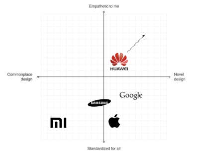
The team analyzed major competitors, including Apple’s iOS, to identify strategic opportunities. They plotted brands on a quadrant to see where they stood regarding "Standardization vs. Unique Identity" and "Function vs. Emotion." The insight was clear: to stand out, Huawei needed to move away from generic Android patterns and embrace a unique, human-centric design philosophy.
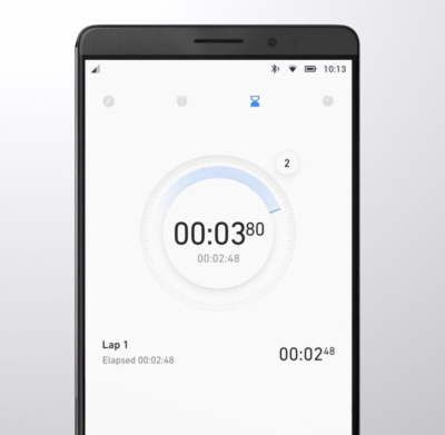
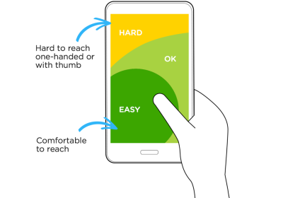
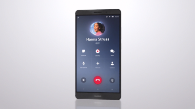
Defining the "Thumb Zone"
A critical discovery during the research phase was the physical ergonomics of modern smartphones. While screen sizes had ballooned by 2016, most functional elements in Android remained anchored at the top of the screen. This forced users to stretch their thumbs, causing frustration. The team proposed moving all core interactive elements to the bottom—the "Thumb Zone." Though radical at the time, this shift anticipated the current industry standard for one-handed mobile navigation.
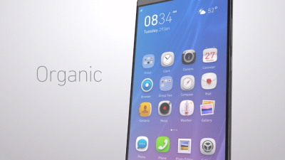
The Philosophy of Organic Design
To ensure the interface resonated globally, from the Americas to Asia, the team adopted the philosophy of "Organic Design." Influenced by the work of Frank Lloyd Wright, the team focused on creating harmony between people and nature.
This manifested in the UI through:
- Softened Geometry: Moving away from harsh, jagged edges to rounded, organic forms.
- Motion as Narrative: Motion was not just used for transitions; it was used to "breathe life" into the interface. Every animation was measured against a motion manifesto to ensure it provided both functional feedback and emotional delight.
- The "Magic" Moments: The team prioritized "surprise and delight" interactions, ensuring that simple tasks felt polished and responsive.
Implementation: The Great Compromise
Despite the strength of the design framework, the transition from concept to production highlighted a perennial issue in large-scale corporations: the "implementation gap."
In many cases, the final product delivered to the consumer did not perfectly mirror the initial design vision. Engineering teams, often operating under tight technical constraints or legacy limitations, sometimes opted for the path of least resistance. This is a common hurdle—when designers are excluded from the final implementation phase, the original intent is often diluted.
Reflecting on this, it becomes clear that design success requires a top-down mandate. Just as Steve Jobs famously forced his engineers to build the specific "minimize" animation for macOS, a product’s design language needs a champion at the executive level who understands that the look and feel are not secondary to the code—they are the code.
Implications for Future Product Development
The evolution of the Huawei EMUI 5 interface serves as a case study for the entire industry. It demonstrates that a visual design language is not a static document; it is an evolving ecosystem.
- Validation is Non-Negotiable: Teams must embrace the "Build-Measure-Learn" cycle. By incorporating designs into functional prototypes early, teams can catch usability flaws long before they hit the mass market.
- Designers Must Be Developers: The divide between "visual designers" and "engineers" must be bridged. The best products emerge when designers understand the technical constraints of the platform, and engineers understand the emotional intent of the design.
- Semantics Matter: There are no "random" visual elements. Every icon, color choice, and transition should serve a specific purpose. If an element does not contribute to the user’s understanding or delight, it is clutter.
Conclusion
A robust visual design language is the heart of good UX. It reduces friction, creates delight, and acts as the bridge between a company’s corporate goals and the user’s actual needs. The journey of the EMUI 5 interface reveals that while the path to a perfect, unified system is fraught with organizational challenges, the investment is worth it.
When form is perfectly paired with function, the interface disappears, leaving only the user and their experience. In an era where digital products are the primary way we interact with the world, the "language" we choose to build our interfaces with is the most important decision a company can make. As we look toward the future of UI/UX, the companies that prioritize a coherent, human-centric design language will be the ones that define the next generation of technology.