For many SaaS organizations, the "Request a Demo" button is treated as a low-friction call-to-action (CTA). Marketing teams often blast this CTA across social media and search ads, expecting a steady stream of high-intent leads. Yet, when sales pipelines stall, the immediate reaction is often to blame the landing page’s design or copy.
However, according to industry experts and recent benchmark reports, the problem is rarely just the page—it is a fundamental misunderstanding of where the buyer stands in their journey. In an era where the average B2B customer journey spans 211 days and involves 88 touchpoints, forcing a demo request too early is the most common reason for conversion failure.
The Misalignment: Why "Request a Demo" Isn’t a Quick Win
The modern B2B buyer is more autonomous than ever. By the time they reach your demo landing page, they have likely already consumed multiple white papers, attended webinars, and compared your solution against your competitors. Asking a prospect to commit to a sales conversation—which they often perceive as a high-pressure environment—is a significant barrier.
Recent data from Dreamdata’s 2025 LinkedIn Ads Benchmark Report reinforces this complexity. Because high-investment software decisions require significant trust-building, attempting to push a demo before the buyer is truly ready results in high bounce rates and low-quality lead volume. Marketers must accept that only 3–5% of the total addressable market is in an active buying cycle at any given time. Treating the other 95% with the same aggressive, sales-heavy messaging is not just ineffective; it is actively damaging your brand’s perception.
A Chronology of the Buyer’s Journey
To understand why your demo landing page may be underperforming, you must map it to the buyer’s timeline. A successful conversion follows a logical progression:
- Awareness & Education: The prospect identifies a pain point. They are looking for information, not a salesperson.
- Research & Comparison: The prospect is building a shortlist. They are looking for social proof, case studies, and feature comparisons.
- The "Core Four" Phase: Before a demo, the prospect needs to interact with the essential pillars of your marketing: the product page, the pricing page, the case studies, and finally, the demo page.
- The Decision: The prospect is now "warm." They understand the problem, they know who you are, and they are convinced you might be the right fit. This is the only time they are ready to land on your demo page.
If your demo landing page is the first place they encounter your brand, the conversion rate will inevitably suffer. The page should act as the "final gate"—a place to answer last-minute objections rather than an introduction to your core value proposition.
Supporting Data: Benchmarks and Reality
According to Unbounce’s 2024 Conversion Benchmark Report, SaaS landing pages hover around a median conversion rate of 3.8%. Landing page specialist Tas Bober, who has analyzed high-performing B2B campaigns, notes that realistic expectations for a dedicated demo landing page fall in the 3.1% to 4% range.
When these numbers dip, teams often panic and begin A/B testing minor variables like button colors or headline font sizes. However, data suggests that the "performance ceiling" is usually dictated by the traffic quality. If you are sending cold, top-of-funnel traffic to a bottom-of-funnel offer, no amount of optimization will fix the conversion rate.
Furthermore, form length is a critical factor. Data from 2026 conversion benchmarks shows a sharp drop-off in completions once a form exceeds five fields. A conversion rate of 17% for a five-field form can plummet to under 7% once the form expands to ten or more fields.
The Anatomy of a High-Converting Demo Page
Once you are driving the right traffic to the page, the design must be laser-focused on reinforcing the buyer’s confidence. Every element should serve to eliminate friction.

1. Strategic Navigation
While conventional wisdom once dictated that landing pages should be isolated islands with no exit points, modern search engines like Google now reward pages that align with user intent. Including an anchor-link navigation allows users to jump to the sections they care about—like "Pricing" or "Results"—instead of hitting the "Back" button when they feel overwhelmed.
2. The Hero Section
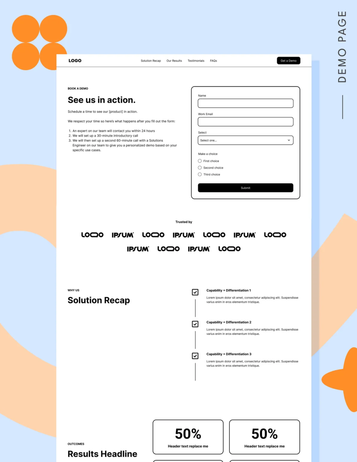
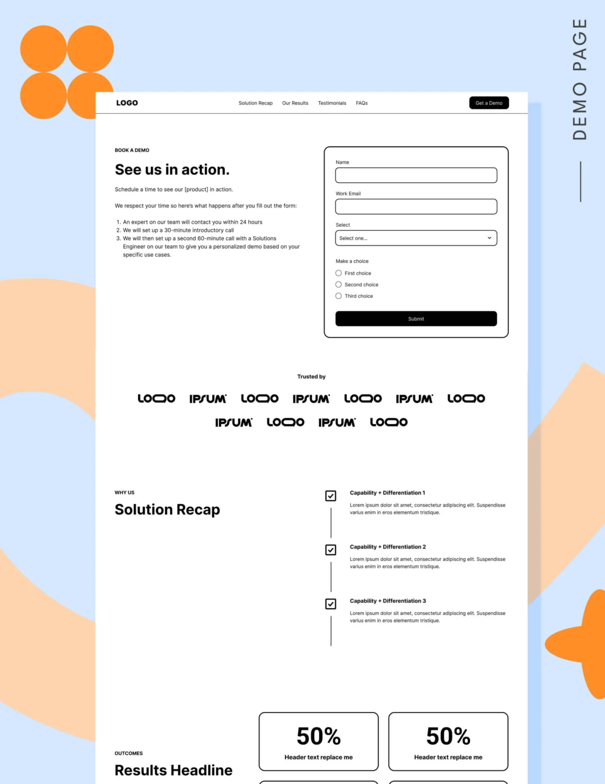
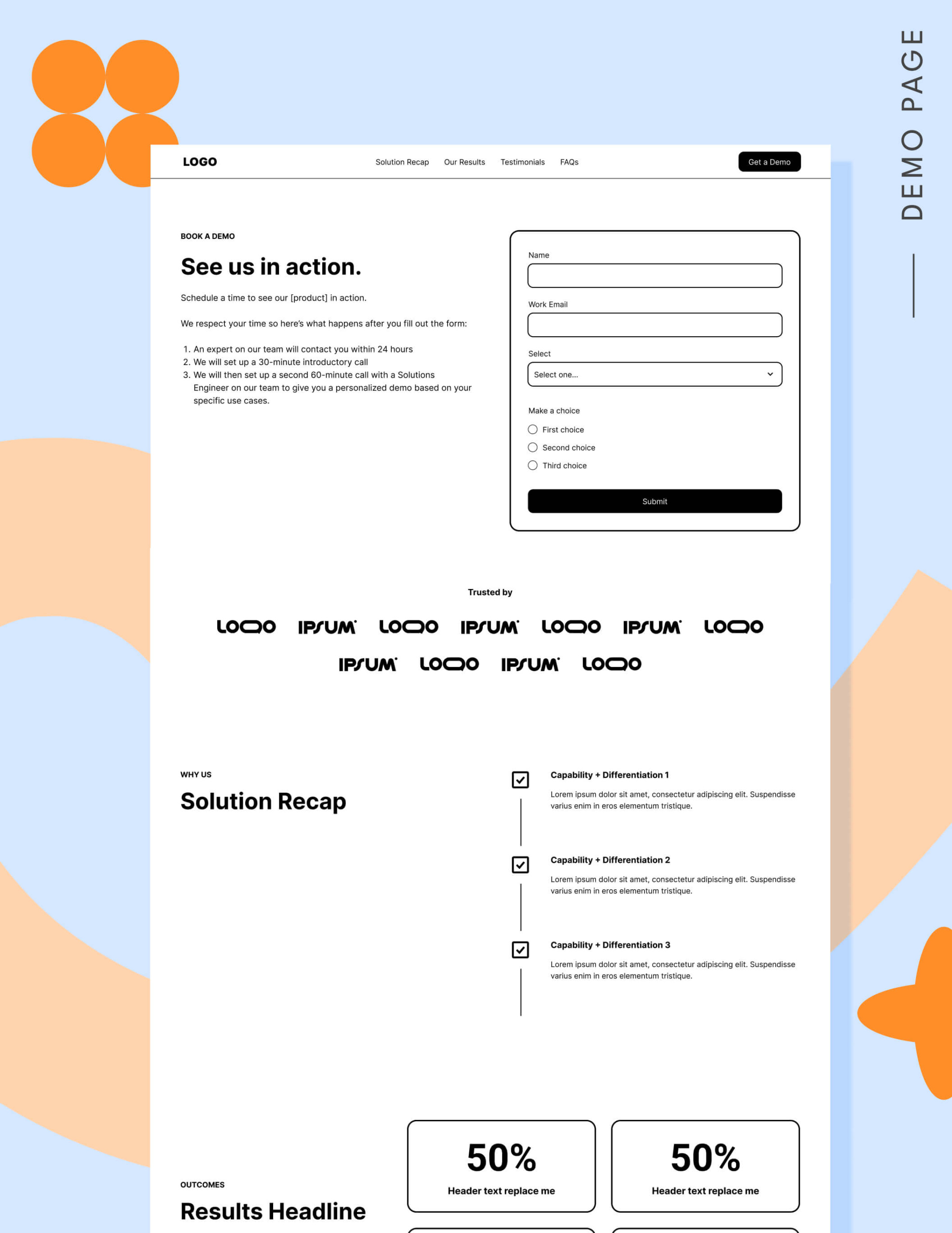
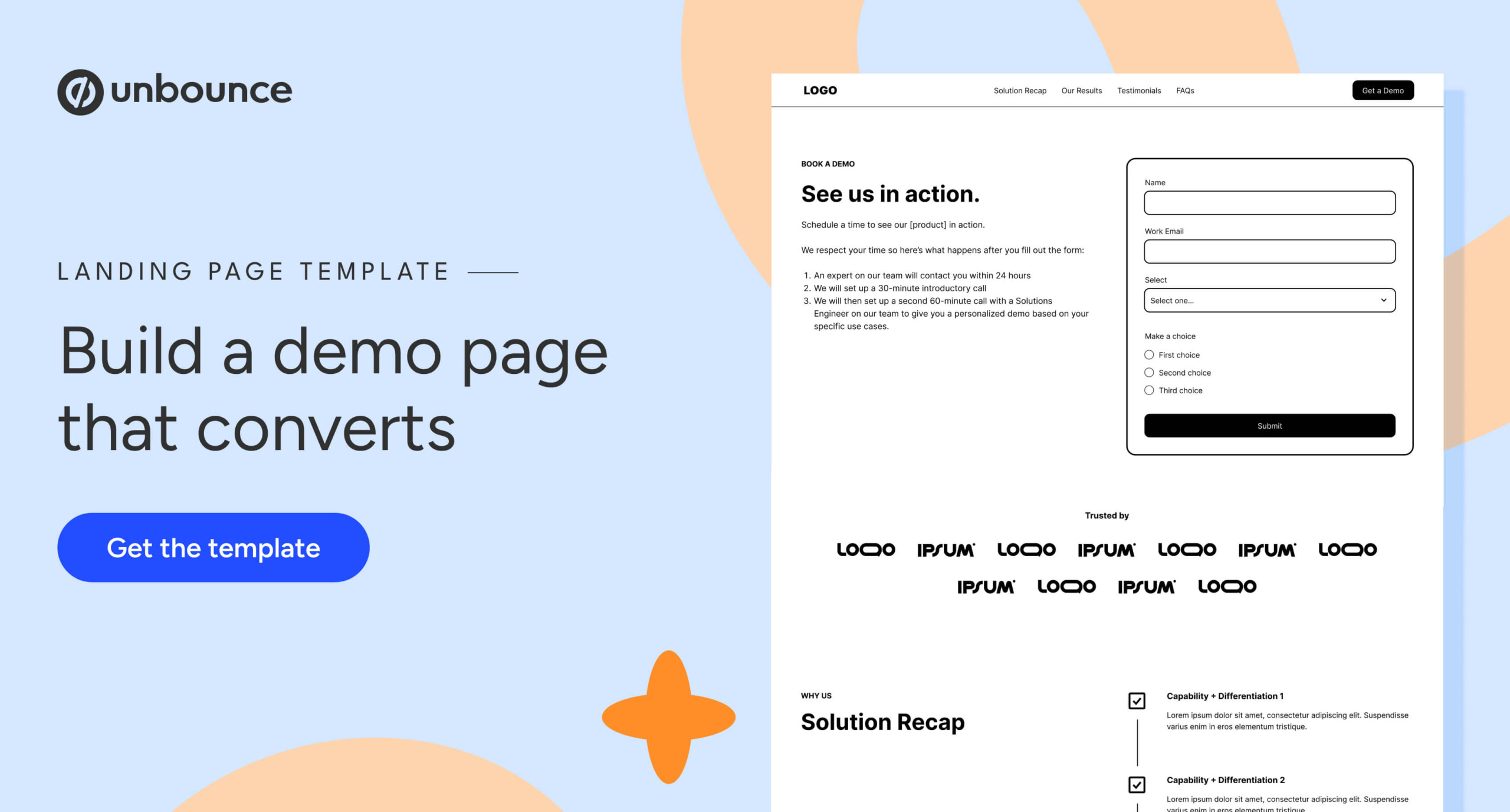
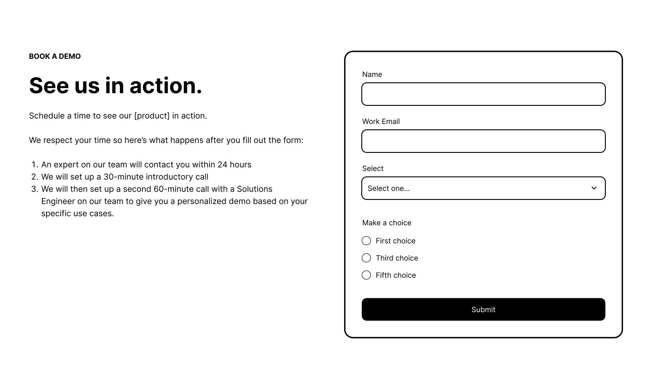
This is the only place on a landing page where placing a form above the fold is encouraged. However, the hero must also clearly articulate the "post-submission experience." If a user doesn’t know whether they will receive an email, a phone call, or a video link, they will hesitate.
3. The "Trust Stack"
If your audience is familiar with your industry, a logo garden of existing customers is vital. If your brand is not yet a household name, replace logos with specific, results-oriented testimonials. A single quote that reads "We reduced our reporting time by 40% using [Product]" is infinitely more persuasive than a vague endorsement.
4. Transparent Pricing
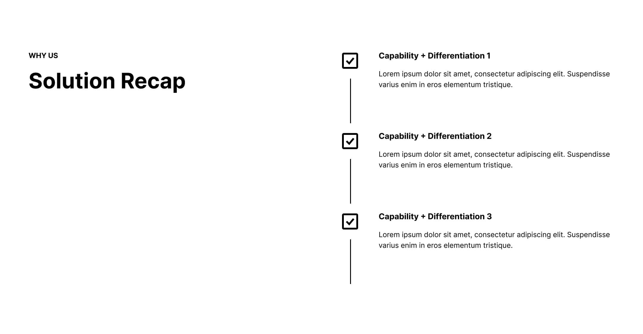
Even for sales-led organizations, the lack of pricing information is a major friction point. Providing a "starting at" range or a condensed pricing grid acts as a self-qualification tool. It ensures that the leads reaching your sales team are not only interested but also have the budget to purchase, saving both the buyer and the salesperson significant time.
Implications for Sales and Marketing Alignment
Perhaps the most significant implication of these findings is the need for tighter synchronization between sales and marketing teams. Marketing must be able to articulate exactly what happens after a form is submitted.
If the sales process involves a consultation call before a live software demonstration, the marketing copy should reflect that. Using labels like "Book a Strategy Call" or "Take a Guided Tour" can be more accurate and less intimidating than the generic "Request a Demo."
The evidence for this is clear: when the firm FORM shifted its CTA from "Request a Demo" to "Take a Tour" and integrated an interactive walkthrough, they saw a 33% increase in PPC conversions and a 50% drop in cost-per-lead (CPL) for their Account-Based Marketing (ABM) campaigns.
Strategic Recommendations for Improvement
If your demo requests are trending downward, follow this diagnostic path:
- Audit Your Traffic: Stop spending budget on cold audiences for your demo page. Move those budgets to middle-of-funnel content and retargeting ads.
- Simplify the Form: Audit your fields. Are you asking for job title, company size, and phone number just because it’s "nice to have"? If a field isn’t necessary for immediate qualification, remove it.
- Clarify the Process: Use a "What to Expect" section on your landing page. Clearly state: "You’ll receive an email within 2 hours," or "Your rep will reach out to confirm a time that works for you."
- Leverage Interactive Content: Consider embedding an interactive product tour. This provides immediate value to the visitor, allows them to self-qualify, and creates a more positive, low-pressure experience.
Conclusion
The "Request a Demo" landing page is not a magic bullet. It is the culmination of a long, trust-based relationship between a brand and a buyer. By refining the traffic you send to the page, reducing friction in your forms, and providing absolute clarity on the post-submission process, you can transform your demo page from a bottleneck into a high-performance engine for revenue. Success in 2026 and beyond will be defined by those who respect the buyer’s journey rather than trying to force it to align with their own sales quotas.