Main Facts
In the rapidly evolving landscape of mobile technology, a device’s operating system is only as good as its ability to communicate seamlessly with the user. Just as writers rely on words to convey complex thoughts, digital designers use a visual design language (VDL)—composed of fonts, colors, shapes, and icons—to form a bridge between software and human behavior.
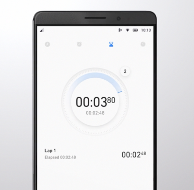
Back in 2016, the digital design agency Fantasy was handed a monumental challenge: overhaul the mobile operating system interface for Huawei, one of the world’s leading telecommunications and smartphone manufacturers. Tasked with spearheading the visual design language for Huawei’s EMUI 5 interface, designer Gleb Kuznetsov stepped into an environment that lacked centralized design cohesion.
At the time, Huawei relied heavily on a heavily customized, fragmented iteration of Android. The software was plagued by internal contradictions, disjointed visual styles, and a complete absence of a unified vision. Multiple silos of teams—ranging from UX and interaction designers to visual and graphic artists—were independently grasping at straws, creating a digital "Tower of Babel" that ultimately resulted in a jumbled, confusing user experience.
The collaboration between Fantasy and Huawei’s internal teams, notably under the guidance of former Apple creative director Abigail Brody (who joined Huawei in September 2015 as Chief UX Designer and VP of Huawei Devices), sought to rewrite the rules of mobile interaction. By grounding the new operating system in meticulous research, organic design philosophies, and strategic architectural shifts, the project aimed to establish consistency, brand recall, clarity, and rapid innovation.
Chronology: From Fragmentation to Framework
The roadmap to building a robust visual design language from scratch required a disciplined, step-by-step product development framework: research, ideation, design, validation, and implementation.
Phase 1: Research and the UI Audit
Before a single pixel was pushed, the team conducted a comprehensive audit of the existing Android anatomy, breaking down the mobile OS into atomic elements: colors, shapes, shadows, lines, and transitions. This exhaustive decomposition allowed the team to understand how individual buttons, navigation bars, and icons functioned together as a unified ecosystem.
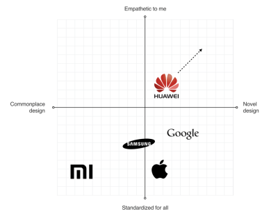
Simultaneously, UX researchers analyzed global consumer trends. Recognizing that Huawei catered to diverse markets across the Americas, Europe, Asia, Africa, and Oceania, the team developed granular user summaries split by demographics, core values, and expectations. They also analyzed major market competitors, mapping out strengths and weaknesses across global tech giants to locate strategic openings for Huawei’s brand identity.
Phase 2: Ideation and Philosophical Foundation
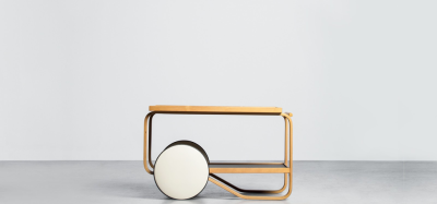
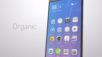
Armed with research, Kuznetsov collaborated with Abigail Brody to forge a philosophy of design. Drawing inspiration from organic design—pioneered by figures like Frank Lloyd Wright, who championed harmony between people and nature—the team anchored their visual aesthetic in smooth curves, natural forms, and rounded shapes.
Furthermore, motion design was elevated from a purely functional utility to a core pillar of brand identity. The team crafted a motion design manifesto focused on delivering "magical moments"—delightful, surprising animations that not only provided clear feedback for user actions but also leveraged the aesthetic-usability effect to make users more tolerant of minor interface friction.
Phase 3: Design, Testing, and Iteration
The design phase moved away from isolated artistic endeavors toward rigorous, collaborative peer reviews. Screens were pinned side by side on collaborative boards, enabling open critiques where multidisciplinary teams could debate the pros and cons of various visual solutions.
To ensure the VDL actually resonated with end users, the team adopted an agile "build, measure, learn" philosophy. Visual elements were embedded directly into functional prototypes and tested internally via "dogfooding" as well as through external user studies.
Phase 4: The Implementation Gap
The final stretch of the timeline exposed a recurring enterprise hurdle: the chasm between design conceptualization and engineering execution. While Fantasy and Huawei’s core UX leadership developed a visionary design language, the practical realities of engineering constraints meant that the final production version of EMUI 5 diverged significantly from the initial design concepts.
Supporting Data and Strategic Insights
The transformation of Huawei’s interface was driven by data-backed insights regarding human ergonomics, visual hierarchy, and brand psychology.
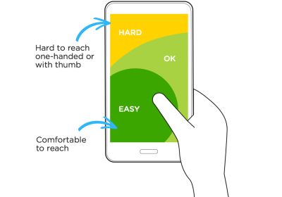
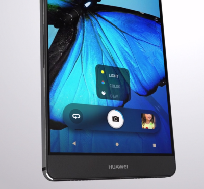
- Reclaiming the Thumb Zone: In 2016, smartphone screens were growing steadily larger, yet mobile operating systems stubbornly retained critical interactive elements at the top of the display. UX audits revealed this forced users into awkward physical stretches and grip adjustments. By consulting with Huawei’s engineering team, designers successfully shifted core functional controls to the bottom "thumb zone"—an ergonomic layout that is now an industry standard.
- Competitor Benchmarking: By plotting major competitors on a quadrant diagram measuring design approaches, the team identified critical white spaces in the market. For instance, while Apple’s iOS offered impressive scalability and standardization, it suffered from inconsistent iconography and an overuse of heavy blur effects. Huawei aimed to carve out a unique identity that merged high refinement with Eastern and Western design sensibilities.
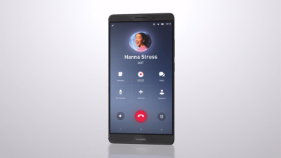
- The Power of Meaningful Semantics: Just as natural language relies on grammar to give words context, visual language demands strict semantic rules. Every animation—such as the pulsing ring behind a user avatar during an active call—was engineered to serve a dual purpose: conveying live system states while delivering emotional delight.
Official Responses and Industry Perspectives
The structural overhaul of EMUI 5 marked a pivotal turning point for Huawei’s global brand perception. In sharing his firsthand experience, Gleb Kuznetsov highlighted a systemic challenge faced by large-scale technology corporations:
"Every company needs a top-manager who cares about design and is ready to fight for it."
Kuznetsov pointed to historical precedents like Steve Jobs famously fighting for the distinctive macOS minimize animation over initial engineering pushback, proving that executive leadership is often the vital catalyst needed to push visionary design through technical resistance.
While designers frequently lament the compromises made during engineering implementation, the broader market metrics told a powerful story. By modernizing its software ecosystem and cleaning up its user interface, Huawei managed to build consumer confidence on a massive international scale, eventually surpassing Apple in global smartphone sales by 2018. The modernized UI played a foundational role in signaling to consumers that Huawei devices were premium, reliable, and competitive at the highest tier.
Implications for the Future of Digital Product Design
The lessons extracted from the Huawei EMUI 5 project extend far beyond a single operating system update. They offer a masterclass in how modern enterprises must approach software development:
- Design Language as a Strategic Asset: A robust visual design language is much more than a collection of pretty icons; it is the heartbeat of a product’s user experience. It unifies multidisciplinary development teams, accelerates product delivery, and ensures brand identity matches consumer brand perception.
- Bridging the Engineering Divide: The "implementation gap" remains one of the most persistent threats to digital innovation. Corporations must integrate designers deeper into the engineering deployment phase to prevent technical shortcuts from diluting the integrity of the original vision.
- Ergonomics and Empathy: True user-centric design requires acknowledging physical realities—such as hand anatomy and mobile ergonomics—alongside digital aesthetics. Shifting navigation zones to accommodate human physical limitations proves that form and function must evolve in tandem.
Ultimately, crafting a visual design language is an exercise in bringing order to chaos. By replacing a digital "Tower of Babel" with a shared, harmonious vocabulary, organizations can transform fragmented software into intuitive, delightful products that resonate with millions of users across the globe.