In the modern digital landscape, the user experience (UX) is the silent currency of the internet. Yet, despite decades of research demonstrating that interruption-based marketing breeds user resentment, many e-commerce retailers remain shackled to a relic of the early web: the intrusive, full-screen newsletter pop-up.
For many companies, these modals represent a "shiny" solution to the pressure of hitting Key Performance Indicators (KPIs). However, as data-driven insights continue to emerge, a clearer picture is forming: aggressive, poorly timed pop-ups are not just annoying—they are structurally detrimental to long-term business health. By forcing an interaction before a relationship is established, brands are inadvertently sabotaging their own revenue potential.
The Anatomy of a Conversion Failure
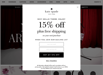
Imagine the scenario: a consumer arrives on an e-commerce site, eager to browse a new collection of products. Before they can evaluate the craftsmanship, compare price points, or check delivery timelines, their screen is hijacked by a vibrant, high-contrast modal demanding their email address in exchange for a "10% discount."
The user’s reaction is almost universally negative. The immediate instinct is to locate the "X" button—a pursuit that is often intentionally made difficult by designers—to dismiss the interruption and return to the task at hand. This is the "Pop-Up Paradox." While the company’s internal metrics might record a "view" or a "dismissal," the reality is that the brand has just introduced friction into a high-intent user journey.
The Myth of Quantity over Quality
The pressure to generate leads often creates a perverse incentive structure. Marketing departments are frequently tasked with growing email lists at any cost. When performance bonuses are tied directly to the raw number of sign-ups, teams are incentivized to optimize for volume. This leads to the "loud and large" design aesthetic—pop-ups that dominate the viewport and demand immediate attention.
Initially, these strategies often appear successful. Dashboards light up as sign-up numbers climb, providing a false sense of security. However, as one major e-commerce retailer discovered, quantity is a poor proxy for value.
A Case Study: The Cost of "Noisy" Leads
Several years ago, a prominent e-commerce retailer decided to aggressively scale its lead generation efforts. The team spent weeks A/B testing copy, colors, and timing, eventually arriving at a massive, unmissable pop-up that appeared on every entry page.
The result was a surge in sign-ups that briefly looked like a triumph. Yet, within weeks, management faced a sobering reality: while the subscriber list had grown exponentially, revenue remained stagnant. A deeper audit revealed the truth behind the data.
The "Disposable" Problem
The leads generated by the intrusive pop-ups were of abysmal quality. They consisted of:
- Disposable Emails: Users entered "junk" addresses (e.g., 10minutemail.com) simply to clear the pop-up and access the site content.
- Creative Aliases: Bot-like entries and randomized strings of characters designed to bypass validation.
- Negative Brand Sentiment: Legitimate users who, feeling harassed, abandoned the site entirely rather than proceeding to purchase.
Ultimately, these "leads" became a liability. They inflated the size of the mailing list, which increased the company’s email marketing costs, yet they suffered from high bounce rates and abysmal engagement. The pop-up was essentially paying for its own failure; by driving away potential customers, it reduced the conversion rate of the entire site.
The Psychology of Interruption
From a UX standpoint, the failure of the pop-up is rooted in cognitive load and task orientation. When a user lands on a product page, they are in a "hunting" mode—they have a specific goal, whether it is researching a purchase or comparing features.
Any overlay that obscures this goal is perceived as an adversarial obstacle. Research from the Nielsen Norman Group and various UX behavioral studies consistently show that interruptions are viewed as major irritants that trigger an "urgent dismissal" response. When a user is forced to stop what they are doing, their trust in the brand diminishes.
The Shift Toward Respectful Integration
The solution, as realized by the aforementioned retailer, was a radical departure from the norm. They decommissioned the aggressive pop-ups entirely. Instead, they moved to a strategy of "contextual placement."
Rather than interrupting the user, the company integrated newsletter signup opportunities into the natural flow of the site:
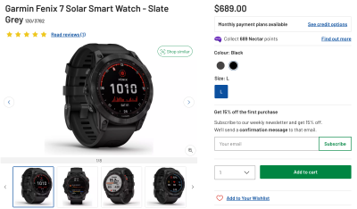
- Subtle Inline Placement: Placing sign-up boxes near the product price or description, where a user is already engaged with the value proposition.
- Post-Purchase Integration: Offering subscription options on the order confirmation page, where the user has already demonstrated trust and intent.
- Collapsible Non-Modal Dialogs: Using UI elements that provide information without forcing a state change or hijacking the screen.
Strategic Implications: Building Long-Term Trust
The transition from "intrusive" to "contextual" requires a shift in corporate culture. It demands that stakeholders prioritize the long-term lifetime value (LTV) of a customer over the short-term dopamine hit of a vanity metric like "total subscribers."
The ROI of Patience
When a company treats a user with respect, they foster trust. Trust is the precursor to loyalty, and loyalty is the precursor to recurring revenue. By allowing the user to navigate the site on their own terms, the company ensures that when a user does eventually sign up, they are doing so because they are genuinely interested in the brand’s messaging.
This results in:
- Higher Open Rates: Emails are sent to users who actually want to receive them.
- Lower Spam Rates: The list is comprised of legitimate, engaged humans.
- Improved Conversion: The brand becomes a partner in the shopping journey rather than an obstacle.
The Future of Interface Design
The lesson for modern businesses is clear: effective interface design is about showing the right things at the right moment. The era of "growth at all costs" is being replaced by an era of "intelligent engagement."
For designers and product managers, the mandate is to move beyond the easy win of the pop-up and into the nuanced work of user experience design. This requires analyzing the entire customer journey, identifying points of natural interest, and offering value—not disruption—at every turn.
As we look toward the future, the most successful brands will be those that view every interaction through the lens of empathy. If you are still relying on intrusive pop-ups to drive your metrics, it may be time to ask whether you are building a database or a community. One is a list of numbers; the other is the bedrock of a sustainable, profitable business.

Final Takeaway
The data is incontrovertible: the most effective way to grow a list is to provide a product and an experience that people want to stay connected to. If your site requires a disruptive pop-up to remind people you exist, the issue may not be your marketing—it may be your value proposition. By stepping back and respecting the user’s autonomy, you create the space for them to step forward and choose your brand voluntarily. That is the only kind of lead that truly matters.